07/12/2012

Oscar Niemeyer Passes Away At The Age Of 104

Oscar Niemeyer Passes Away At The Age Of 104

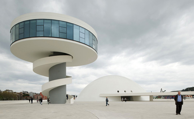
The last of the ‘heroes’ of the Modern movement has died Wednesday, at the age of 104 in Rio de Janeiro, Brazil, the country he has both celebrated and become a celebrity for during more than 70 years of work. Oscar Niemeyer, one of the greatest architects of all times, didn’t have an easy time entering the highly Modernist circle. Even though Le Corbusier praised him for the innovative use of reinforced concrete, he did also receive pretty harsh criticism.


Nevertheless, Niemeyer worked tirelessly on new projects, each and every one of them highly iconic and undersigned by his intrinsic fascination with curves. He famously stated: “I am not attracted to straight angles or to the straight line, hard and inflexible, created by man. I am attracted to free-flowing sensual curves. The curves that I find in the mountains of my country, in the sinuousness of its rivers, in the waves of the ocean, and on the body of the beloved woman.” or “My work is not about ‘form follows function’, but ‘form follows beauty’ or, even better, ‘form follows feminine’.” This all can be clearly seen in one of the most ambitious and utopian projects of modern architecture, and Niemeyer’s masterpiece, Brazil’s concrete dream capital – Brasilia.

Brasilia was constructed in less than four years, in 41 months to be precise, following the determination of its president Juscelino Kubitschek. Brasilia, despite the fact that it is currently facing difficult social and infrastructural problems, has been listed as the World Heritage Site and remains one of the most incredible cities in the world. Its almost futuristic skyline, highly characterized by Niemeyer’s steady hand, collects some of the most important buildings in the history of architecture: the beautiful Alvorada Palace, the official residence of the Brazilian president, the House of the deputy, the National Congress of Brazil, the Cathedral of Brasília (a hyperboloid structure resembling a crown), diverse ministries and residential buildings.

Among other works created by this great master must be mentioned the Niterói Contemporary Art Museum, a futuristic building looking out across Guanabara Bay from Rio, Brazilian National Museum in Brasilia, the contribution to the United Nations Headquarters in New York or the Serpentine Pavilion in London. He was awarded Pritzker Prize in 1988, RIBA Royal Gold Medal in 1998 and the Lenin Peace Prize as life-long determined communist. Well, dear Oscar, you have done it all.


Rujana Rebernjak

Share: Facebook,  Twitter  
06/12/2012

The Barrow Boys And Buskers of Columbia Road

The Barrow Boys And Buskers of Columbia Road

No East London weekend can be considered complete without a wide-eyed amble along Columbia Road Flower Market. Teeming with thriving foliage, bundles of bulbs, blossoms in every imaginable hue and a string of independent stores and galleries, hidden within Victorian shop fronts, this street seems to hibernate midweek but blooms with life on Sundays.


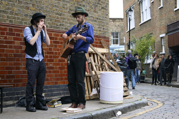
Here the chants of barrow boys mix with the tunes of harmonica toting buskers and the scent of perfectly brewed coffee, something that’s harder to find in London than you may imagine. For less than a fiver you can leave with anything from an exotic 10-foot banana tree to snow white, locally grown roses. Drawing in serious horticulturalists and those after house brightening blooms, space is hard to come by on this road, especially when the sun makes a fleeting appearance.

Flowers aside, Columbia Road is a mecca for alternative art lovers. For quirky and fanciful printed artworks head to Elphick’s, a print shop run by textile designer Sharon Elphick, that feels more like an intimate art show than a gallery. Further along you’ll stumble upon Three Letter Man, a space that can only be reached by braving a characteristically rickety flight of stairs. Brimming with vintage linen and embroidered artwork, this small, secret-feeling gallery is owned by Nathan Hanford, who spends his days sitting by his first floor window, adorned with a fox head mask, happily creating his art.


Then there’s Ryantown, a gallery dedicated entirely to Rob Ryan’s exquisite cut out designs. His works are adored by the V&A Museum, have taken the UK by storm and lift the spirits of all who stumble upon them. This Columbia Road store, with creaky wooden floors and stencil covered walls, is just around the corner from Ryan’s London studio, and is every bit as whimsical, dreamy and utterly romantic as his art, which reminds you – in an almost child-like manner – to ‘let your heart have a say’.

Also worth a visit is Laird of Glencairn, a traditional gentleman’s hatter that exudes old school charm and will ensure that your head departs well-dressed. Alternatively, you can let your inner child rejoice at Suck and Chew; a confectionary shop where jars full of sugary treats decorate the walls, sweets are measured by hand, retro toffee tins are everywhere, and thoroughly British bunting reminds you that you’re in England and all is well. No doubt a more delightful, more varied, more capricious Sunday London haunt is yet to be unearthed.


Liz Schaffer

Share: Facebook,  Twitter  
05/12/2012

The Editorial: Easy Bake Boy

The Editorial: Easy Bake Boy

Feminism is so 1970s. While we love us an empowered lady (and know that equal rights still have quite a ways to go in many cases), the notion of a strong, independent woman now just seems a bit too… binary. Because, feminism is a two-way street: when men were Archie Bunker, of course they had no choice but to punch those chauvinists in the nose! But in retrospect, it’s important to remember that most activist feminists wanted power, and not necessarily equality: a stereotypically alpha-male approach for escaping alpha-male oppression. Hmm.

But today, “man” can mean sensitive bearded hipster and James Franco and “manscaping” and drastic, provocative fashion. It’s in this progress of what it means to be a man that we seem to have at long last discovered the finer shades of both genders, far beyond the heretofore black and white previously admitted. When women don’t have blockheads to react against, they can be anything they want. We’ve got latitude at long last, but ours is anything but a post-gender world.


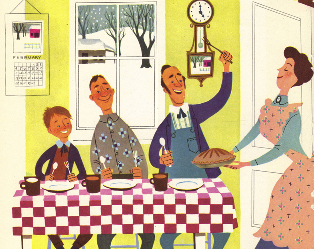
It follows that among the more fascinating cultural shifts over the next several years will be just how the traditional boy vs. girl iconography evolves in relation to this latitude. Google “1950s family,” and there, in impossibly saturated colours, will be most literal icons of the lock-step identities marketers are still actively trying to create. Children’s toys, that means both Tonka trucks and My Little Pony, are charged with polar gender associations that are both exclusive and limiting. It’s slightly sad, but once the marketers fully grasp that they can make boatloads of money by selling Barbie to boys and Bob the Builder to girls, the toy boxes of the world will be more equal places. And I, for one, will be ecstatic to inhabit a world of yellow mixed with green instead of blue versus pink.

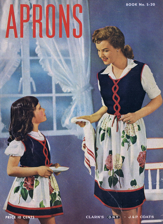
Recently, a little girl named McKenna Pope launched a campaign on change.org to have boys included on the packaging of everyone’s favourite kitchen toy, the Easy Bake Oven. For generations, our sisters have made us icky, chalky cupcakes in the ugly little apparatus – but just why is it only for them? It’s always been marketed as a girl’s toy, that’s why: a training tool for those fortunate future housewives, taught from the age of 5 to drown in the halogen glow of domestic bliss. (Batteries required.) But, boys can bake. Hell, they should be baking, instead of sitting around while their poor, overworked sisters slave over a warm lightbulb…

Let’s all do little McKenna and ourselves a solid and sign her petition. Get with the times, Hasbro.

Tag Christof

Share: Facebook,  Twitter  
04/12/2012

Are Design Fairs Really Needed?

Are Design Fairs Really Needed?

That time of the year has come when speaking of one of the most important art and design events seems inevitable. Art Basel in Miami will officially open its gates tomorrow. Unofficially it will open today, where ‘unofficially’ means only the richest of the rich international collectors will be granted access to make their Christmas shopping a bit more relaxed. As it always happens, every big event gives birth to a series of smaller ones, who through time, with dedication and right connections eventually become themselves big, too. This is the case with Design Miami/Basel, a fair entirely dedicated to passionate design collectors. We were able to follow the first tranche of this major event this summer in Basel, whereas the second part we will have to watch only from distance.


This has maybe given us the privilege to contemplate the event itself in a more critical manner and think through what should be the point of design, and as a consequence, of collecting design. Design is, or should be, one of the most democratic forms of visual expression. It happens to be so, not only because design products are fairly economical and mass produced, but also because anyone, to a certain point, can be considered a designer. While in the 50’ and 60’ design was seen as a means of gaining and distributing culture on a broader social scale, where producing quality goods at an affordable price seemed a viable way for emancipation and cultural growth of its users, much has nowadays changed. Design has since then become that simple adjective that can accompany almost any word and justify almost any action, degrading its social status and cultural significance.


Even though fairs like Design Miami are explicitly commercial venues, where the whole point is selling vases, chairs, sofas and lamps at an exaggerated price, they should consider better their position. It should be far more useful and constructive if they didn’t present superficial performances and fake prizes as ‘design’. If their central point must be private collecting they should communicate the importance of conservation and history, with the goal of making design seem less ‘decoration’ and more ‘critical evaluation’.


Rujana Rebernjak

Share: Facebook,  Twitter  
03/12/2012

Wut by cie. Toula Limnaios

Wut by cie. Toula Limnaios

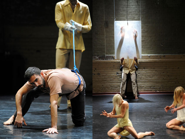
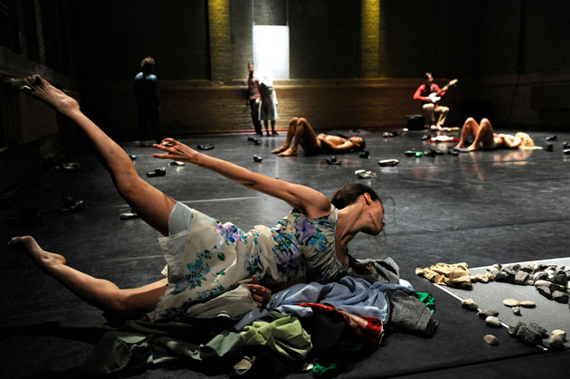
What does it really mean to be angry? In Greek born, Berlin based choreographer Toula Limnaios‘ latest piece Wut, literally translated into “fury” or “rage”, her ensemble experiment with a physical language based on of anger, aggression, manipulation and power. This latest work of the productive company premiered in Berlin in the end of last month and is is being followed by a tour in Sao Paolo until the 11th December.

In Limnaios’ permanent base HALLE; a beautifully transformed old gym hall of red brick stones, six young and talented dancers are occupying the space. All with different bodily expressions and personalities – even when they reunite in small moments of symmetry – all accompanied by live music performed by composer Ralf R. Ollertz, also a co-founder of cie. Toula Limnaios.


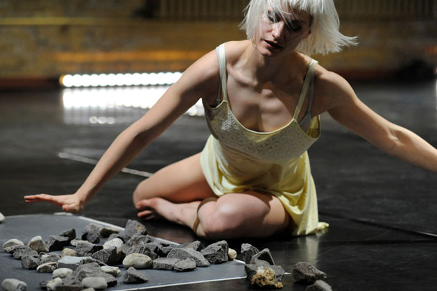
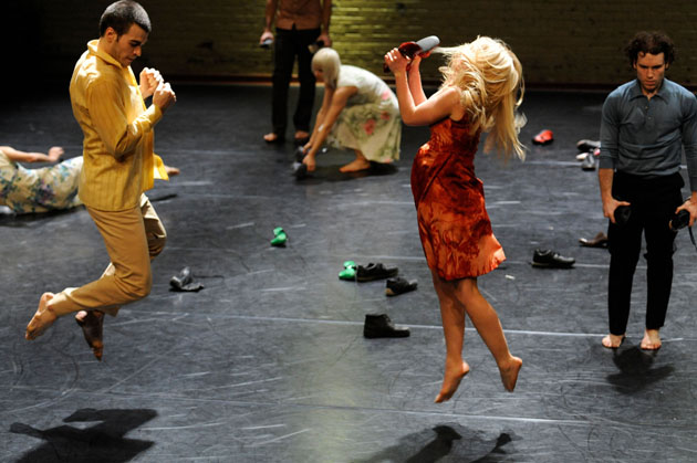
Wut is a study of fury on the verge to hopelessness, despair, angst and fear; where one dancer goes wild with mania, someone else reacts with inward anger. The visual input is strong – besides the many-layered colourful dresses and costumes – shoes, stones or belts are being thrown all over the stage with furious forces. The dancers are working hard; their costumes slowly gets covered in sweat, their skin tone turns red when they seemingly carelessly throw themselves on the floor or resolutely pull their bare skin with their hands. While Karolyna Wyrwal gives seemingly useless orders into a microphone, Elia López follows every direction with twists and turns, uncomfortably folding every joint into a Houdini-game of humiliation. It is one of the strongest moments of the evening, a study of will, suppressed anger, power and the lack of it.

After about an hour of intense rage and physical battle, the stage is still reverbing from the dancers’ actions and steaming of their body heat during the massive applause. Afterwards we step out into the cold winter night left with slight mental, if not physical, bruises.


Wut 
cie. Toula Limnaios 
HALLE TANZBÜHNE BERLIN
 Premiere
 22 Nov – 2 Dec 2012,
4-11 Dec 2012 
Festival Panorama, Sao Paolo, Brazil

Helena Nilsson Strängberg – Images courtesy of Sabine Wenzel

Share: Facebook,  Twitter  
03/12/2012

Alberto Garutti Seen Through Unusual Eyes

Alberto Garutti Seen Through Unusual Eyes

Going to visit a contemporary art exhibition in children’s company can be a pleasant surprise, an amazing source of inspiration that offers myriad of reflections, watchful insights and cues coming from a genuine, superstructures-free point of view. We had already carried out this sort of pedagogical experience some time ago discovering the smart project by Emanuela Torri and DOREMILAB: L’arte raccontata dai bambini (art told by children). Once again Sofia (6 years old), this time along with Giulia (5 years old), has dressed the part of an emerging critic, going to see a show to make her fairly personal review.
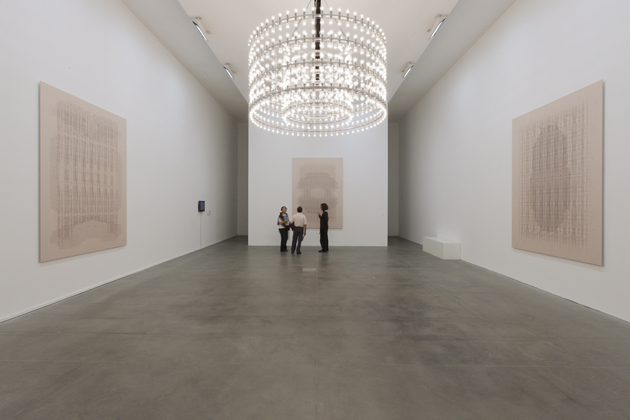
We are at PAC, and the exhibition is Didascalia/Caption by Alberto Garutti, curated by Paola Nicolin and Hans Ulrich Obrist. 
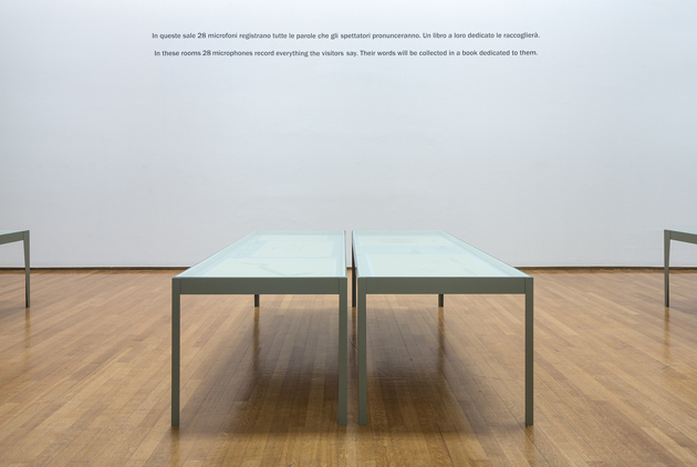
Both Giulia and Sofia like the artist’s idea that artwork exists only in the eyes of the viewer, in the unique encounter with its addressees, and seem to be more than enthusiast to take on the assignment of making sense of his works, putting them through. Just got into the museum, which presents about thirty historical and new works to retrace Garutti’s research evolution from the 70’s to date, conceived with different media and languages (photography, installation, painting, sculpture, sound, video etc.), and the first impressions come punctual: “you don’t need to pay the entrance but mommy and daddy have signed a paper (ed. Note, the letter of waiver for the presence of recording devices). There are a lot of microphones, that’s so strange. Besides the microphones there would be cameras too because they capture people’s expressions, if you are happy you look different than when you get bored or you yawn”.
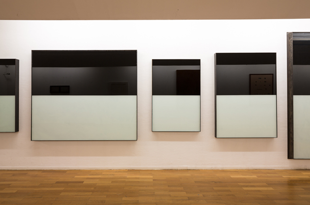
The atmosphere is homely; the children feel at ease; the dialogue is immediate and sincere; the narration begins. Giulia’s attention is attracted by the tables with digital prints of Bacheche progetti Opere Pubbliche (1994-2010): “Alberto put his secrets under the mirror that covers the tables, you can look at them but only he and one of his friends can really understand them. Secrets should be told to not more than one person. Nice microphones, I love singing”.

“Those microphones are giant, they work like Hoovers which draw in all the words people say while here”, Sofia adds.

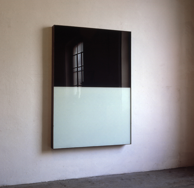
After few minutes the exhibition path stops again because of huge beakers (Dedicato agli abitanti di Via dei Prefetti 17, 2004) that excite the little girls’ imagination: “Even giants have their bottles, they are thirsty too. It must have been difficult to bring them here, but they are beautiful. They seem fish tanks put like this [miming vertical with the help of her arms], hey look the show through the glass, you can see it bigger, like you have giant’s eyes”.

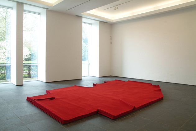
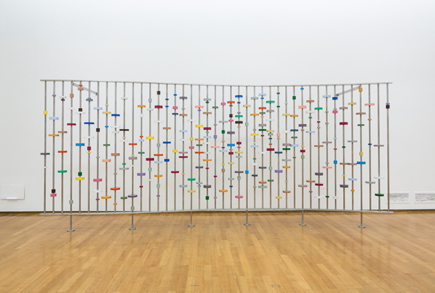
While following their suggestion, we cannot avoid thinking about the main characteristic of Garutti’s works, the ability of interacting with the viewer and the surrounding space, getting in tune with them. Didascalie (2012) reminds Sofia of bricks/books, but “you’ve better not build a house with them, unless you are one of the three little pigs”. “ I cannot read yet, but Sofia told me she has started reading… Sofi, how did you call them? Lower-case letters right?”

The visit goes on. The charismatic artist/professor, who has been able to have a positive ascendancy on most of the Italian emerging art talents, defining an attitude more then an aesthetic – all his students have developed a very different approach and personality – enchants Sofia and Giulia. Funny moment when they both think that Ficus (2012) is a present from Garutti’s mom for the opening and that it has very shiny leaves “maybe someone has been dusting them each day. Do you think it will be here until the end of the show, or Alberto will bring it home earlier?” “The bench with dog – Il cane qui ritratto appartiene a una delle famiglie di Trivero. Quest’opera è dedicata a loro e alle persone che sedendosi qui ne parleranno (2009) – is lovely, why benches like these aren’t in the parks? Alberto must like dogs”.
After more than one hour and a half inside the building, our emerging critics take their time to recap: “this exhibition is for males and females. It is a show that also children younger than us could like. We haven’t got bored, we have looked at the works and we would have loved going into the sculpture-house made of wood (upstairs), but we put there Elisa (their stuffed rabbit). The red carpet is great, we would like cutting capers. This space is beautiful, look! You can see the park while visiting the show and viceversa. There are even men in uniforms, but they have never reproached us or said “shut-up!” (…) the Doctor (ed. Note, the curator) has been good in picking up the works, we enjoy all of them”.

Conceptual art can be difficult to approach. Cerebral and cold in its shapes, but sensitive in content, and always related to spirituality and nature, the art by Mr. Garutti plumbs different narrative keys pinpointing the mission of getting closer to everybody. 
Undoubtedly one of the best shows seen in Milan during this year. It will run until 3rd February 2013.
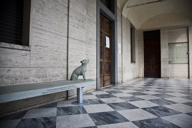
Monica Lombardi and Giulia & Sofia – Images courtesy of Studio Pesci / Delfino Sisto Legnani

Share: Facebook,  Twitter  
02/12/2012

Sunday Breakfast by Love For Breakfast

Sunday Breakfast by Love For Breakfast

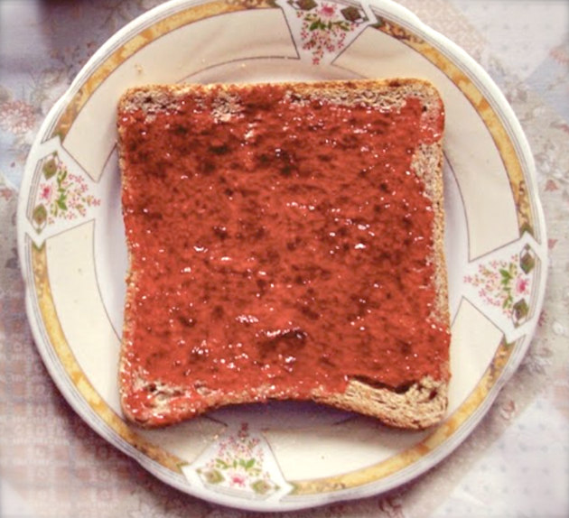
Do not forget simplicity.

Alessia Bossi from Love For Breakfast

Share: Facebook,  Twitter