18/10/2012

Autumn in Middle-Earth

Autumn in Middle-Earth

If you see its red roofs, Bologna seems like a burning city. If you want, you can imagine it as Middle-Earth: caught between the North and the South of Italy, eternally hung in the balance between rebellion and stillness, crossroads of diversities that menace its genetic indolence: but it’s exactly these diversities that create an everlasting equilibrium. Here you’ll find the oldest academic institution of the western world and beautiful arcaded streets. Near the secret gardens of middle class houses you’ll find crumbling hovels inhabited by several generations of students, as well as abandoned buildings chosen as a residence by gutter punks; the metropolitan vagabonds.
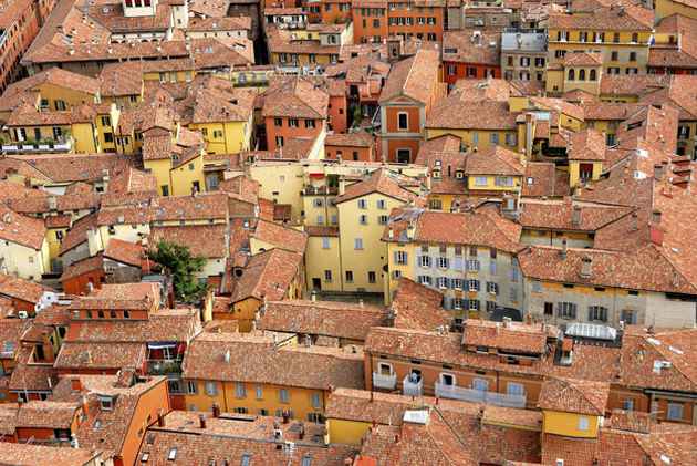
In Via Zamboni, where the students spend almost more time than in their apartments, you see pinned up posters that sing hymns to urban rebellion. The smell of mariijuana is a constant, as the smog in Rome and tacos in Mexico City. Students argue about last revolutions and tomorrow’s exams. In these days, many of them walk around with reflex cameras in their hands: in autumn, Bologna shows the turists and inhabitants its best dress.

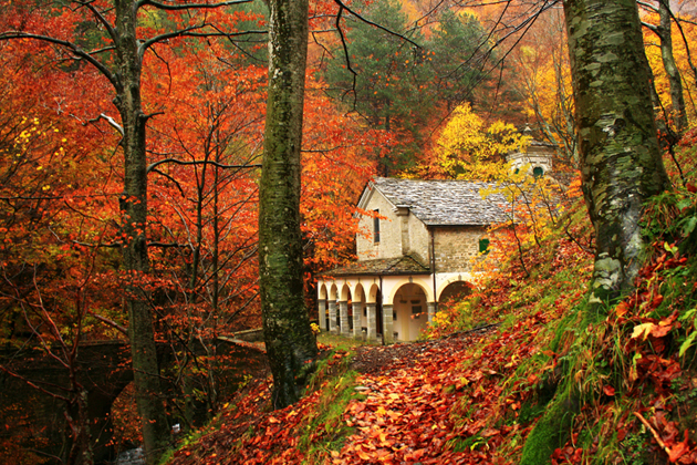
If you decide to visit this beautiful city, keep a simple tour plan and move around by foot; it’s the only true way to enjoy the smells and colours of the town. After a must visit in the old town centre, move from Piazza Maggiore to Via del Pratello, “the street of slaves and prostitutes, terrified by change” as the Italian musician Emidio Clementi sings. Go back and take Strada Maggiore or Santo Stefano street, they will lead you to the Margherita Gardens, the main urban park of the city. Here you can taste a real peace of what autumn in Bologna is. For those who love to walk, we recommend wearing the comfortable shoes for an outdoor trip to the hills of Bologna to search inspiration from the lovely hillside villages, and to have a look over the whole city. Another must-see destination especially for those who have a car is the Madonna del Faggio Sanctuary in Castelluccio, 40 miles far from Bologna: here you will find sceneries worthy of a William Turner painting.

Antonio Leggieri – Photos Marina Posillipo, Marco Albertini

Share: Facebook,  Twitter  
17/10/2012

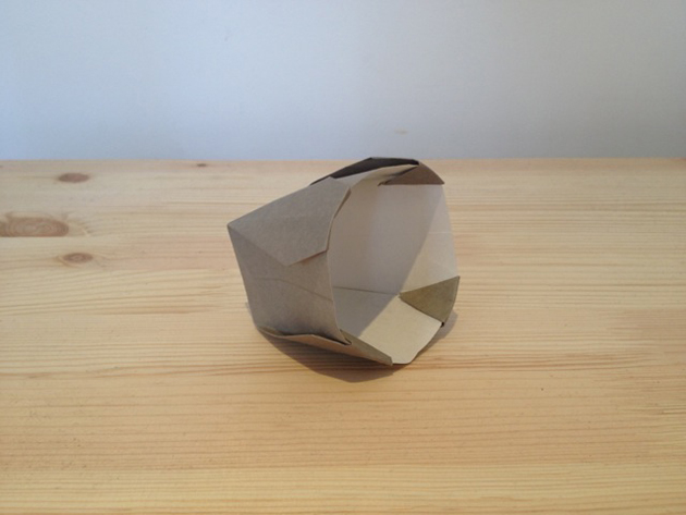
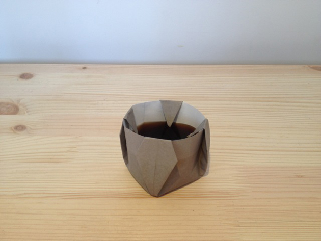
The Editorial: Origami Coffee

The Editorial: Origami Coffee

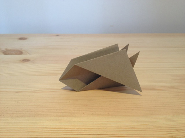
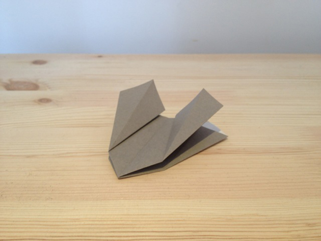
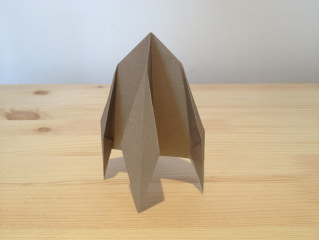
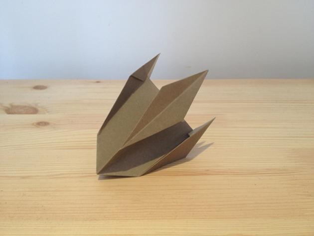
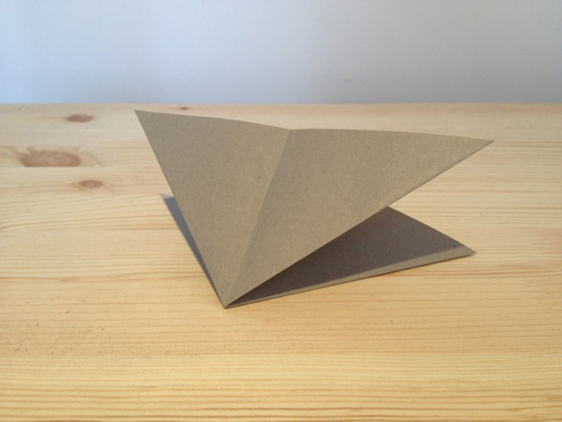
I don’t know about you, but I am tired. Partly because it’s nearly 4am, partly because it’s October. The slow and agonising build-up to the holiday season has begun (Starbucks has started serving its cosier, fattier, spiced-ier coffee contrivances), which means we’re all negatively charged bundles of stress lately. And so this week, I shall spare the world a wordy diatribe and will instead fold origami while I brew a little coffee.


There’s something intensely romantic about getting intimate with a square of paper. You come to know its essence. (Fold.) Its zen. (Crease.) Its materiality. (Tuck.) And ultimately its limits. (Rip. Oops. That stegosaurus is too difficult. On to something else…) But from crane to ninja star to water bomb to flower, that something so utterly straightforward is capable of taking on infinite variations in symbolic form is positively mind-blowing. Koolhaas would be nowhere without origami. And as with everything, it’s all in how you bend it.

(Water’s boiling.) So while I may be tired (especially after sitting through two hours of a droning, predictable US presidential debate), the night is young! It’s raining here in London (shocker), which lends to the already pervasive serenity of 4am. Fold. Crease. Tuck.


I can make coffee slowly, carefully at 4am. No rush to get out the door and onto the early train. It isn’t for a jolt now, but rather a shameless hedonistic indulgence. And much like the origami, its seeming straightforwardness can give way to great complexity when considered more closely. Consider your coffee well and it, too, becomes craft. Fold. Crease. Tuck.

(It’s ready.) So, slow down this week. It changes everything.


For world-class coffee in the spirit of 4am origami indulgence, check out London’s Prufrock (and sit at the bar while you take it in), Brooklyn’s Blue Bottle Coffee or LA’s extraordinary Demitasse (swoon over the Japanese brewing equipment). And just for the mood’s sake, watch this gorgeous film about brewing in a Chemex.

Tag Christof – film by Hufort

Share: Facebook,  Twitter  
16/10/2012

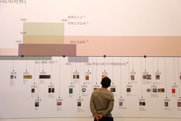
Changing Design in China

Changing Design in China

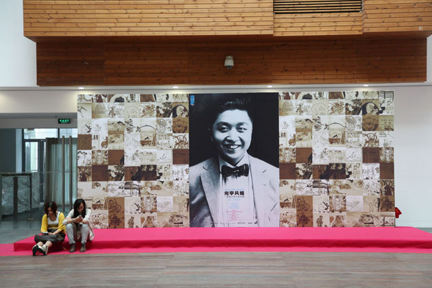
Speaking about design in the West has become an ubiquitous subject. Everyone in some way, more or less passionately, is involved in the discourse. The idea of ‘design’ itself as a discipline has become widespread and commonly shared. The same thing cannot be stated as firmly about design in the Orient, especially China.


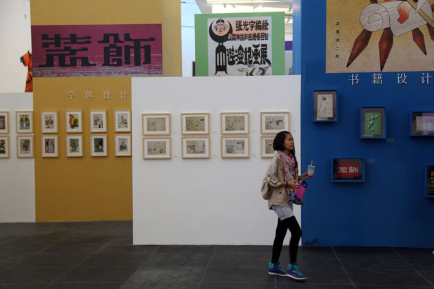
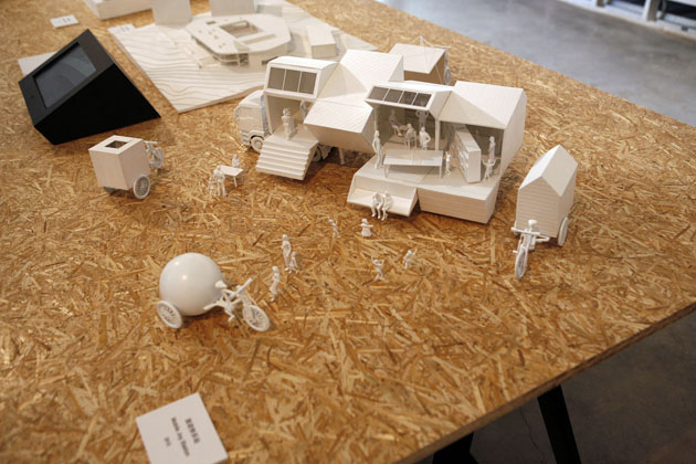
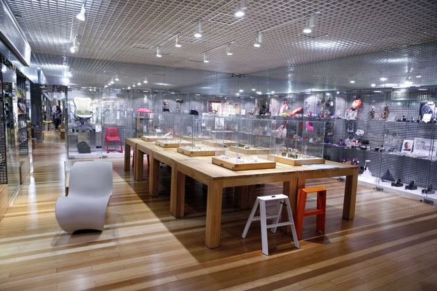
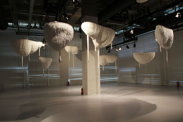
After decades of growth as a productional power-force (with all its good and bad sides that we cannot engage in discussing in this particular context), China is strongly intent in changing its production methods as well as the public image. The recent hustle and bustle of grand design events confirms the country’s determination in shifting from ‘Made in China’ to what should become ‘Designed in China’. Hence, the recent Beijing Design Week tried to focus its activities in promoting and discussing the importance of craft in design process – stressing on the urgent need of both industrials as well as designers in China to engage in producing authentic projects, more than merely copying European or American design pieces.


The desired shift is surely a tough task and, as Justin McGuirk swiftly points out, BDW hasn’t quite made it in making a strong statement about what should be done, neither has it shown examples of successful collaborations between young Chinese designers and enlightened Chinese manufacturers. The highly ambitious design week, unfortunately, still seems kind of copycat of European events, without authentic projects that try to put in practice the theoretical goals. Presenting a series of events, exhibitions and talks, together with the main fair, even the ones with a keen eye on Chinese design weren’t able to really find much to be impressed by.

Even though our ‘Western’ design fairs don’t have much to envy, too, a bit of criticism might help passionate Chinese designers to find the right way to embrace the peculiarities of their fascinating culture and both promote an authentic idea of contemporary design.


Rujana Rebernjak

Share: Facebook,  Twitter  
15/10/2012

‘Returning’ Memories Through Painting

‘Returning’ Memories Through Painting

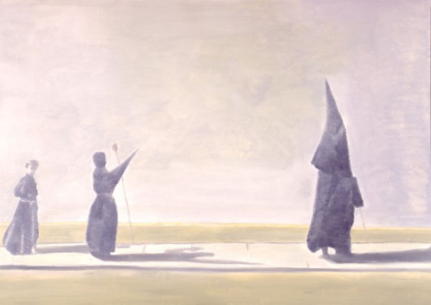
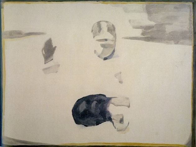
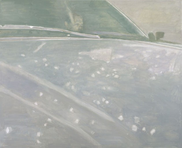
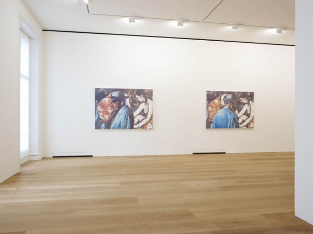
We have no hesitation in saying that the Belgian artist Luc Tuymans (b. 1958 Mortsel) is one of the centerpieces of painting today – maybe we would say one of the few ones left –, able to carve out a place of honor in the contemporary art world even if using a ‘traditional’ and for many old-fashioned media. Perhaps in a time of spectacular, huge or site-specific installations where the watchword seems to be more than ever amazing and capturing attention at once, being shaken by a canvas and feeling controversial emotions while looking at it may sound very strange. But it still can happen, and it happened to us with Tuymans’ narrations.


Mr. Tuymans looks like a man with a sterling character, and when observing his works, the first thing that comes to one’s mind is that he is not a joyful and merely visual artist. Going a bit more into his painterly world, this approach leaps out at you, plumbing the diverse and significant historical topics chosen by the artist during is career: the Holocaust, returned through the representation of a gas chamber or the Nazi entourages; the post-9/11 period, which includes the TV-sized close-up of Condoleezza Rice, The Secretary of State; the Belgium’s colonial history and its relationship with Africa that lead to his unmistakable portrait of Patrice Lumumba; the religion iconography, or the puzzling Disney Eden, which mixes up an outward innocence and a weird, somehow terrifying implication. Power in its different forms and manifestation, often stripped of cultural superstructures, plays a key role in Tuymans’ works, which reveal their complexity along with their intimacy and vulnerability though exercising a symptomatic view.


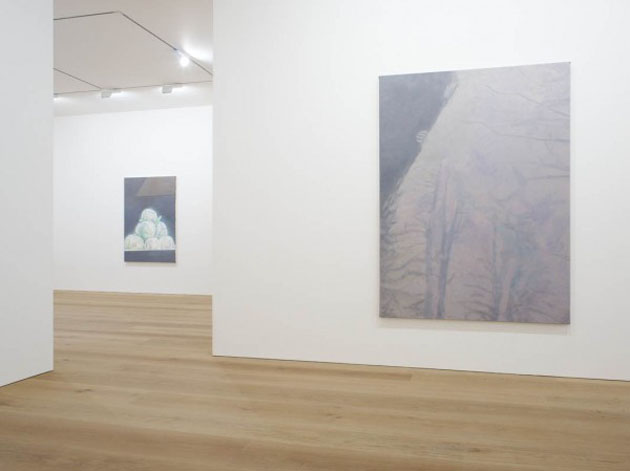
Once again, the theme of accessing the world through the lens of a camera comes back. Using photography and film/television/internet stills as memory traces and starting points, Luc Tuymans tells blurred, fragmented histories that have to be reconstructed through clues depicted with a palette of unsaturated and delicate colours and thin, mainly horizontal brushstrokes. There is no will of drawing inferences, rather creating observations of observations of the reality.

If you want to know more about the Belgian Artist, a new series of works is currently on view at David Zwirner Gallery that inaugurated its first European location in London with the show entitled Allo! at the beginning of October. The exhibition – presenting a suite of new paintings characterized by atypical bright chromatism, dark backgrounds and an exotic atmosphere inspired by the final scene of the movie The Moon and Sixpence – will run until November 17th.


Monica Lombardi – Many thanks to David Zwirner Gallery

Share: Facebook,  Twitter  
14/10/2012

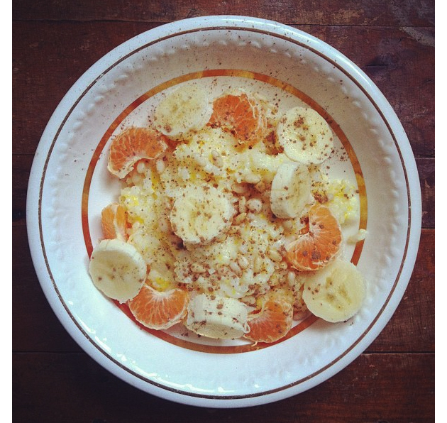
Sunday Breakfast by Love For Breakfast

Sunday Breakfast by Love For Breakfast

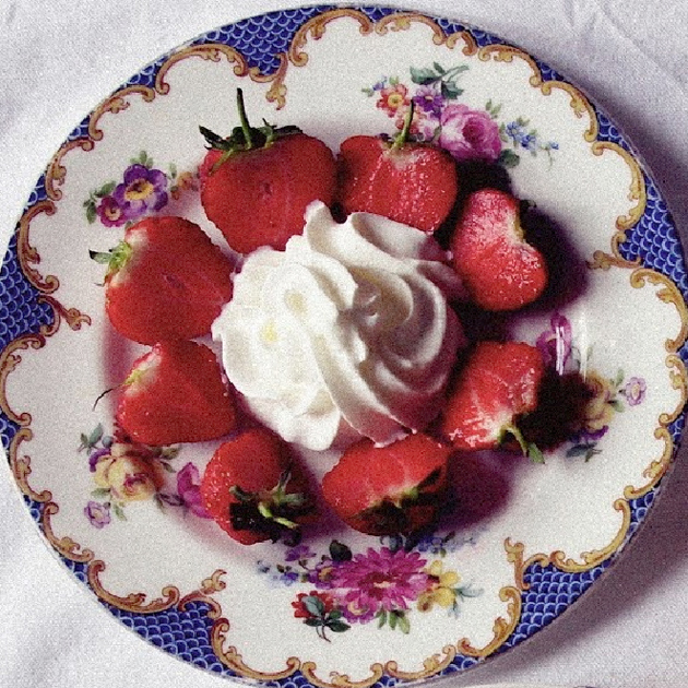
Give me sweetness. A little more sweetness. I have to get up, but give me a minute longer.

Alessia Bossi from Love For Breakfast

Share: Facebook,  Twitter  
11/10/2012

The Founders of Fashion

The Founders of Fashion

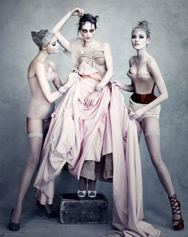
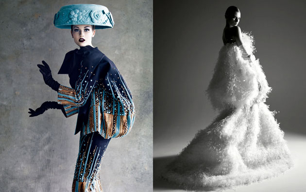
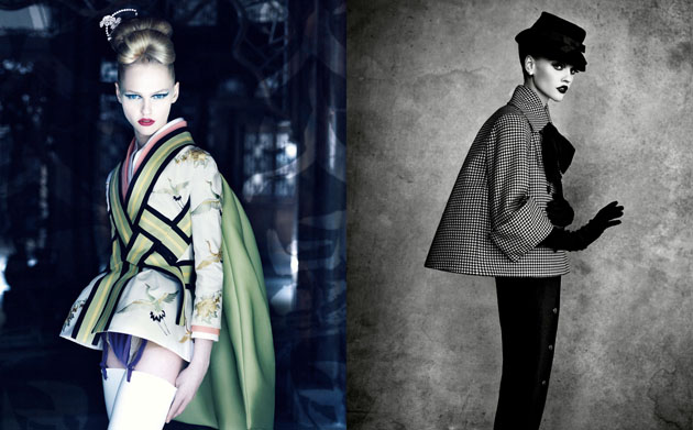
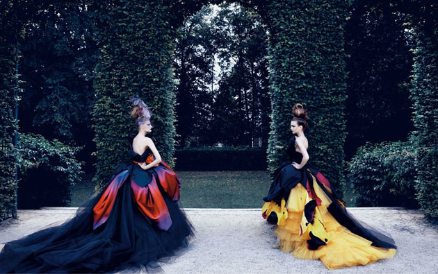
This year Christian Dior celebrates 65 years in business, long after the fashion house founder left the building. Cristóbal Balenciaga is being honoured with an exhibition in Paris 40 years after his death and Jil Sander steps back into the role as head designer of her eponymous brand. There are dozens of fashion brands that are famous for the name of the person that gave it its first stamp, whether that person is still in his or her seat. How important are these ‘fashion founder’ names for their respective brands? And is the status of the fashion houses paying homage to their founders as much as to their current createurs?

Take aside everyone with special interest in fashion. How many really knows the name of the designer behind Dior today? Average Jane does for sure know the name Christian Dior, she probably buys both his make-up and perfume as well. But the name of Dior might be as important to everyone who actually knows Raf Simons as well. Dior, Yves Saint Laurent, Pierre Balmain, Emilio Pucci, Kenzo Takada and all their friends – they breathe fashion excellence. Some of the great names are still alive; some are still even with their companies. These designers have shaped much of what the business is today, and whether they smile or turn in their graves over what their successors are doing to their lines, every garment entering the runway is carrying their names and their heritage.

When Alexander McQueen, a much younger ‘genius’, tragically passed away, the death of the brand was up for immediate discussion. Even if there’s probably a few years left before anything can be told for certain, Sarah Burton is keeping the brand floating – McQueen isn’t a name that anyone will let slip away without a fight. It must be a fine balance to sustain between honouring the name you work for and staying true to your own design aesthetics, while making business happen. “If you don’t know your history, you have no future” are the words of Jil Sander who for many years has seen collections in her name being directed by someone else.

Is it the stories of old Paris and Italian family companies deriving from leather producers that add to the myth and status of today’s giants? Is it the impact that these designers once made, or is it smart business? Is this a phenomenon of the past, or will we in the future be as nostalgic about Marc Jacobs, Stella McCartney, Thomas Tait and their younger friends? No matter what the answer might be, the names that still inspire awe in us have made a contribution to the beauty of things we still see today.

Lisa Olsson Hjerpe – Image courtesy of Patrick Demarchelier (Dior Couture)

Share: Facebook,  Twitter  
10/10/2012

The Editorial: I Wanna Deliver A Shark

The Editorial: I Wanna Deliver A Shark

Torture devices, outlandish sex toys and garish, ostentatious trinkets might make you uncomfortable. As artefacts of design, they invariably reflect some human behaviour, some deeply held desire. “What is wrong with people?” you might ask. But regardless of your quirks and kinks (or your motivations and prejudice therein), it is through our charged relationships to these objects, their symbols, their very existence, that we might most understand our absurd selves.

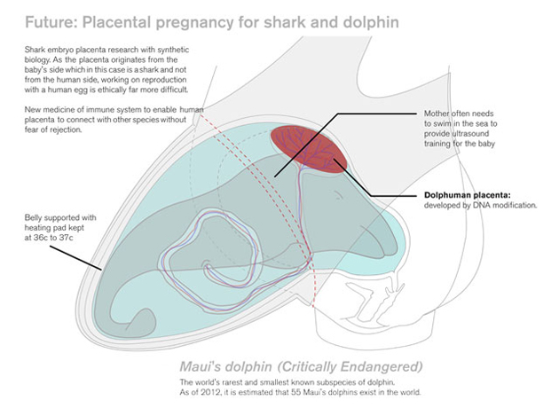
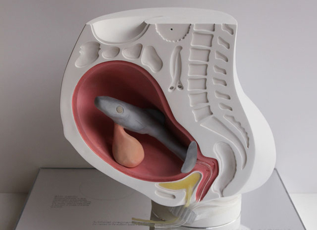
I caught the Design for the Real World exhibition at London’s Royal College of Art on its closing day last week. Among lighting schemes for poor urban neighbourhoods, a bike-powered espresso maker and edible insects, Ai Hasegawa‘s extraordinarily provocative “I Wanna Deliver A Shark” was tucked into a quiet corner. Equal parts whimsical LOL and stare-you-in-the-face “I dare you!”, her design exercise asks exactly what the title suggests: would you deliver a shark? And this is not Gaetano Pesce-style shock-art. Hasegawa is dead serious.

For occupying such messy social space, Hasegawa’s idea is surprisingly elegant: it’s a scary, uncertain world – maybe instead of bringing another person into it, you might put your reproductive organs to use, and perhaps even positively contribute the food chain in the process. Three birds with one stone. (And to avoid any trace of misogyny, I invite all the guys to close their eyes and imagine a shark foetus inside them.)

While the whole thing is biological pie-in-the-sky (for now), the prospect is both terribly conflicting and strangely compelling. But man, since we just love to harp on about sustainability, animal kindness, responsible supply chains, it could be interesting to see people put their money where their mouths are: “Yes, I know exactly where this endangered fish I’m eating came from!” And one can’t help but wonder what the hardcore Alice Waters acolytes who endlessly preach locavorism might feel when it involves a placenta and a great deal of blood coming out of you.

And much like the torture devices, sex toys and gluttonous SUVs, Hasegawa’s exercise strikes uncomfortably at the heart of our absurd humanity. What’s sacred? What isn’t? Why? So, why not give birth to an adorable little salmon filet? Or a cute kitty? Given the context of plummeting happiness, overpopulation and sinking economies, it almost makes sense.

So, would you? Could you?

Tag Christof – Images courtesy Ai Hasegawa

Share: Facebook,  Twitter  
09/10/2012

Ampersand by Ryan Gander

Ampersand by Ryan Gander

If you get hold on texts, articles and interview featuring Ryan Gander, one word will pop-up in particular – storyteller. Through his work he always tries to narrate in form of objects or actions particular feelings or actions, pose questions and maybe sometimes give loose answers. His initial projects involved public lectures and performances, but lately it has evolved into creating articulated stories and emotions through the use of sculpture, real estate projects, architecture or (sometimes) technically complex installations. If you have seen his work for the latest dOCUMENTA in Kassel, “Airflow-velocity Study for I Need Some Meaning I Can Memorise (the Invisible Pull)”, you are surely aware of the complexity of the questions his projects pose to the user, questioning the notions of “language and knowledge, a reinvention of the modes of the appearance and creation of the artwork”.


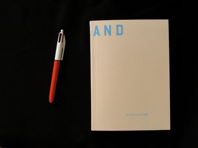
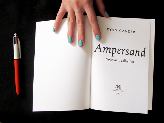
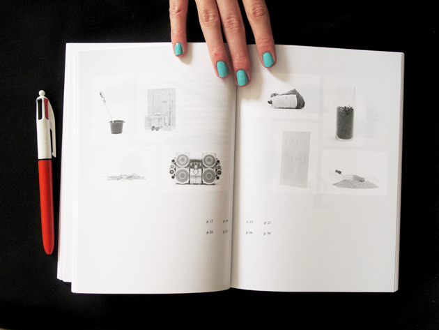
Nevertheless, Gander is also keen on using more ‘traditional’ and simple media, like books, where his ability to tell stories finds the perfect output. These projects are often equally challenging, mixing reality and fiction, playing with our perception and rules we are used to take for granted. This is exactly the case with his latest print project, “Ampersand”, a book published by Dent-De-Leone, a small publishing house founded by Martino Gamper, Kajsa Ståhl and Maki Suzuki, and usually designed by åbäke.

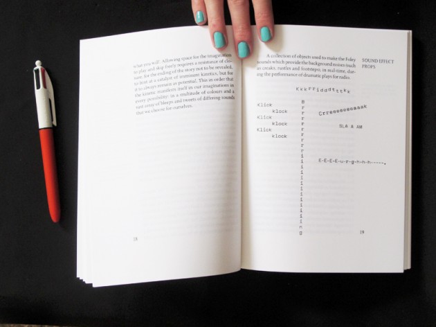
This edition of “Ampersand” is actually the fifth one, even though the first, second, third or fourth were never printed. It was made as a prelude for the current solo show by Gander, “Esperluette”, currently held at Palais de Tokyo a Parigi. “The present publication crystallises, for a fleeting moment (books are not eternal, you know), the ever expanding collection of Ryan Gander and the stories for which objects of all pedigree — artworks alongside coloured toilet paper – are the catalysts of.” Hence, the series of short essays contained in this book try to explore our surroundings in a typically ‘Ganderian’ way and play with our perception and the beauty of the everyday.

Rujana Rebernjak – Images courtesy of Dent-De-Leone

Share: Facebook,  Twitter  
08/10/2012

Curtis Mann: Medium and Materiality

Curtis Mann: Medium and Materiality

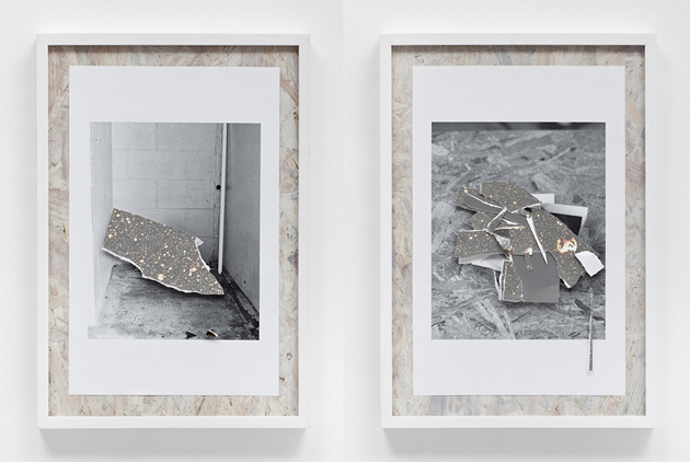
The title of Curtis Mann’s first show at Monica De Cardenas Gallery, Medium and Materiality, immediately introduces us to the core of his artistic research.

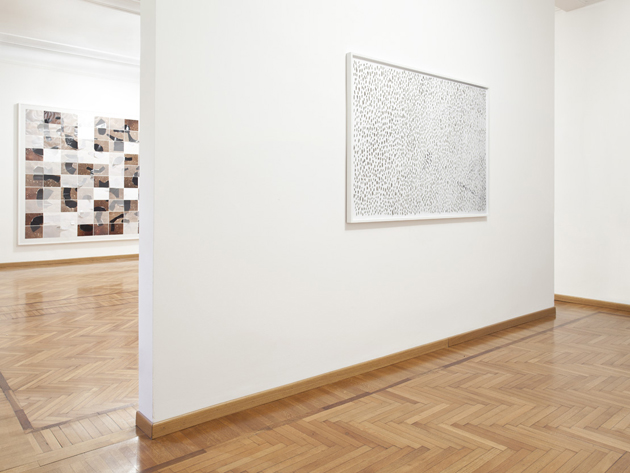
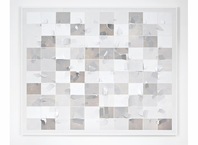
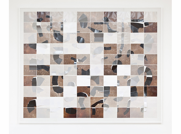
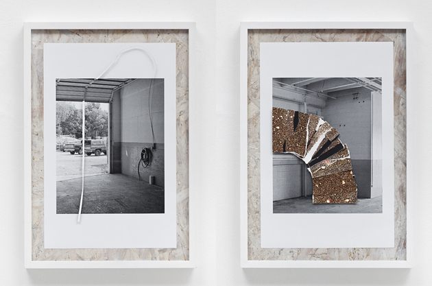
Curtis Mann (Born in 1979 in Dayton, Ohio, lives and works in Chicago, where he also teaches photography at Columbia College) displays a new body of unusual photographic works: partially modified images, slightly manipulated with Photoshop, or erased by means of a technical process developed by the artist by painting on portions of enlarged color photographs with a clear varnish, and then bleaching away unprotected portions with the result of an abstract image with some recognizable areas. While his early works are composed by found images taken from different sources, showing current affairs (namely, violent conflicts abroad) or images taken from appropriated snapshots, travel photographs, and casual documentations, this time Curtis Mann seems to be more focused on patterns and geometrical compositions such as grids or minimal images, like empty spaces and solitary traces in vanishing landscapes.

In works like Object A or Ouroboros the viewer could get the sensation of being in front of an image of Mars, or some scientific or geological picture of a landscape. Due to the particular artistic process adopted by the artist, the original photographic image results transfigurated, leaving the viewer in front of a variety of possible interpretations.

To understand deeply the final result of this intense process of transformation, the viewer should get closer to the works and look how the photographic paper becomes dense and materic: certain parts of the image are reinforced while others are partially concealed or disappear completely. But unlike in digital manipulation, in this case the physical procedure that leads to the final result is clearly visible. This long artistic procedure, far away from the quick photographic “click” seems to drift outside of time, going inside the photographic image, prying into the innermost character of the medium.


In some of these more recent works, like Rock Collection, the action of the medium is reached through the direct manipulation of the photographic surface, introducing a more sculptural and three-dimensional effect, achieved by folding, cutting or overlapping different portions of pictures with some reference back to the tradition of old American masters thus Gordon Matta-Clark, and maybe to other less-known artists, photographers and experimental filmmakers, who started during the sixties to expand media like photograpy, cinema and painting.
Between bi-dimensional image and object, photography and painting, real and fiction, this is Mann’s first Italian exhibition, programmed simultaneously in two different spaces: Monica De Cardenas Gallery (Milano) and Luce Gallery (Turin).


Riccardo Conti – Images courtesy of Galleria Monica De Cardenas, Exhibition pictures by Andrea Rossetti.

Share: Facebook,  Twitter  
07/10/2012

Sunday Breakfast by Love For Breakfast

Sunday Breakfast by Love For Breakfast

When the air is cool and the eyes struggle to open. The sweet smell of milk on the stove blends with the deep shades of banana. It’s so sweet, awakening.
Alessia Bossi from Love For Breakfast

Share: Facebook,  Twitter