19/09/2012

Emerging Trends from the Big Apple; NY Fashion Week

Emerging Trends from the Big Apple; NY FW

Winter is nearing, but for all of those involved in the fashion industry, next summer is hot on the agenda. It’s the time for designers, whether it is well established fashion houses or new creative talent, to show their Spring/Summer 2013 collections on the runways.
 Buyers, designers, fashion editors and bloggers are eager to spot the latest trends and hottest looks. 
Here at The Blogazine, we’ve been following the NY fashion shows and have analyzed some key emerging trends.

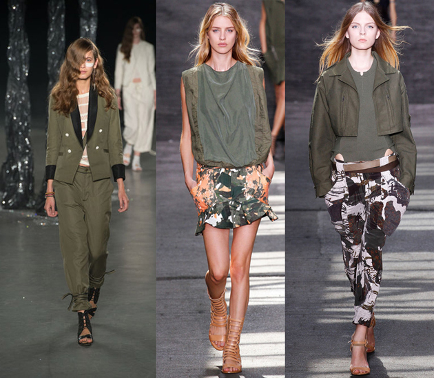
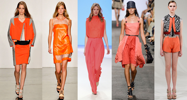
Think mixed florals and patterns from head to toe, bold black and white statements, 60’s, 80’s and 90’s grunge make a clear comeback. Military and utility are still strong influences and for sure, the future is still very orange!


MILITARY, ORANGE, FLORAL

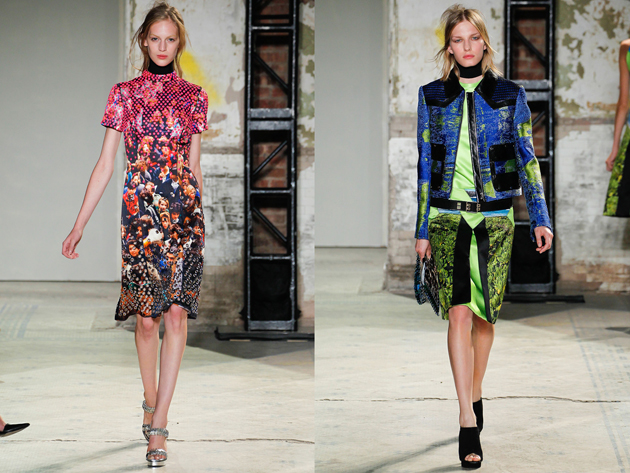
DIGITAL:
As many of us are in a constant digital environment, the Proenza Schouler collection zoomed in on the world wide web, blurring pixelated images from Google Earth to create random flashes of our technological universe.
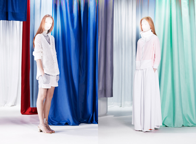
MM6:
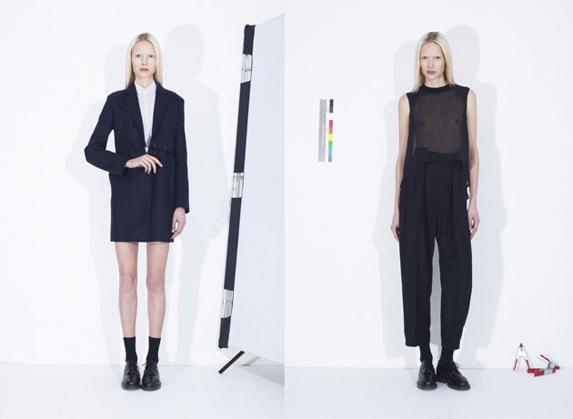
Almost Angelic, Maison Martin Margiela’s diffusion line MM6 revealed a flowing relaxed basic collection. Sporty influences were apparent and unexpected details created the signature MM6 avant-garde approach.
60′S
:
60’s silhouettes are a predominant look among many designers. Marc Jacobs takes a look back to the Mod scene and NY Factory hip hang out. Where as Michael Kors brings a 60s mod look with a nautical twist, bold primary colours in graphic stripes look fresh and chic.
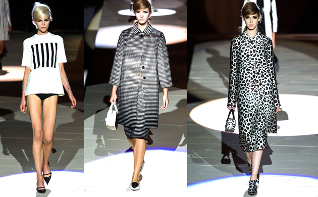
BLACK & WHITE:
Black and white came in many forms, from the 60’s but in new dimensions at Marc Jacobs, whilst at Alexander Wang, cut out and deconstruction in crisp white fabrics and leather teamed with American sportswear & baseball uniforms created a sharp urban look. Jeremy Laing presented a slick monochrome line in sporty crisp decontructed silhouettes.
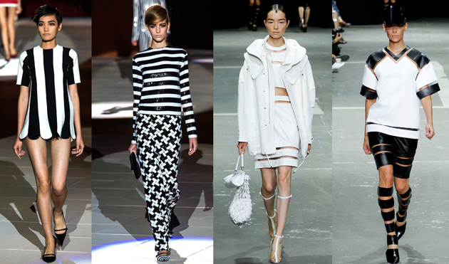
80’S
:
Remember the days of bopping about to Culture Club and Bananarama? This era was played homage to by Alexandre Herchcovitch, capturing Boy George’s signature style. Marc by Marc Jacobs‘ line was a fun lean on 80s club wear, rag-tied heads, clashing checks and stripes and paper-bag waisted trousers. He Was Really Sayin’ Somethin’.
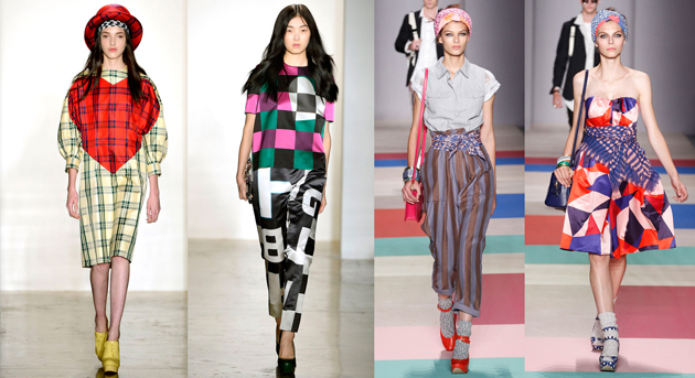
Tamsin Cook

Share: Facebook,  Twitter  
18/09/2012

Apple Software Philosophy – Skeuomorphic Design

Apple Software Philosophy – Skeuomorphic Design

Apple is once again back on everyone’s lips. After a few months of silence, while we were all using our iPads, iPhones and iMacs as usual, our beloved company was designing the new iPhone 5 and winning a major 1 billion dollar worth case against Samsung. With the launch of the latest edition of the ‘phone that changed the world’ (the first presentation ever without the genius Steve Jobs), some questions have come up about the direction the company is taking, especially design-wise.


Apple has always been the symbol of extremely eloquent, smart and unobtrusive design as far as hardware is concerned, lead by Sir Jonathan Ive‘s clear vision and Modernist heritage. Its immaterial counterpart – the software, on the other hand, has taken quite a strange shift. Since the very conception of desktop interfaces, where visual metaphors such as folders or trash bins were used to facilitate user interaction with personal computers, the leap has been progressive in enhancing the richness of that experience. Hence, with the development of software both for the Macs as well as iPhone or iPad apps, the initial useful metaphors have become a visual overload. The current wooden bookshelves, leather stitching and yellow legal pads have become basic graphic expression of functions that actually don’t have even the hint of that materiality.

The term to describe this use of graphic elements is skeuomorphism and it stands for ‘objects that retain ornamental elements of past, derivative iterations, that are no longer necessary to the current object’s functions’. Skeuomorphism stands to digital applications in the same way as baroque decoration stands to furniture design. If you think this approach is actually amusing and enjoyable, you must admit that it doesn’t have anything in common with the product design that Apple has accustomed us to, and it is not the only reason why it’s bad. Even if idealist Modernist discussion of appropriateness of form and function is certainly an outdated discourse, it doesn’t mean it isn’t still a valid approach to design. Visual overload that skeuomorphism is creating is bad because it doesn’t really relate to the basic functions these new objects have. It pushes forward the idea that the world isn’t changing and that we are still using the same objects as we used to, when we can’t even recall what a material address book looks like anymore, and loosing our smartphone equals being on a death row.

Rujana Rebernjak

Share: Facebook,  Twitter  
17/09/2012

Thomas Demand’s Manipulation of Reality

Thomas Demand’s Manipulation of Reality

Fact and fiction. Even if photography and cinema are supposed to be the more suitable means to record and convey reality, capturing transitory situations, we should know by now that the camera is not necessary synonymous for objective form of representation. This subject, in the age of mediated images, has already been investigated in depth to reveal the actual mechanism of constructing fictional scenes from the real world – it is understood that what we see through the lens of the new and old media frames cannot be taken for granted, but needs to be investigated to evaluate its reliability.

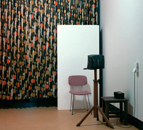
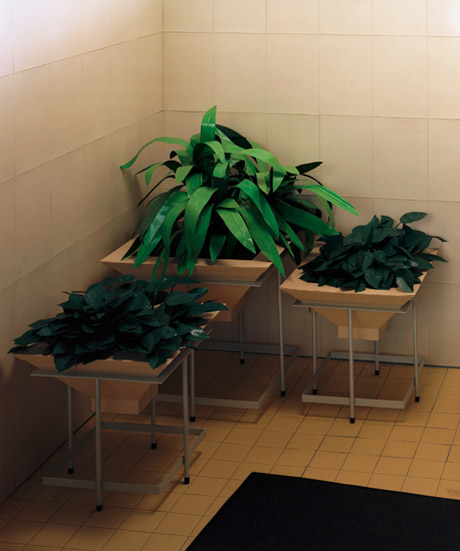
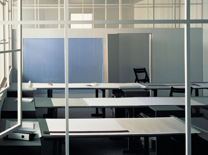
The versatile German artist Thomas Demand (b. 1964, Munich), combining video, sculpture, photography and architecture, builds complex stages that play with reality and illusion, making us linger over the ways in which the reality could be manipulated. Using paper and cardboard, and starting from images “stolen” by mass media, Demand assembles 1:1 dioramas, without human beings, and shoots them with telescopic lens that enhances their verisimilitude. Privileged places where unclear political events and unsolved news items took place – circumstances that remain in collective memory, surrounded by an air of mystery – the artist leaves visible traces of his making of: tiny imperfections such as pencil marks here and there or small wrinkles in the paper. After the shooting the models are destroyed, while the final results are neutral, frozen, hyper realistic and definitely unsettling pictures.

Among the most intriguing works by Demand we mention the Büro/Office (1995) that shows the Stasi headquarters after they were ransacked after the fall of the Berlin Wall, Presidency (2008), the Oval Office of the American president after the presidential election (the one after which G. W. Bush left his chair to Mr. Obama), Kontrollraum/Control Room (2011), where he displays the interior view of the control room of the atomic reactor Fukushima, deserted soon after the earthquake, and the latest Pacific Sun (2012), a two-minute-long film made by 2.400 frames, where the artist recreated, thanks to the footage of a surveillance camera, the chaos of a turbulent sea condition on a cruise ship.

At present, works by Thomas Demand are on view at four exhibitions: Thomas Demand, Peter Fischli / David Weiss, Thomas Scheibitz, the group show among the collateral events of the 13th International Architecture Exhibition, More real? Art in the age of truthiness at Site in Santa Fe until 6th January 2013, Model Studies at Esther Schipper, and last but not least, Demand’s first solo show at Monika Sprüth and Philomene Magers’s Berlin gallery, which will run until 20th October 2012.


Monica Lombardi – Images courtesy of Sprüth & Magers Gallery

Share: Facebook,  Twitter  
16/09/2012

Sunday Breakfast by Love For Breakfast

Sunday Breakfast by Love For Breakfast

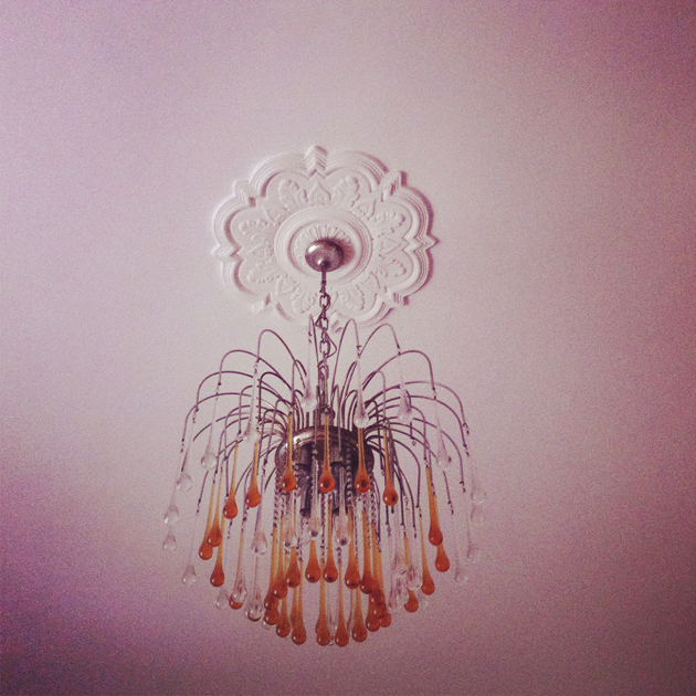
I open my eyes and see those drops of glass hanging over me. The slight warmth of my skin lingers on the sheets, while I slowly prepare something that feeds my first hunger.

Alessia Bossi from Love For Breakfast

Share: Facebook,  Twitter  
14/09/2012

Honest By: A Pioneering Fashion Philosophy

Honest By: A Pioneering Fashion Philosophy

Antwerp fashion designer Bruno Pieters already had a well-established resume, having been appointed as art-director for Hugo Boss and having worked with esteemed labels such as Maison Martin Margiela and Christian Lacroix. A success he ultimately consolidated with the launch of his own label. Yet for his latest project, Pieters decided to resign his label and take a different, more sustainable spin.

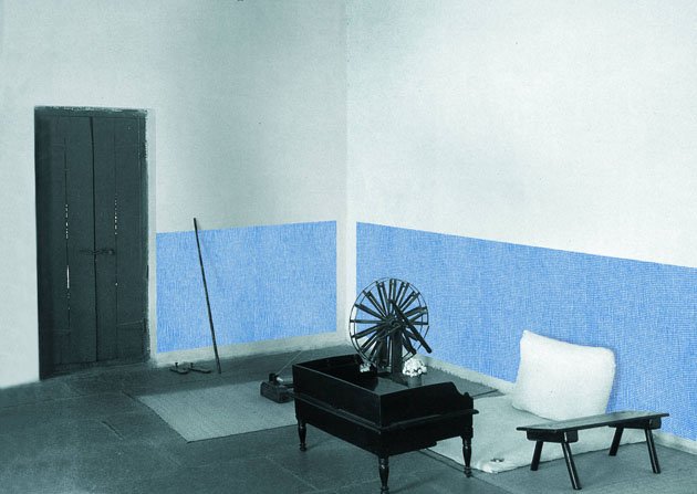
Having spent a sabbatical in India, he became captured by the realisation that native Indian people were dressed in clothes that were grown, constructed and sewn solely from resources they could identify around them. It was in view of this that he began to question whether a similar way of operating could also be applicable to western manufacturing and business practices.

As such, from the beginning of this year Pieters propelled Honest By, a high fashion label premised on the concept of complete and utter transparency. In doing so, it has become the world’s first company to share the complete cost breakdown of its products, down to details as materials, labels, thread, as well as the carbon footprint of each produced item. If that isn’t commendable by itself, all vestures are additionally eco- and animal friendly.

With limited edition pieces of about 50 designs for both men and women, he has remained faithful to his lineament of sharp, androgynous construction lines, albeit nuanced with a touch of smoothness to his aesthetic. But also by circulation, other designers such as Calla, Muriée and Nicolas Andreas Taralis, are invited to create a green item for the Honest By collection (of which 20% of the profits will go to a charity appointed by the guest designer).

Bruno Pieters has taken with Honest By a revolutionary approach to fashion, creating a new role model for not just the fashion industry, but also for other industries worldwide.

Claire van den Berg

Share: Facebook,  Twitter  
13/09/2012

Aspen Magazine: 1965-1971

Aspen Magazine: 1965-1971

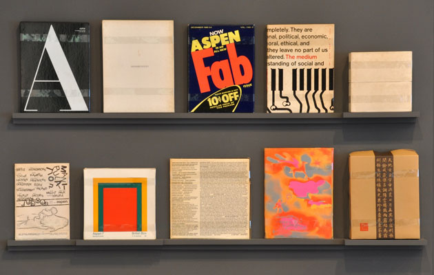
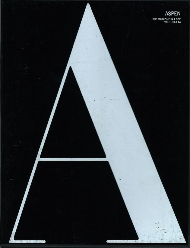
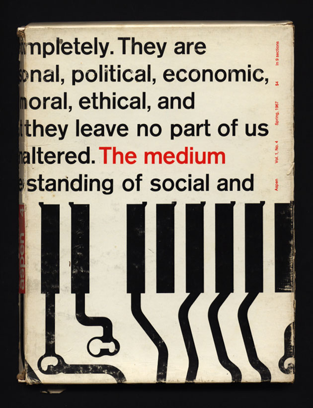
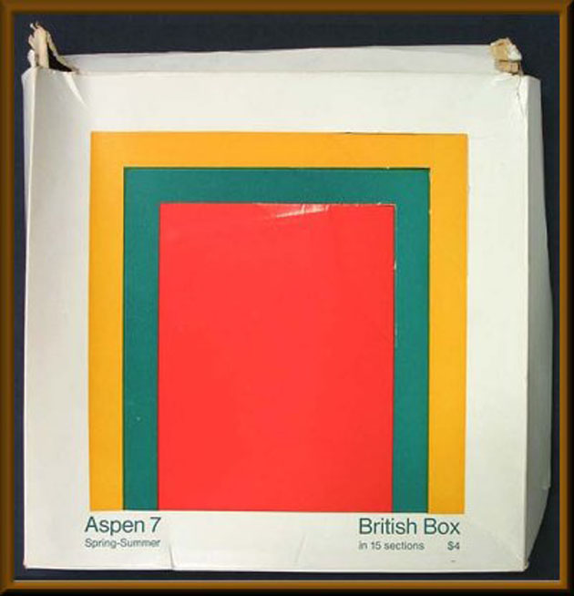
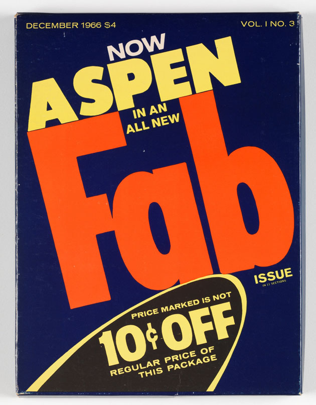
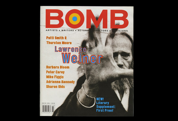
For all the lovers of contemporary ‘independent’ magazines, a look in the past and the magazine production of the 60s and 70s should be obligatory. The richness of cultural production of the period, as seen through the lens of print ephemera, has a lot to offer. One of the most significant, yet slightly overlooked, magazines produced during that decade is Aspen, a multimedia magazine published by Phyllis Johnson from 1965 until 1971.


Aspen first started as a magazine about “the civilized pleasures of modern living, based on the Greek idea of ‘whole man’”. It evolved during the years in one of the most innovative avant-garde publications. Johnson, a fashion journalist and editor for “Woman’s Wear Daily” and “Advertising Age”, wanted to create a publication boundless of the traditional physical support of a magazine. With this idea in mind, all the issues published, 10 in all, Aspen was published in a different form every time, according to the content it was supposed to carry.

More or less, this form always corresponded to some kind of box containing different material, from reels of Super 8 film, flexi discs, posters, small leaflets, ticket books etc. While the first two issues revolved around life in Aspen, the following ones were guest edited by some of the most influential artist, critics, writers, entirely dedicated to topics such as Pop-Art, Performance Art, psychedelia or Asian art among others. As Emily King said, Johnson “had little time for style” and her interests “centred on the ideas-heavy end of the contemporary art spectrum”. Hence the issues were guest curated by Andy Warhol and David Dalton, Quentin Fiore, Brian O’Doherty, Jon Hendricks, Dan Graham, Mario Amaya, Angus and Hetty MacLise, while the list of writers and contributors includes John Cage, Yoko Ono, Marcel Duchamp, William S. Borroughs and David Hackney among others.


While the openness and flexibility of Aspen Magazine might be directly linked to its downfall, nonetheless it should serve as a reference point for contemporary magazine lovers. A show running at Whitechapel Gallery in London until the 3rd of March, is paying a tribute to Aspen Magazine that paved the way for future art publishing.

Rujana Rebernjak – Images courtesy of Whitechapel Gallery

Share: Facebook,  Twitter  
11/09/2012

Fashionably Biking

Fashionably Biking

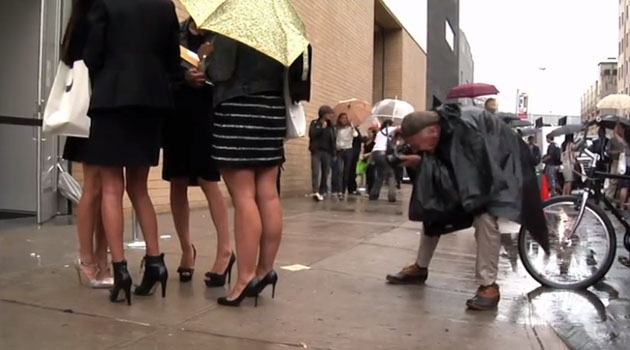
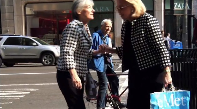
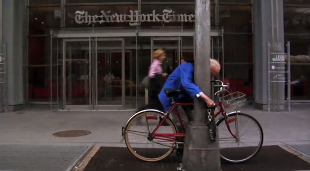
Every city has them – the urban chic boys and girls, wheeling along the lanes or zigzagging through traffic on a sleek bicycle. Whether the suit is matched with sneakers or kitten heels, whether the bicycle is vintage cool, sporty or high-end manufactured, it is clear that the bike as a fashion attire is what completes the perfect city look rather than being a distraction from it.

There are numbers of bicycles on the market being of high-end quality, high-end branded and high technological but yet keeping a simple design with the perfect amount of vintage and cool. Further, there might not be another accessory making any outfit look more effortless and smart. Talking about benefits, there are with no doubts a few found in being a ‘biker’; getting from point A to point B whenever you say, without dependence on anyone else, for a starter. Men and women from New York to Amsterdam are taking the saddle from work to the bar, swishing by pedestrians and pleasing street style photographers. No one is longer startled by the look of a financier arriving to the office on his bicycle or a dress and heels matched with metallic and steel.


To place the cherry on the top, being a chic biker is also an eco-friendly take on life, even though if we point a finger or two, one can always wonder how many of those bikes are in reality just fashionable attires. Like any trend, this one could reach its high and then slowly pedal its way out of fashion again, but for some reason it has been lodging here for quite some while now.

Hopefully the seasons will pass but the bicycling gentlemen and women remain, making the bike a phenomenon of not only fashion, but environmentally responsive mean of transportation.


Lisa Olsson Hjerpe – Images from a Bill Cunningham video

Share: Facebook,  Twitter  
11/09/2012

Arefin & Arefin: The Graphic Design of Tony Arefin

Arefin & Arefin: The Graphic Design of Tony Arefin

That graphic design and art often speak the same language has been an obvious point in different stages in history. Since the initial developments of what has now become a socially and culturally affirmed discipline, graphic design has been both used by artists as a tool for conveying their ideas, as well as a mean by which their work was communicated to the public through a concrete form of a poster, a book or other printed matter. As a direct consequence there have been, and still are, some graphic designers that have found their natural habitat working within the realm of the art world.


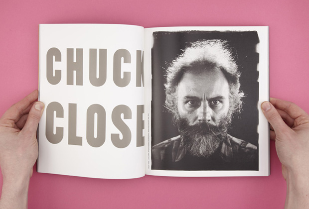
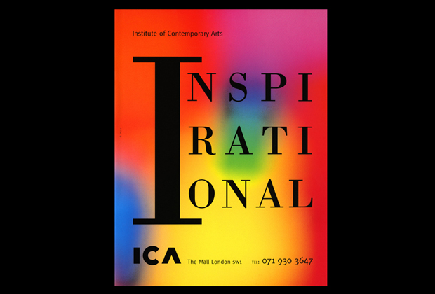
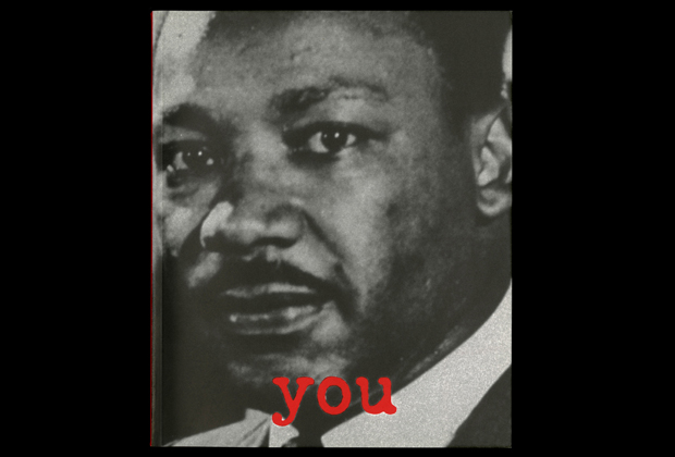
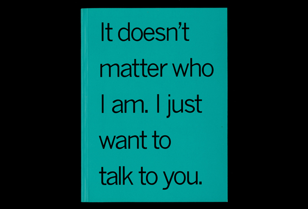
One of those practitioners was surely Tony Arefin (1962-2000), who’s work is at the centre of an exhibition at Ikon Gallery in Birmingham. Inaugurating tomorrow, the 12th of September, the show titled “Arefin & Arefin: The Graphic Design of Tony Arefin”, curated by James Langdon, finally pays homage to one of the most talented and slightly overlooked graphic designers involved with the art world. Tony Arefin, born in Pakistan as Abed Mohhamed Arefi, drew his path into the art domain first by working as photo editor for several magazines, which led him to organize a show of Neville Brody’s work for The Face magazine, and consequently brought him to design different art catalogues. Under the name “Arefin & Arefin”, deliberately playing with the names of huge corporate branding firms, Tony has worked for institutions and artists like Serpentine Gallery, ICA, Damien Hirst, Douglas Gordon, Cornelia Parker, Jasper Morrison and Adrian Piper, among many others, before moving to New York to work as creative director of I.D. Magazine.


Even though Arefin worked in the United States for large corporate organizations such as IBM or Nike, the widespread idea of his work still remains tightly bound to art publishing, where his ‘bold visual language, irreverent use of photography and striking typography’ act most strongly.
 The exhibition, accompanied by a catalog with essays by some of the most influential design critics and historians, will run until the 4th of November at Ikon Gallery, Birmingham.

Rujana Rebernjak

Share: Facebook,  Twitter  
10/09/2012

Let’s START

Let’s START

Milanese art people are in ferment. For ten days, thanks to StartMilano – the non-profit association that gathers together some of the most important local galleries, museums and institutions – everything in the city will revolve around art. The umbrella event, founded in 2006 to give more dynamism to the Milan contemporary art scene, will run from 13th to 23rd September offering a myriad of exhibitions, talks, projections, parties and so on and so forth.

Our tip to get the most out of it, is to catch a map of the city and the full programme of openings and cultural activities to pinpoint the places of interest. This way you’ll be ready to set up your tour avoiding wasting time and energy being on the trot. But don’t forget that if you are not an “openings’ addict” and your interest is all focused on visiting good art shows, you could choose to concentrate all the visits during the last weekend, enjoying the extended opening time and the extra Sunday openings. No stress.

The ‘dances’ will begin on Tuesday at around 6pm, and for those who don’t know which way to turn, here we give you some glimpses (chosen according to the date of inauguration). From the first day of the festival, Camera 16 will propose a joint exhibition entitled Fashionality that displays, among the others, the talented photographers Màrton Perlaki and Brea Sauders; the same evening in the Navigli district, Le Casa d’Arte will present Rosemarie Trockel’s solo show Prisoners of Yourself, while Saturday 15th all eyes will be locked on the great artist Anselm Kiefer at Lia Rumma.


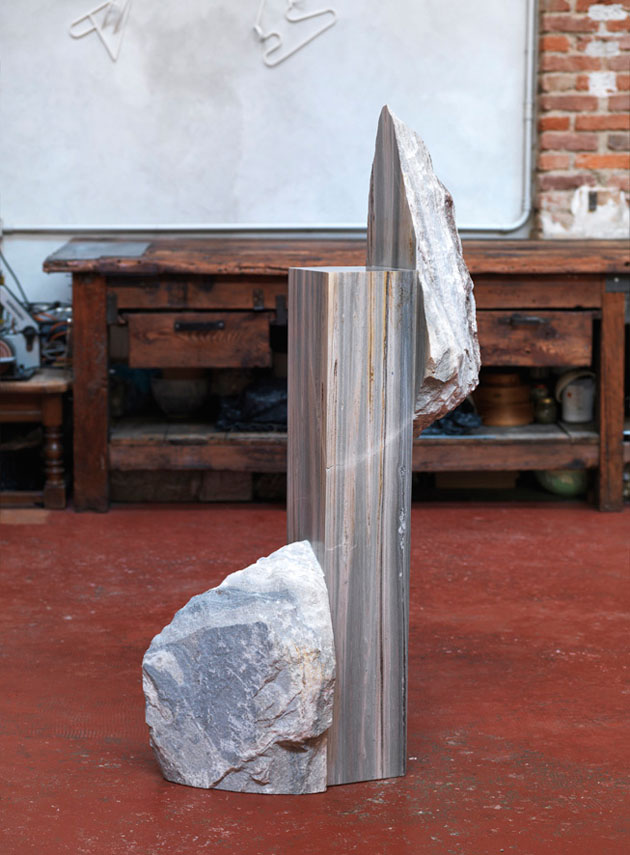
Just a small break to warm up for the following week that will start at Museo Pecci Milano with a selection of videos from China: Moving Image in China 1988 – 2011; then the exhibition by Rob Pruitt Faces: People and Pandas at Massimo De Carlo on the 19th; and the gallery evening which will take place on Thursday 20th all around the city. During the official opening day it would be worthwhile going to Porta Venezia – an area that gathers a high concentration of contemporary art galleries – and take a look at the historical gallery Studio d’Arte Cannaviello for Bernd Zimmer’s exhibition and to the experimental space of Galleria Zero for Michael E. Smith (or if you like it more, for Riccardo Beretta’s finissage).

We don’t want to keep this tour overlong, so let’s add just two more suggestions: Dan Perjovschi at Kaufmann Repetto Gallery and Paolo Chiasera at Francesca Minini, before getting to the usual closing party, which will be hosted, as in the last few years, at the Swiss Institute.

The full program of the event is available online, while an info point will be at visitors’ disposal at Villa Reale (Via Palestro) along with a special section devoted to independent publishers and a shuttle service, which will drive art lovers around the Milan galleries circuit.

Monica Lombardi – Many thanks to ch2

Share: Facebook,  Twitter  
09/09/2012

Sunday Breakfast by Love For Breakfast

Sunday Breakfast by Love For Breakfast

The air rustles my hair and ruffles my thoughts while I’m riding fast. In my mouth the sweet taste of a fresh fruit smoothie wakes up my senses.

Alessia Bossi from Love For Breakfast

Share: Facebook,  Twitter