Apple Software Philosophy – Skeuomorphic Design
Apple is once again back on everyone’s lips. After a few months of silence, while we were all using our iPads, iPhones and iMacs as usual, our beloved company was designing the new iPhone 5 and winning a major 1 billion dollar worth case against Samsung. With the launch of the latest edition of the ‘phone that changed the world’ (the first presentation ever without the genius Steve Jobs), some questions have come up about the direction the company is taking, especially design-wise.


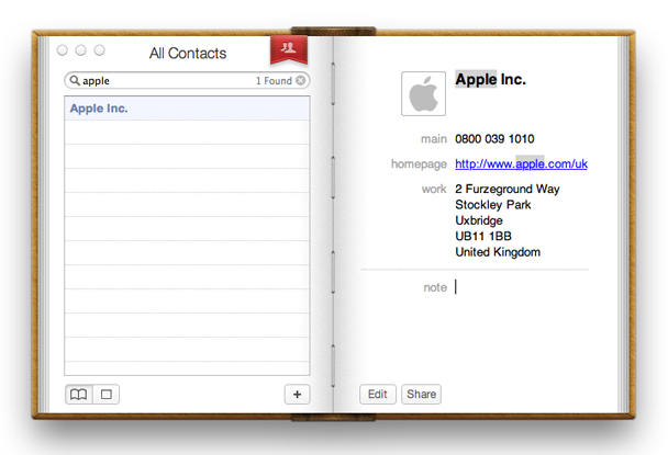
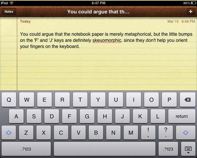
Apple has always been the symbol of extremely eloquent, smart and unobtrusive design as far as hardware is concerned, lead by Sir Jonathan Ive‘s clear vision and Modernist heritage. Its immaterial counterpart – the software, on the other hand, has taken quite a strange shift. Since the very conception of desktop interfaces, where visual metaphors such as folders or trash bins were used to facilitate user interaction with personal computers, the leap has been progressive in enhancing the richness of that experience. Hence, with the development of software both for the Macs as well as iPhone or iPad apps, the initial useful metaphors have become a visual overload. The current wooden bookshelves, leather stitching and yellow legal pads have become basic graphic expression of functions that actually don’t have even the hint of that materiality.

The term to describe this use of graphic elements is skeuomorphism and it stands for ‘objects that retain ornamental elements of past, derivative iterations, that are no longer necessary to the current object’s functions’. Skeuomorphism stands to digital applications in the same way as baroque decoration stands to furniture design. If you think this approach is actually amusing and enjoyable, you must admit that it doesn’t have anything in common with the product design that Apple has accustomed us to, and it is not the only reason why it’s bad. Even if idealist Modernist discussion of appropriateness of form and function is certainly an outdated discourse, it doesn’t mean it isn’t still a valid approach to design. Visual overload that skeuomorphism is creating is bad because it doesn’t really relate to the basic functions these new objects have. It pushes forward the idea that the world isn’t changing and that we are still using the same objects as we used to, when we can’t even recall what a material address book looks like anymore, and loosing our smartphone equals being on a death row.


