31/07/2012

London 2012: Olympics Through Design

London 2012: Olympics Through Design

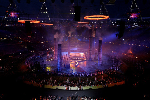
Every four years we are being overwhelmed by the most important and prestigious sports events. This year’s Olympics held in London, have been at the centre of our attention for quite a while now, due to many controversies, security and economic scandals. Despite of all this, when the games were inaugurated with the praised ceremony directed by Danny Boyle, we couldn’t but forget almost all of it. But besides being one of the greatest sport events, every Olympics also inevitably touch design and architecture.
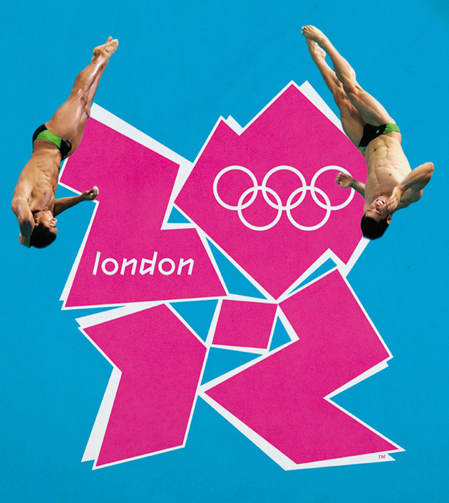


Since the London 2012 trademark, designed by the British super-force in advertising world Wolff Olins, was first presented in 2007, criticism was raised and with it (at least among the design community) skepticism towards the London Olympics. For this logo, the International Olympics committee had commissioned for the first time in history an actual branding strategy for an Olympic trademark, which was then interpreted by Wolff Olins as “bringing the Games back to the normal people”. Aside from the trademark, the Olympics have required a massive amount of work from graphic designers of various firms and studios who designed the signage system, advertising, pictograms, tickets and other printed matter, and a specially designed typeface.

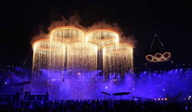
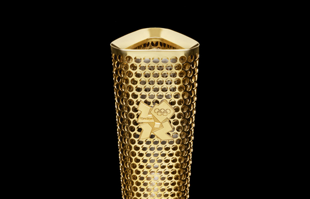
As far as product design is concerned, besides the Olympic Torch, whose incredible design (80 cm long and weighing only 800-850 grams) has already been celebrated with “Design of the Year” award, we have to mention Thomas Heatherwick‘s Olympic Cauldron. The cauldron is made of 204 copper petals representing the competing nations which were brought by each team and lit during the opening ceremony.

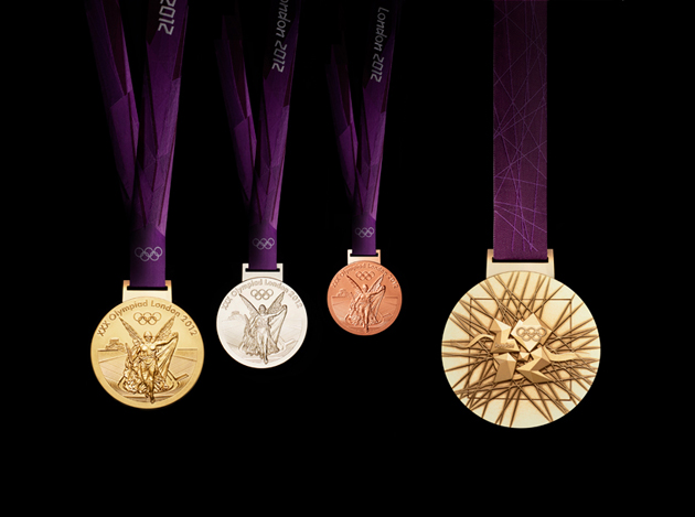
The creative work done for London 2012, from architecture, urban planning, set design, photography, product design and fashion (think only about the GB team who’s kit was designed by Stella McCartney) was really impressive. So, even if these Games can have some hard time competing with the ones held in Beijing four years ago in terms of impressiveness and scale, we can’t but say – hats off to London.
Rujana Rebernjak

Share: Facebook,  Twitter  
30/07/2012

I Vespri | Civic Forum In Five Acts

I Vespri | Civic Forum In Five Acts

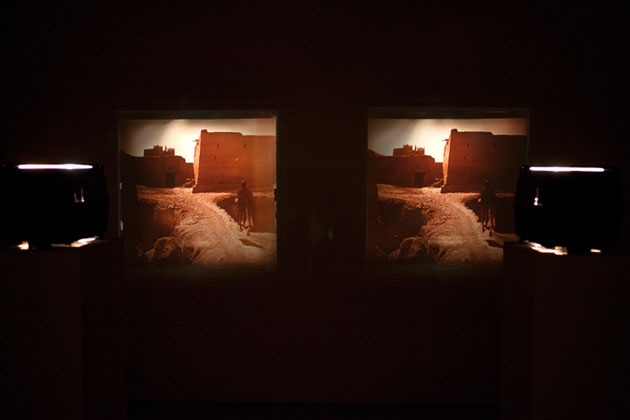
From 24th to 25th August 2012 Modica (Province of Ragusa, Sicily) will be the venue of an exhibition which will turn the town in a urban theatre where artists, inhabitants and visitors will play together. Drawing inspiration from Verdi’s drama of 19th century I Vespri Siciliani (The Sicilian vespers) – based on the historical event of Sicilians revolt against French domination in 1282 –, the show entitled I Vespri. Civic Forum In Five Acts will be developed in five acts, assuming the form of a public discussion; a place to take up with people coming from all the Mediterranean areas with the aim of putting on stage an opera between past and present, local and global. Artists from Lebanon, Libya, Israel, Egypt, Croatia, Cyprus, France and also from Italy will meet in Modica to get in touch with the local habits and customs and give birth to a contemporary ritual with an ancient taste: a 24 hours non-stop performative event that will start at dusk – the vesper is the prayer of setting sun, one of the oldest and major rites of Catholic Church – and finish at the same hour of the day after. Keeping an eye on traditional forms of local collective rituality, the exhibition will tackle with current social issues of North Africa and Middle East, mixing tradition and recent documents and interlacing history and cultural stratifications.


The invited artists, under Marco Scotini’s supervision and the collaboration of local people and associations, will show their works in different locations around the town, among which Garibaldi theatre, Palazzo Tommasi Rosso Tedeschi, St. Peter’s Church and St. George’s Cathedral.

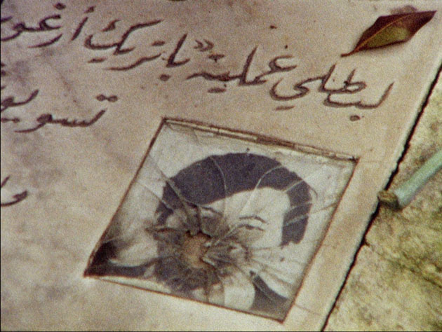
Roy Samaha (Lebanon, 1978) will present Transparent Evil (2011) a 27 minutes film, which represents a sort of artist’s diary of his time in Cairo, featuring the events of Egyptian revolution, while the French filmmaker Eric Baudelaire will show The Anabasis of May and Fusako Shigenobu, Masao Adachi and 27 years without images, a story of hiding and revolution, the report of two lives set between Tokio and Beirut. The other emerging or already internationally known artists who will take part to this heterogeneous artistic event, sharing and exchanging their personal and unique experiences, will be Wael Noureddine (Lebanon, 1978), Adelita Husny-Bey (Italy-Libya, 1985), Stefanos Tsivopoulos (Greece, 1973), Amir Yatziv (Israel, 1972), Igor Grubic (1969), Celine Condorelli (Italy-UK, 1974), Marianna Chrisofides (Cyprus, 1980) and the duo of French filmmakers Jean-Marie Straub (1933) and Danièle Huillet (1936-2006).


Monica Lombardi – Images courtesy of the artists

Share: Facebook,  Twitter  
30/07/2012

Christopher Shannon in an Olympic Dance

Christopher Shannon in an Olympic Dance

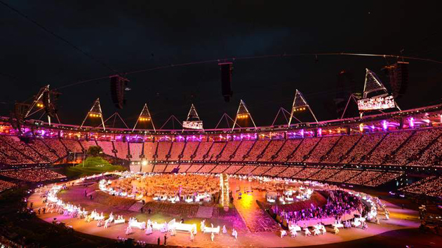
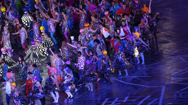
Watching the Olympic Games 2012 Opening Ceremony in London on Friday evening was like watching an enormous fashion parade. The national teams, flag bearers, performers and dancers were marching out in a delicate designer mix. Seen by over a billion people worldwide, it is hard to imagine a better spotlight than the Opening Ceremony to showcase the UK’s creative talent even though the name Christopher Shannon should be a drawing card in itself.


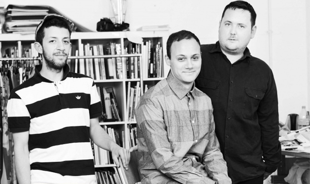
Shannon, together with designers Michael van der Ham and Nasir Mazhar created 350 of the 1200 dancers costumes, putting London’s East End in the limelight.

Christopher Shannon is a Liverpool born designer using “just the right amount of drama”, according to his own words, and after graduating with an MA from Central Saint Martins, the designer is now based in East End-London. His prominent work is since before known by The Blogazine and it wasn’t a surprise to us that he was one of the chosen three to represent the British fashion in such an important event.
In the crescendo of the ceremony, Shannon’s eye for clean silhouettes and high-end sport references came to its right. Together with Michael van der Ham’s, another Blogazine acquaintance, sense for contrast in colours and fabrics and Nasir Mazhar’s headgears designs – the show was on. The Opening Ceremony, which has been compared with large-scaled runway shows, has created a fashion discussion all around the world and put these three London designer’s under the public’s eye, for a very good reason.

Lisa Olsson Hjerpe – Images from Quinn Rooney, Michael Regan, Ronald Martinez, Andrew Lamb.
Share: Facebook,  Twitter  
27/07/2012

Skyscraper: Art and Architecture Against Gravity

Skyscraper: Art and Architecture Against Gravity

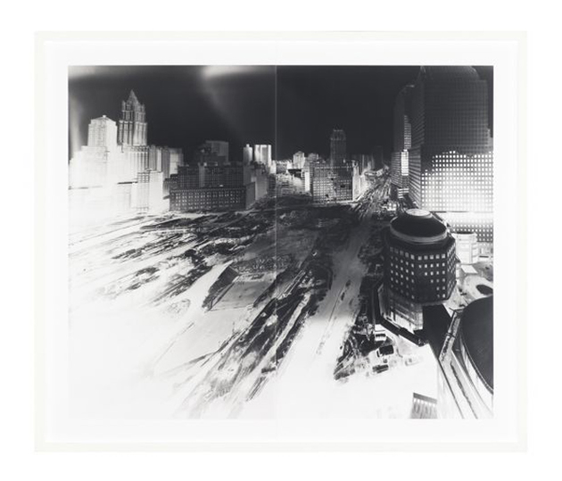
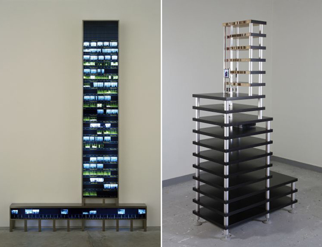
Skyscrapers have always been so much more than pieces of architecture. In the modernist culture skyscrapers have stood for belief in prosperity, innovation and a better future as the symbols of power and enormous possibilities the world shaped by man could achieve. These incredible building structures that have for almost two centuries involved the most illuminated minds in architecture, engineering, art and design are being celebrated with an exhibition at the Museum of Contemporary Art in Chicago.

The exhibition titled “Skyscraper: Art and Architecture Against Gravity” tries to show the impact this iconic artefact has had in our contemporary society. The myth of the sky and the possibilities of men to reach it through artificial means have inspired not only the imagination and poetics of architects, but also artist from all over the world. These artists have taken as subject the form, technology, message, symbology and image of the skyscrapers as the central idea and subject of their work. Even though years have passed since the first concrete structures have reached meters and meters above ground, the skyscrapers, highly mechanical but also extremely elusive structures, still continue to play with our imagination.

The artist showcased in the exhibition are Fikret Atay, Jennifer Bolande, Roger Brown, Jeff Carter, Roe Ethridge, Jonathan Horowitz, Bodys Isek Kingelez, Claes Oldenburg, Gabriel Orozco, Thomas Struth, Jan Tichy, Andy Warhol, Peter Wegner, Wesley Willis and Shizuka Yokomizo, among others.

While currently many Western and Eastern cities continue to fight over who will build the next ’world’s highest building’ in search for technological domination and cultural glory, Chicago still remains one of the most important sights on the skyscrapers map. Hence, this exhibition, in some way, certainly plays homage both to this incredible piece of architecture, as well as the city of Chicago where it is being hosted.

Skyscraper: Art and Architecture Against Gravity runs until the 23rd of September at Museum of Contemporary Art in Chicago.

Rujana Rebernjak – Images courtesy of Museum of Contemporary Art Chicago

Share: Facebook,  Twitter  
26/07/2012

Met at Pitti 82: WANT Les Essentiels de la Vie

Met at Pitti 82: WANT Les Essentiels de la Vie

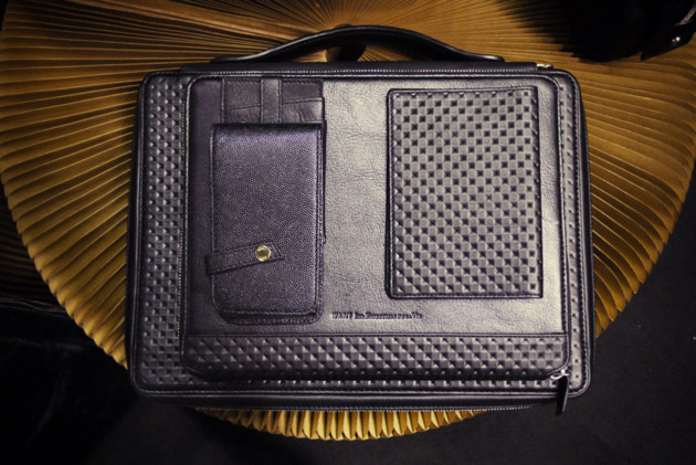
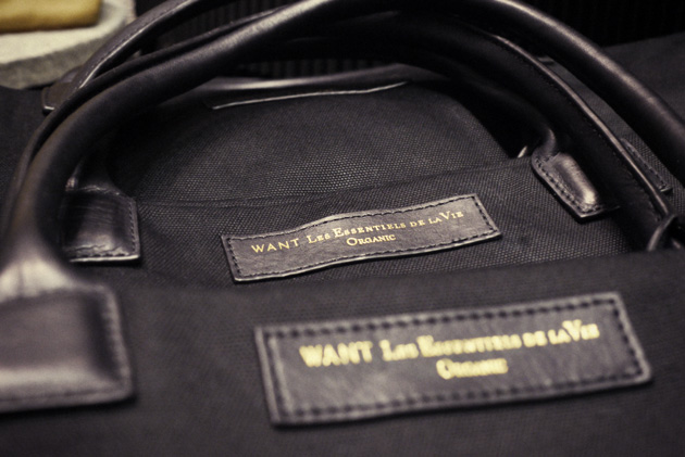
Byron and Dexter Peart know what is essential and what is redundant. With a simple yet functional, modern yet timeless and design over fashion-philosophy the twin brothers behind WANT Les Essentials de la Vie are making everyday life easier for whoever on the move. We end our trip of Pitti meetings with this brand of quality leather and luxury accessories, where form follows function.

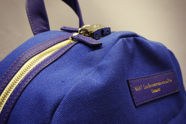
Byron and Dexter have designed WANT Les Essentiels de la Vie since 2006, and subtle and smart solutions for technology have been the key features from the beginning. In fact, one of the brand’s first products was an iPod case. Today the space for an iPad has become a key element in bags and portfolio’s, together with smart and clean features in the iPad cases themselves. “The accessories and the functionality of them keep changing. When we started out the iPad didn’t even exist, and who knows what the next essential feature will be,” Byron said while unzipping the signature gold and silver zipper to show the inside lining of a bag.

The contrast in the zip closure underlines and celebrates the opposites that come together in WANT Les Essentiels de la Vie – uptown and downtown, classic and modern, masculine and feminine. “Every aspect of a product is thought through carefully, and it’s definitely design over fashion. Nothing is unnecessary, yet not missing,” Byron continues to tell The Blogazine while showcasing the accessories collection. “Like this one, this one is for you!” he says and picks up a business cards holder, which expands for those moments when you need to carry an extra bunch.

The architecture inspired products of organic cotton and high quality leather are a remedy to fast fashion and a protagonist for sustainability. For Spring/Summer 2013, the exceptional touch of the Italian and French leather has found a friend in a smooth suede, and the colour hues of blue and green call for optimism among the other, more classic tones.

WANT Les Essentials de la Vie is refined luxury evoking emotions of simplicity and class. It is of timeless style presenting design classics for a modern voyageur, which will remain relevant not only today, but surely even more tomorrow.

Lisa Olsson Hjerpe

Share: Facebook,  Twitter  
25/07/2012

We Are What We Repeatedly Do

We Are What We Repeatedly Do

Impossible is just a big word thrown around by small men who find it easier to live the world
they’ve been given than to explore the power they have to change it. Impossible is not a fact. It’s an
opinion. Impossible is not a declaration. It’s a dare. Impossible is potential. Impossible is temporary. Impossible is nothing.

Muhammad Ali

Olympic games are at the gate, and once again, as almost every four years since long time ago – the games are currently held biennially, with alternating summer and winter editions – thousands of athletes representing their nations compete in sports to prove their mental and physical superiority to other people and above all to themselves.


It’s interesting to stop and think about the fact that, in everyday life as in sports, we all have always been aiming at strengthening our personal knowledge and skills as well as our neurosis, thanks to training through the repetition of the same gestures. Most of the time we link iterative actions to stagnation and boredom, while our lives are beating by rituals where the repetition represents, for once, a positive meaning and a crucial role in the challenge of autotransformation.

You must change your life! says the title of a book by one of the most important philosopher at work today, Peter Sloterdijk, and it sounds like a call for playing fair, which actually means trying to cross our intimate guilt of being insufficient to aim to a vertical tension. All shortcuts are illusions; human beings’ urge of standing out passes through daily exercise, which is nothing but the sum of actions made to improve the same following actions. The yearning to go beyond is typical of art and sport, as the will of getting to a superterrestrial reality is typical of religious ambitions. Reaching perfection is not enough, and making possible what is supposed to be impossible is the modern mantra.


More than anything else, sport involves the one-to-one relationship with divinity – how many times have you seen the name of a famous sportsperson compared to gods? –, but the message that tries to convince you that everybody can do everything through the strength of will has never been so abused; will is the mean by which we measure our possibilities; what moves a pizza maker and a yogi, a priest and a model, a biologist and an economist is the continuous physical exercise meant to improve our own performances. Being virtuous or even ascetic is definitely not for all, but it is a common belief that training for competition and the pursuit of success should ennoble people. As Aristotle said: We are what we repeatedly do. Excellence then, is not an act, but a habit.

The other side of the coin? The art of Living by Chad Harbach and the compulsiveness of performances that stresses the physical dimension of the contemporary youth, which forces its body with an unnatural and obsessive exercise to defeat or, at least, survive!

Monica Lombardi 

Share: Facebook,  Twitter  
24/07/2012

Met at Pitti 82: President’s

Met at Pitti 82: President’s

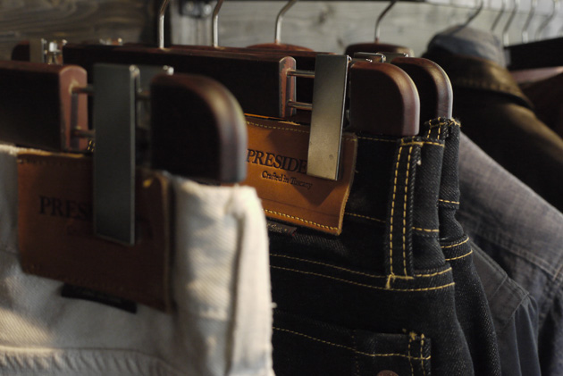
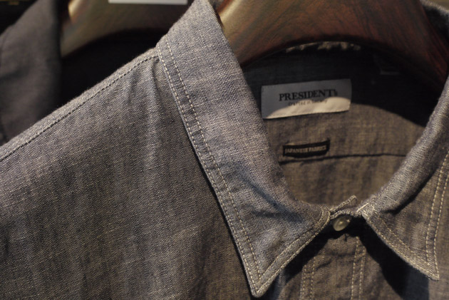
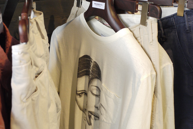
It was with love for vintage and respect for Italian tailoring and Tuscan manufacturing that President’s was brought back to the market 60 years after it was founded. Guido Biondi, grandson of the founder Francesco Bacci, has given the brand a defined identity, that was presented to The Blogazine during Pitti Uomo 82, along with the raw yet sophisticated men’s collection of the signature high-end quality the brand pays special attention to.

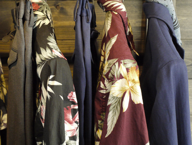
It was in 1957 that Francesco Bacci, originator of the first Italian denim brand, registered the name of President’s. 60 silent years later the grandson Guido Biondi decided to revive the brand and took over at the helm. As both owner and creative director of the family company, Biondi has marked out the identity of the brand and created a menswear line, where grand traditions meet with style. “We have the Hawaiian stuff for summer, but above all it’s the contemporary and sophisticated side of the Made in Italy production and the fine quality we want to highlight. Look at the shirts, and the suits – it’s Loro Piana, Thomas Mason, Japanese cotton… Then all the work is done here,” he continued to explain.

The collection shows well the traditions, craftsmanship and know-how of the Tuscan manufacturing and Italian customs as the core of President’s. Together with fabrics that have been searched from all over the world, this is what forms the base for the brand’s position in the high end of quality. Suits in virgin wool by Loro Piana, cotton shirts by Thomas Mason, triple twisted cotton from Columbia, Japanese indigo dyed jersey and selvedge denim, and so on – the fabrics give a big variation to the collection, while it’s the all crafted in Tuscany statement that makes it all come together to one.

The fitting of the garments is modern and adapted to what will create elegant streetwear with a hint of retro inspiration. The gently thought-through collection with fine stitching is permeated with contemporary sophistication and the Spring/Summer 2013 man of President’s is a man with care for details. Above the Hawaiian prints, soft denim and quality cotton it all lies in the points fines. From real horn buttons, belt loops made using original 1940’s machines, inner safety buttons and hanging loops in leather to the 0.5mm threading and 3mm French stitching. The simple accessories in Tuscan and American vegetable leather were a nice ending touch to the full collection that showed the completeness of the detail range.

The intense attention to details and the slight rawness in the style gives a stand-out edge to President’s, and we can’t but thank Guido Biondi for bringing to life what his grandfather once was dreaming of.

Lisa Olsson Hjerpe

Share: Facebook,  Twitter  
24/07/2012

Brno Graphic Design Biennial 2012

Brno Graphic Design Biennial 2012

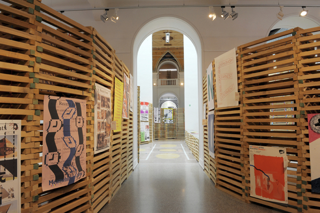
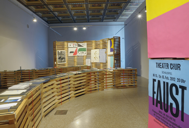
This year the 25th anniversary of one of the most important international graphic design competitions is being held. Brno Graphic Design Biennial founded in 1963, is celebrating its silver jubilee with a different exhibition concept.

Traditionally, the Biennial includes an international exhibition of design excellences, an international design symposium and an exhibition by a guest curator from abroad, accompanied by a series of smaller exhibitions and a rich cultural program.


At this point you may be wondering what has actually changed in the most famous graphic design biennial’s structure. Brno Biennial’s central point has always been the design competition, awarding prizes to professional design practitioners in several categories. This year, the organization committee headed by Radim Peško, Tomáš Celizna and Adam Macháček, has decided to abandon the traditional division of the international show into categories, leaving more space for a curatorial selection of works developed through a vast range of media, thus showing a broad and metamorphical spectrum of contemporary graphic design.

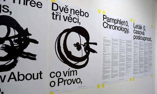
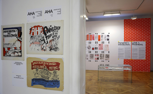
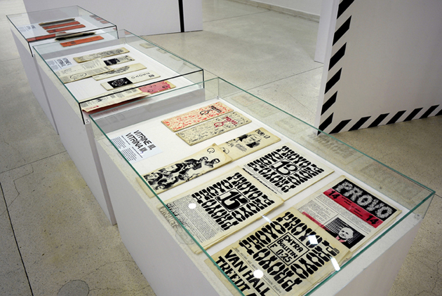
Besides the central international exhibition, the 2012 Brno Biennial also offers a series of curatorial exhibitions. The first one, conceived by the guest curators Experimental Jetset, a graphic design studio based in Amsterdam, is titled “Two or Three Things I Know about Provo”. The exhibition revolves around a small, personal archive of Provo, an anarchist movement which existed in Amsterdam between 1965-1967.


Among the accompanying exhibitions you can find a showcase of Czech graphic designer Květa Pacovská’s work, an exhibition titled “Work From California” displaying the projects that reflect the multiple layers and the complexity of the Golden State and Slavs and Tatars’ show “Khhhhhhh”.

Even though the opening days, including a series of lectures entitled Biennial Talks, have already ended, the above mentioned shows running until the 28th of October should be just enough to satisfy your graphic design hunger.

Rujana Rebernjak – Images courtesy of Archive of the Moravian Gallery in Brno

Share: Facebook,  Twitter  
23/07/2012

The Antithesis of Today’s Throwaway Fashion

The Antithesis of Today’s Throwaway Fashion

The fashion apparel industry has drastically changed over the last twenty or so years. By consequence, today’s ‘fast fashion’ industry, with the retail conglomerates in the frontline, has become hugely standardised. This has led to immeasurable bulks of ‘anonymous’ and often poorly made clothes. Rapidly produced fashions without any history or noteworthy source of reference, readily available to be thrown away. As a result, the disdain for these disposable fashions is growing.

By contrast, German men’s wear label Merz b. Schwanen, shrewdly understands how in today’s fashion realm, craftsmanship and expressing authenticity and quality has become imperative in establishing a sense of fashion rigueur.


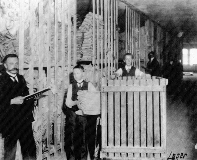
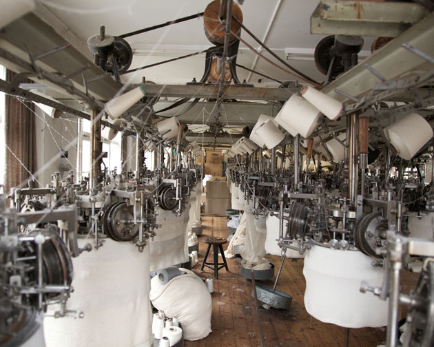
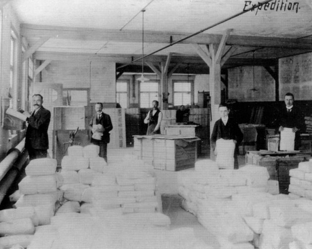
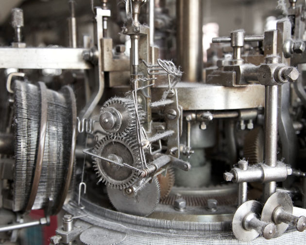
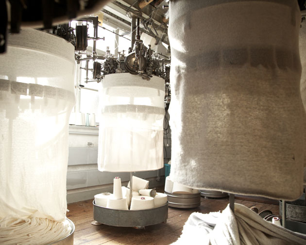
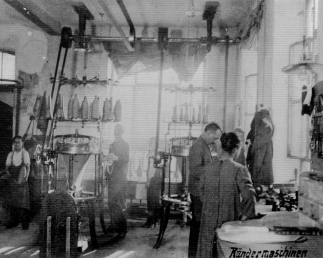
The Berlin based fashion label, founded by Peter Plotnicki, offers a range of beautifully basic army shirts, singlets, pants and sweaters, all of which are inspired by vintage workmen’s undergarments from the 1920s, 1930s and 1940s. Each piece of clothing is made with care and generated by authentic manufacturing processes, whereby original, historic circular knitting machines are being put into use again. Accordingly, in line with traditional production facilities that were customary in various parts of Germany from the 1920s up to the 1950s, an old way of crafting is revived.

The effect of this bygone technique is an irregular weaving pattern, which leaves the clothes without a side seam, giving each item a refined, singular and authentic look. In result, the knitted ‘vintage feel’ garments made by Merz b. Schwanen hold a surplus value that industrially developed fashions are a-priori deficient in.


Labels as Merz b. Schwanen can be considered a welcoming counterpoise to today’s throwaway McFashions, a term once brilliantly coined by sustainable fashion designer and author, Kate Fletcher. Moreover, the turning away from mass produced, standardized apparel matches a larger cultural trend that is comprised in a returned interest in the decorative and handmade. (See the documentary series Made by Hand that is an active proof of it.)

Additionally, in our increasingly fast paced 24/7-stress society, time has become a true luxury ‘good’. As such, time equals quality (simply put). In view of this, these kinds of labour intensive, carefully crafted ‘slow fashion’ clothes, permeated with historicity, will almost certainly hold a radiantly bright future.


Claire van den Berg

Share: Facebook,  Twitter  
23/07/2012

Reading Ed Ruscha at Kunsthaus Bregenz

Reading Ed Ruscha at Kunsthaus Bregenz

Ed Ruscha is surely one of those super-star art names you may hear quite often even outside the highly selective art world. Born in 1937 and living in California, Ruscha is one of the most elusive contemporary artists. Even though he is commonly associated with the pop-art movement, his work doesn’t actually fit any precise category. Perhaps that is precisely why we were instantly attracted by the equivocal title of his latest exhibition.

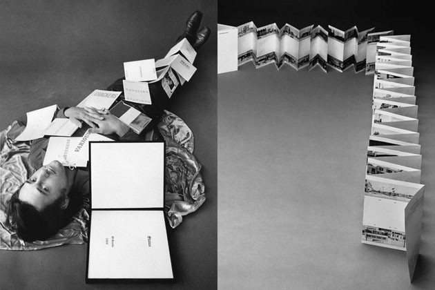
Entitled Reading Ed Ruscha the exhibition was specially conceived by the artist for Kunsthaus Bregenz. The show’s main interest is to give an interpretation of Ed Ruscha’s work in ‘generating meaning’ through writing and language. Even though speaking about writing and Ruscha may immediately lead you to think about his book-works, namely the notorious “Twenty-Six Gasoline Stations” or “Every Building on Sunsent Strip”, these are actually not the most significant ones as far as words and language are concerned. Reading Ed Ruscha tries to explore the significance of writing in Ruscha’s work through a vast array of media – drawing, photo-gravure, book, film, photography and painting, with the obvious attention to the book through the act of “reading”.

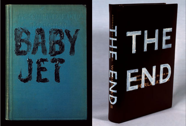
Among these media, a special attention has been given to his book-objects, which play with the idea of the book as a picture, while still retaining its status as an object and thus creating a tension and play between the content itself and the artwork on the cover. Some of the works displayed are “The End”, “O Books”, “Oh No” and “Pep” books. Reading Ed Ruscha tries to show how the artist cleverly ‘dramatizes the relation of text and image, signifier and signified’.

Reading Ed Ruscha, the artist’s first institutional solo exhibition in Austria is running until the 24th of October at Kunsthaus Bregenz.

Rujana Rebernjak

Share: Facebook,  Twitter