Stedelijk Museum – The New Identity
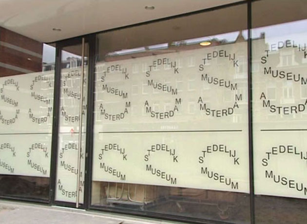
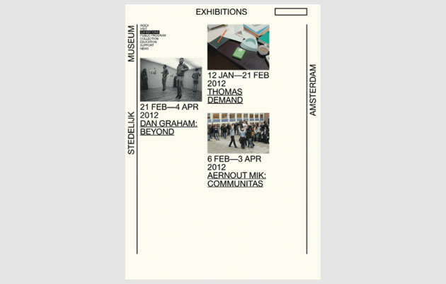
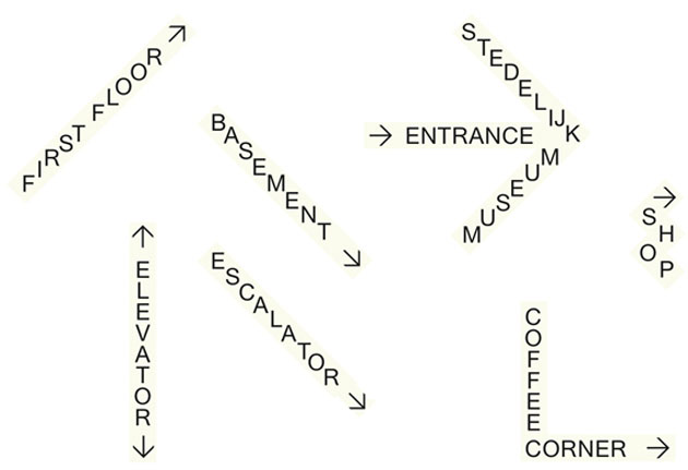
On the 28th March the definite public opening of the Stedelijk Museum in Amsterdam was finally announced. The grand opening is scheduled for the 23rd September 2012, and it’s to be followed by a grand retrospective exhibition of Mike Kelley’s work. Years of delays on the construction site raised a lot of criticism from both the press and the public, and finally at the end of last month it was possible for the curious and the art hungry people in Amsterdam to take a tour in the new building. The new museum was slightly anticipated by a new corporate identity, and already debated projects by Mevis and van Deursen.
The now almost 70-year-old museum was initiated with the direction of Willem Sandberg – an incredible graphic designer himself – in 1945, and the graphic design that followed each of the museum’s exhibitions has become almost as important as the exhibition itself. Designers allowed to place their hands on those projects weren’t that many. After Sandberg’s tyranny Wim Crouwel came along, designing the modernist ‘SM’ identity that stood proudly until 2010.
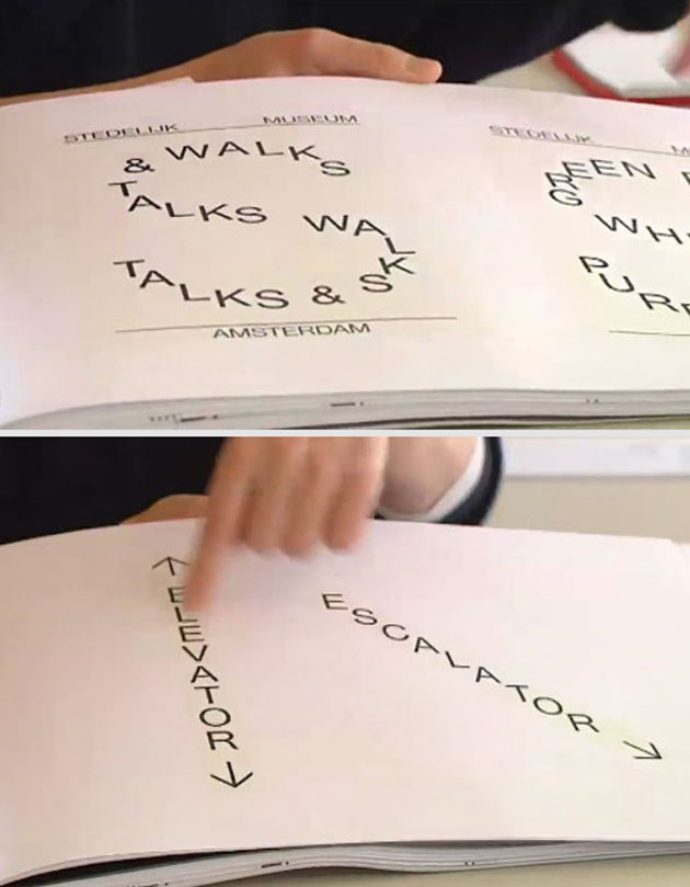
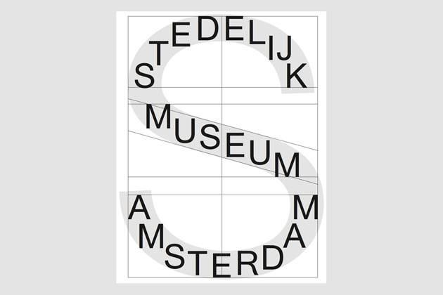
It should have been followed by Experimental Jetset’s SMCS logo, but it was actually replaced by the capital T designed by Mevis and van Deursen for Temporary Stedelijk. Mevis and van Deursen’s logo might seem a bit goofy at the first glance for hard-core modernist habitues. It plays with the iconic idea of the capital initials, as with the Temporary Stedelijk’s capital T, filling it with the museum’s full denomination. Hence, it becomes both an image, an icon and almost a phrase. After the initial moment of wonder you can’t but be amazed how Mevis and van Deursen manage to surprise each and every time.
