31/05/2012

Charles and Ray Eames – The Films
Charles and Ray Eames – The Films

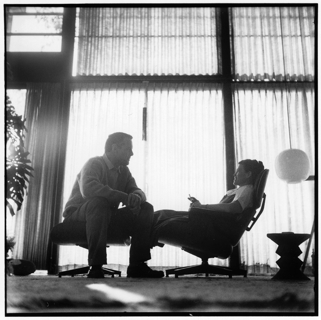
The legacy of Charles and Ray Eames is still one of the most relevant cultural heritages we have carried out from the sixties. The famous couple, known respectively as the architect and the artist, started their long work-life relationship back in the college years. 
Hundreds of successful projects that have crowned their collaboration, originated from a studio in Los Angeles that has grown up to be America’s most creative site during the Mad Men years. 
Charles and Ray’s career has recently been poured into a documentary. The film was appropriately titled “Eames: the Architect and the Painter”.

The film in itself, apparently a feature created for mass audiences, doesn’t reveal much to a design geek. Historically speaking though, it gives an insight into their studio and working method, narrated through a series of anecdotes told by their young collaborators. The movie actually reveals quite vividly the complex visual world the creative couple has brought to life during their career. 
One of the most interesting projects Charles and Ray worked on, surprisingly as it may sound, is not their appraised furniture.

The actual treasure revealed by the documentary is the way they made their short films. Guided by Ray’s sensitivity that transformed everything in paintings, the filmography produced by the Eames’ studio had the exact same goal of every other project: to communicate ideas. The extensive list of films is conserved today by “Eames Office”, an association dedicated to communicating, preserving and extending the legacy and work of Charles and Ray. Comprising more than 100 films made between 1950 and 1982, it showcases videos like Powers of Ten, Tops, House, supreme examples of their wit and curiosity towards the world.

Rujana Rebernjak

Share: Facebook,  Twitter  
31/05/2012

Depicting Fragrances

Depicting Fragrances

Design has always been a fundamental element in the process of creating a new perfume. The bottle, which contains the essence, very often becomes its symbol; the image that gets fixed in people’s visual memory and turns itself into a key factor for establishing and furthering its identity.

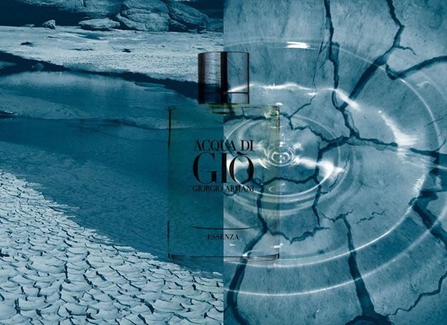
With Acqua di Giò in 1996, Giorgio Armani contributed to change the fashion approach of contemporary men, who are more and more focused on the details of their personal and casual style. After sixteen years, the renowned brand presents a new fragrance: Acqua di Giò Essenza, a more intense and sensual version of the original scent, which owes its appearance to Alberto Morillas’ nose, and embodies the spirit and the characteristics of the 21st century man.

The Italian newspaper Corriere della Sera through Giancarla Ghisi’s words – accompanied by Karin Kellner‘s pencil – retraced the main steps of the history of masculine perfume. 2DM’s illustrator, with her delicate and romantic mark along with her peculiar sensitivity, borrows the key elements of master perfumers to depict some of the best-known essences ever. Jasmine flowers, rosemary branches, violets, lemons and bergamots surrounded the bottles of Dior‘s Eau De Savage and Issey Miyake‘s L’Eau d’Issey, both of them dominated by the new scent of Armani.

Once again the expressive power of Karin’s drawings joins the allure of perfume world, giving birth to a marriage with a perfect and total harmony.

From the Bureau – Image Karin Kellner

Share: Facebook,  Twitter  
30/05/2012

Electrik-Shrine In An Insomnolent City

Electrik-Shrine In An Insomnolent City

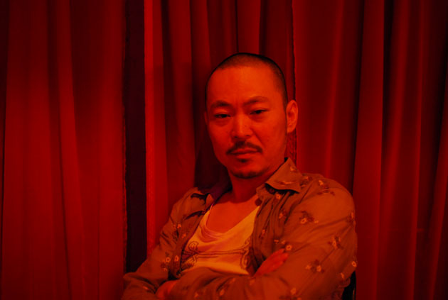
Slowly climbing down the narrow stairs, we visited Electrik-Jinja (literally means ‘Electric Shinto Shrine’) located in the center of Roppongi, the massive nightlife mecca and the melting pot in Tokyo.

Happy birthday Kenji, the owner of the place. The celebrations were well underway, the underground skeleton box was jam-packed with his friends, bare wall to wall. Amongst them, the distinguished jazz bassist Christopher Thomas from St.Louis. The place itself was newborn last April.

Why “Electrik-Jinja”?

“For me, the two terms are actually synonymous. In ancient times, spirits were everywhere, and certain places were designated for the interface of this world and the sacred. Even monuments were not always necessary, it’s all about the vibration of energy. Energy is electric, something invisible, but does exist. You don’t see it, but you feel it. And we humans are also electric, right? I love to see people’s vibes generating spontaneous Jinja here.”

Suddenly, we felt an amorphous mass of billowing vibes, which lulled us into the illusion of wriggling luminous red sea slugs in the blackness. Hung Electro-Voice 15 inches were blowing Miles Davis’ The Man With The Horn.

“Something raw, greasy, chaotic… Once Mishima said (in an essay For Young Samurai by Yukio Mishima, 1969) that ‘culture is yourself’ and ‘be more proud to be savage’, it took me long time to understand his words. Now, I believe in those things deeply rooted in one’s raw emotions based on real life, you know, something far beyond right or wrong.”

Kenji continued, “Every time when my friends come from overseas asking me where they could discover Japanese culture, I always say, go to Harajuku area, you will find those girls in odd fashion called Gothic & Lolita walking around Meiji Shrine.”

A profound embracement to let something vulgar move around in the holy ground. It was already around 7 AM when we climbed up the stairs, fresh air after the rain welcomed us with a sight of a little shrine, coincidentally named ‘Morning Sun’, just then a Shinto priest in white was entering through the concrete Torii (gateway), while three young drunk boys were playing next to it.

Ai Mitsuda

Share: Facebook,  Twitter  
30/05/2012

Acqua for Life

.

Acqua for Life

Acqua for Life is an initiative by Giorgio Armani in partnership with Green Cross International, aiming to collect clean water to Ghana and Bolivia, the two countries included in the project. This is the second year that Armani is taking actions in this specific cause and with two days left before the ‘expiration date’, the Acqua for Life Facebook page got almost 362 500 likes, which in itself means over 18 million litres of clean drinking water. The minimum quantity of water that will be donated is 40 million litres, the final result of the 2011 Water Race. Through 100 litres of donated water for each bottle of Acqua di Giò or Acqua di Gioia and 50 litres for each like on Facebook, they hope to take the Water Race even further and go above last year’s numbers.

Organisations performing charitable actions which not necessary are linked to the expectations of society could be called corporate philanthropy and should be separated from Corporate Social Responsibility, even though the line between them often is seen as fine, and even more so – hard to define. Whether we are talking about one action or the other, it gives a boost to the social image of a company and adds to what many of today’s highly sensible and conscious customers are looking for. We have seen fashion companies using their power to raise awareness before, and thanks to social media and a generally interested and involved ‘audience’ it is an industry that really can make an impact. Campaigns such as these do not only do what they are set to. Hopefully they create circles on the water, increasing the attentiveness for other issues regarding society, environment and development.

At the moment, Italy is the leading country, leaving both Denmark and USA behind, together with all the other countries taking part in the project. Even though it’s not the single contest but the gathered efforts that will make a difference, today, Milan is a winner, leading the Acqua for Life Water race 2012 to its goal.

Lisa Olsson Hjerpe – Image courtesy of Acqua for Life – Armani

Share: Facebook,  Twitter  
29/05/2012

Kristina Gill: Citrus and Rosemary

Kristina Gill: Citrus and Rosemary

Usually by the time I get to the gelato shop down the street at the end of the day, there are only empty holes where full bins used to be. The last time I went there early, and found a panoply of flavors I’d never seen. I settled for the blood orange gelato solely for the color, because otherwise I would only buy hazelnut. Arrived at home, I wanted to have something else to go with it. I sorted through my assortment of cookbooks and found a rosemary loaf cake. Thinking back on a recipe I saw for a loaf cake with citrus and rosemary scented icing, I thought my gelato and the rosemary cake would work quite well together, and I was right. I do still have my doubts about how summery this flavor combo is, but for now I must turn my attention to saving a slice of cake before my husband devours the rest.

Kristina Gill

Share: Facebook,  Twitter  
29/05/2012

Found Muji

Found Muji

Muji is a worldwide known brand famous for denying having a brand identity at all. Or at least, hiding it. The power of the un-branded, almost thirty-year-old company has always been the strong focus on the product quality. The quality pairs with extreme simplicity, a ‘supernormal’ quality – as Naoto Fukasawa, a company associate, and Jasper Morrison would put it. 
The designs Muji has put on the market have never been publicized by its famous designers’ names, although the company wouldn’t have hard time showing off, seeing the impressive list of its collaborations.

Among the designers working with Muji, you can read names like Konstantin Grcic, Enzo Mari and the two design superheroes mentioned above. These pop-stars of design have conceived some of the simplest objects of our everyday use such as an umbrella or a mug. Not quite a posh assignment for this elite of creative engineers.


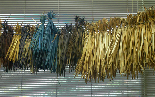
As we may argue endlessly about how this un-branded strategy has actually created one of the most powerful contemporary brands, Muji has moved forward to developing a new project. Muji has taken the role of the collector and the distributor of some of the finest local crafts, thus promoting a kind of design heritage handed down to us from the tradition of our popular culture. 
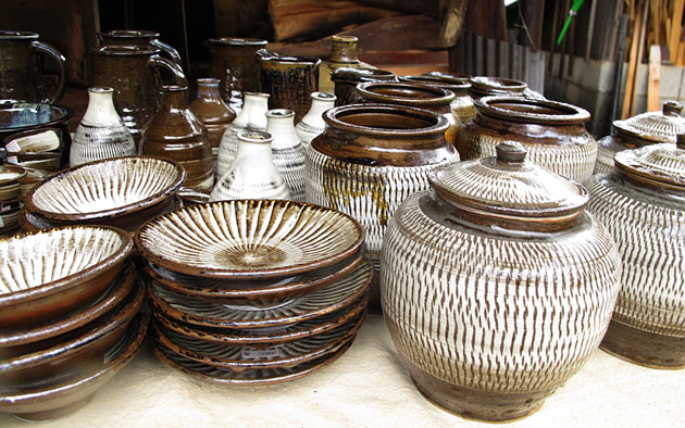
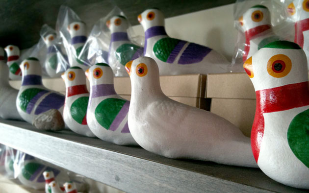
The found collection comprises a series of jugs, brooms, toys, ceramic sculptures and gardening kits among others, all so essential and well conceived that they might have actually been designed by some of the Muji’s creatives. The utmost proof of the importance this concept represents for the no-brand company is the opening of the Found shop at the first ever Muji Tokyo store in Aoyama.


Rujana Rebernjak – Images Muji
Share: Facebook,  Twitter  
28/05/2012

Copperwheat -Punk, Prints & Potential

.

Copperwheat -Punk, Prints & Potential

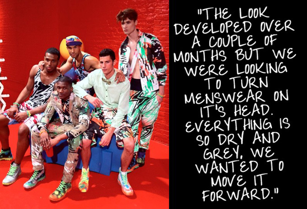
There are a lot of facts one could find interesting when talking about the London-born and New York-based Copperwheat cousins, Ben and Lee. Lee has been teaching at Central Saint Martins and Royal College of Art, he is the Copperwheat of the Copperwheat Blundell label, and his freelance list of work includes names such as Marc Jacobs, Stephen Burrows and Coach.

Ben has a Master’s Degree in Printed Textiles and a position as Senior Print Designer at Calvin Klein Jeans on his resume, and his portfolio holds work for Isabella Blow, Gucci, 3.1 Philip Lim and Tommy Hilfiger, among others. What is of more interest is their joint talents and effort put into the eponymous label Copperwheat that they established in 2009, aiming to bring a fresh angle into menswear.

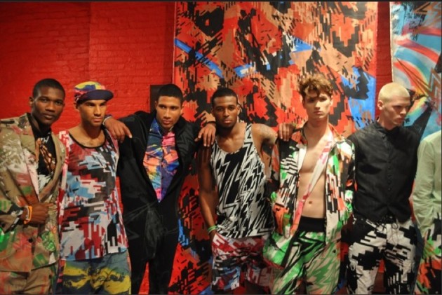
“London To New York”, the debut collection for S/S10, laid down the ‘frames’ for the upcoming seasons of bold colours and prints, and even though there has been a shifting level of vivacity in the subsequent collections, the strong aesthetics and image are continuously coherent. After a, in comparison, rather somber F/W11 collection, Ben and Lee went back to the vibrant and eccentric and presented “Smash It Up!”. The S/S12 collection surpassed their previous work and took the brand’s pulsating prints and colours to a new level of interesting; a slight hint of 80’s punk references and a mash-up of everything you could expect from a brand like Copperwheat.

The last season has been cheerful for the brand and some of the attention is the outcome of the collaboration with Cappellini. Both the S/S12 presentation and the Fashion Night Out event – which ended up on Vogue’s Top Ten list over FNO happenings – were held in the Cappellini SoHo store, emphasizing the brand profile of Copperwheat. Menswear is not changing as rapidly as the women’s fashion, but with a lot of potential on the market, a brand bold enough to keep it interesting both through the actual clothes and also through what happens around the brand, might be able to add something to the evolution.

Lisa Olsson Hjerpe – Image courtesy of Copperwheat

Share: Facebook,  Twitter  
27/05/2012

Sunday Breakfast by Love For Breakfast

Sunday Breakfast by Love For Breakfast

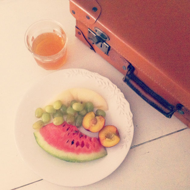
Wake up early and just one thought, escape from the city. The first glimpse of a day that taste of new is a dish made of fresh fruits.

Alessia Bossi from Love For Breakfast

Share: Facebook,  Twitter  
25/05/2012

Mind the Map

Mind the Map

Everybody knows Harry Beck’s map of the London Underground system: brightly coloured lines running only at right and acute angles, connected by circles and notated neatly in the signature Johnston typeface. It is arguably the most beautiful, influential and important piece of information design ever. Its magic lies in its ability to render an incredibly complex system eminently comprehensible through abstraction and good design: while it is geographically inaccurate, you simply can’t lose yourself in it. For decades, cities the world over have tried to ape its intuitive simplicity and iconic handsomeness to no avail.

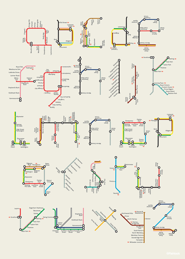
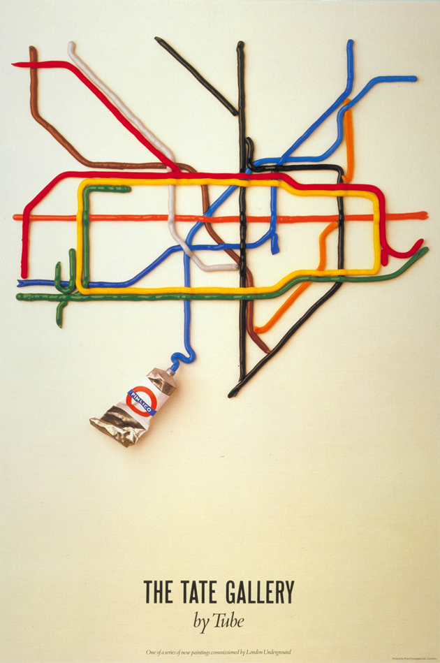
In the spirit of Beck’s design, the London Transport Museum this week launched Mind The Map, an exhibition of iconic and newly commissioned artworks inspired by the map itself. Included in the exhibition are abstractions, deconstructions and reconstructions, including David Booth’s legendary paint tube map for Tate Britain and Tim Fishlock’s “A-Z” alphabet made from the hidden letterforms to be found in the map’s many sinewy intricacies.The exhibition’s ethos is “the maps in this exhibition are more about journeys than geography,” and nowhere was this more clear than in Jeremy Wood ethereal “My Ghost” maps, in which the artist used GPS to track himself around London to reveal his phantom presence around the city.

Catch Mind The Map tucked in behind the museum’s usual interactive collection of TFL history – 19th century train cars you can sit inside, classic Routemaster buses you can climb aboard and life-size models of 19th century subterranean tunnelling – running through October 28th at London Transport Museum’s space in Covent Garden.

Tag Christof

Share: Facebook,  Twitter  
25/05/2012

Johanna Pihl – The New Rookie In Town

.

Johanna Pihl – The New Rookie In Town

Swedish designer Johanna Pihl is one of the 5 hopeful nominees for The Swedish Fashion Council’s Rookie Award 2012.

Since 2005, S.F.C has organized the competition in order to promote young talents in the Swedish fashion industry. “Passion for design, interesting concepts and promising brand value” are what the jury with H&M’s head designer Margareta van den Bosch in the lead are searching for, and winning the competition means heavy exposure, networking support and PR-activities en masse. The coronation will take place during Stockholm Fashion Week the 15th of August.

“Being nominated for The Rookie Awards feels amazing, since it gives you opportunity to meet people in the business. At the moment, I’m in the middle of the process of creating my S/S 13 collection, and when you have a recently established fashion brand it’s so important to get the word out”, Pihl acknowledges.

Stockholm-born Johanna Pihl has studied fashion design at London College of Fashion, worked for avant-gardist Ann-Sofie Back and had an exhibition at The Victoria and Albert museum. Last year, she won the Young Fashion Industry Award which gave her the chance to present her collection during Stockholm Fashion Week. Along with brands such as altewai.saome and Alice Fine, Pihl has been named ‘the future of Swedish fashion’.


“The people in the business have always been very kind and supportive, it makes you feel appreciated. The hardest part, which is also the most intriguing part is that there’s always so much to learn every single day, there’s always a new challenge to face, but the performance pressure forces me to break boundaries, which I think is very important in this business.”

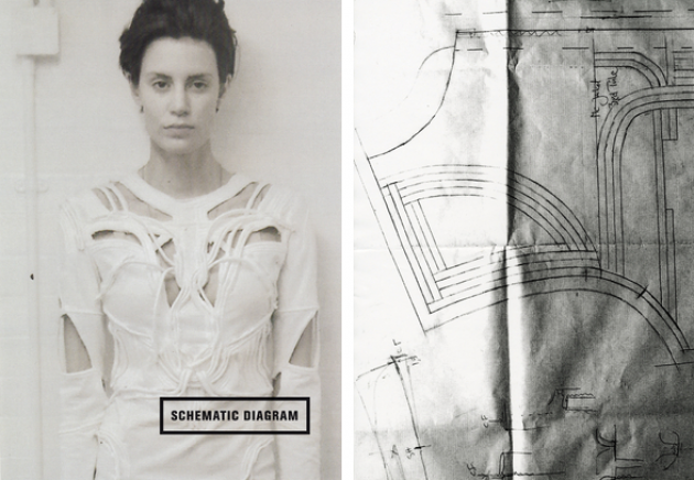
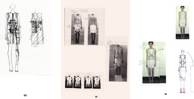
With her current collection, she introduces a contemporary tomboy-woman, with the most prominent piece being a cut-out leather jacket with detailing reminiscent of ancient day’s war breastplates. Behind every garments is a journey into the relationship between the anatomy of the body, and the ambivalent curiousness with body modification through plastic surgery. Sharp silhouettes, manipulated fabrics and high technical finish are three details to summarize Pihl’s design philosophy.

“The Collection is to be worn as a second skin. The garments represent our cast, stretched and distressed over our mechanical form. By using trapunto techniques the garments demonstrate that our anatomy is engineered and calculated like an engine, showing that by altering and reorganizing our appearance through plastic surgery we diminish our human design.”

Petsy von Köhler – Image courtesy of London College of Fashion, Patrick Lindblom, James Finnigan & Timothy Hill

Share: Facebook,  Twitter