19/04/2012

Salone 2012 – Tom Dixon & MOST
Salone 2012 – Tom Dixon & MOST

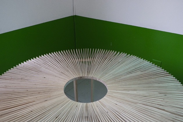
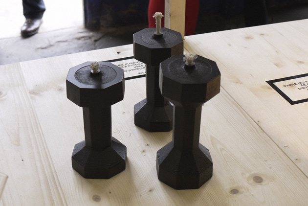
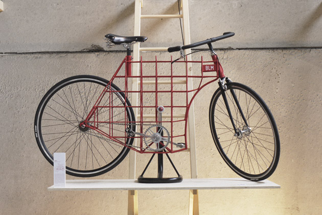
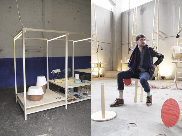
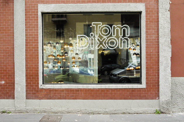
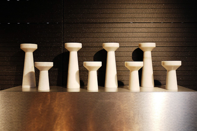
Tom Dixon is one of those design entrepreneurs that manages to turn into gold everything he touches (in some cases literally). Most, the bombastic event promoted by Dixon held at National Museum of Science and Technology, is one of the highlights of this year’s Salone. Most is a collective exhibition whose goal was to transform the museum’s scientific environment in what resembles a design research center. The juxtaposition of historical transportation exhibition with contemporary design, stood almost as a reminder for today’s designers of what actually good design should be like, offering a perfect situation for sharp confrontation and critique.
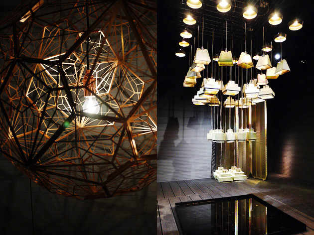
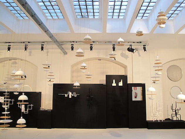
As far as single exhibitors are concerned, they were distributed between five of the museum’s buildings. The first part of the exhibition was obviously Tom Dixon’s show called Luminosity where he presented new lighting and furniture projects. With an eye on new production methods as well as materials, the project that struck us most was the Lustre lamps collection that uses glazed ceramics in order to create an effect reminiscent of hidden colours in nature. Also Dixon’s Eclectic collection of everyday objects was eye candy, showing how big design companies haven’t forgotten the simple daily pleasures we all can find ourselves in.

Among other exhibitions, Studio Toogood‘s La Cura project has to be mentioned. Designed as a shelter place from the chaos of the Salone, it offers a series of performances that serve as a retreat for our senses. There you can find the sound installation by Kite&Laslett, a re-energizing elixir created by Arabeschi di Latte while the air is filled with a scent by the scent designer 12.29.
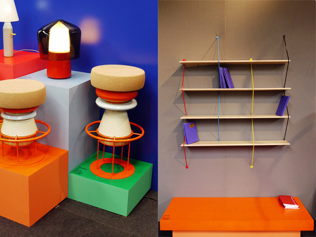
One of the most interesting stands is the one by a new french design company called La Chance. Presenting its first ambitious collection called Jekyll and Hyde where each piece comes in two versions, the company has inaugurated a hopefully long collaboration with designers like Pierre Favresse, Luca Nichetto, Susane de Graef and Note Design Studio.

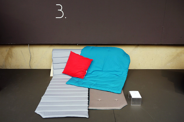
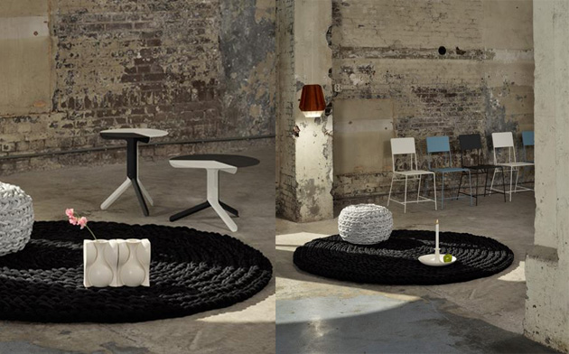
The astonishingly enormous museum space actually offered a lot more than we could possibly summarize in these few lines. If you’re into work like the one produced by Areaware or want to discover companies like Resident from New Zealand, take at least a few hours to wander around these beautifully designed spaces and check what Most has to offer.
Rujana Rebernjak

Share: Facebook,  Twitter  
19/04/2012

Salone 2012 – Superstudio

Salone 2012 – Superstudio

After the first two days of this year’s Salone we are slowly but steadily approaching its more consolidated venues. The fulcrum of Fuorisalone is obviously Zona Tortona, with the massive presence of Superstudio. With yesterday’s pouring rain here in Milan we couldn’t but take shelter there and soak in the best from the Temporary Museum for New Design. Arrived at its fourth edition this year, Temporary Museum for New Design has presented more than 50 exhibitions with the participation of 40 international brands and more than 200 designers.

Among this myriad of projects, we would lie saying that all of them were interesting, some have really caught our eye. As we have a soft spot for Scandinavian design, we were obviously intrigued by the collective exhibition organized by Inredia. Their bold statement about Scandianavian design being much more than Ikea and H&M, has certainly been heard as companies such as SA Möbler or designers like Formforyou and institutions for research like Steneby, have really a lot to say.

Another inevitable installation was Past, Present, Future by the german furniture company Kusch, made out of chairs floating in a bouquet-like composition, connecting the realities of contemporary design and artistic sensorially.
The third stop was New Duivendrecht, the newest of contemporary Dutch furniture manufacturers. Presenting the projects of nine young designers, the company has successfully promoted their ideals of high quality, sustainability and both formal and technological innovation.

Without any further waffling, the other musts are definitely the works of NgispeN, Cube on Cube, Nendo and Fritsch-Durisotti, to name but a few. Even though the weather in Milan is giving us a break and you may not be looking for a shelter, Superstudio is definitely an inevitable stop.

Rujana Rebernjak

Share: Facebook,  Twitter  
18/04/2012

Salone 2012 – Ventura Lambrate

Salone 2012 – Ventura Lambrate

In the last few years the more independent young designers as well as universities of design have been moving away from the center of Milan to Lambrate. This year the Lambrate fever has reached its higher peak as far as number of participants is concerned. Distributed between Via Ventura, Via Massimiano and Via Oslavia, this year’s exhibitors have included both the usual young as well as superstars like Jaime Hayon and established companies such as COS and Ikea.

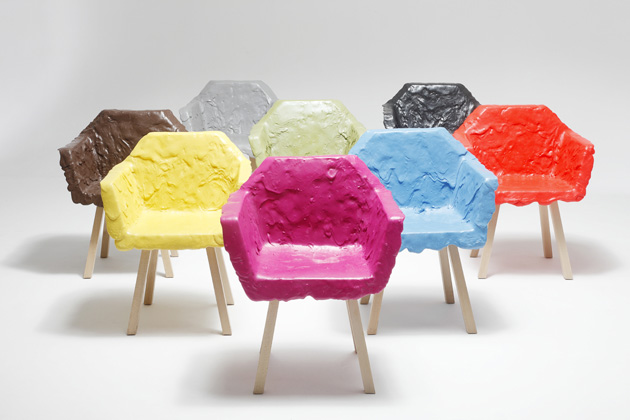
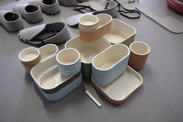
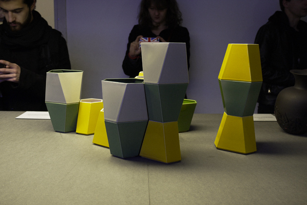
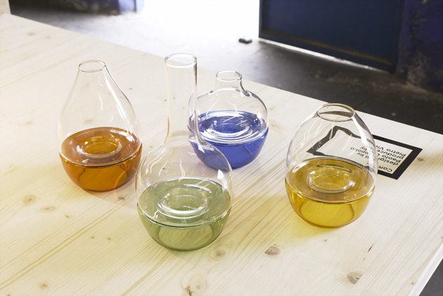
As far as design schools are concerned, The Royal College of Art has made an almost impeccable exhibition. In a long series of experimental projects entitled Paradise, the strongest impression was made by ‘Fan Table’ by Mauricio Affonso, ‘Red & Blue Stacking Vessels’ by Pia Wustenberg.

The University of Bolzano was also there, with less projects but a nicely designed exhibition space curated by the school’s professors.

The most interesting young and independent designers would make an endless list, so we’ll only point out a few: “Edition of 9″ curated by Something Good that explored the relation between local crafts and contemporary design, “Think +” by Studio 248 which concentrated on the exploration of gestures and usability in design, Nino & Svenja that concentrated their research on the use of simple materials with innovative production and assembling methods.

Rujana Rebernjak

Share: Facebook,  Twitter  
18/04/2012

Salone 2012 – Spazio Rossana Orlandi

Salone 2012 – Spazio Rossana Orlandi

The Salone fever has begun this year, punctual as ever. Hundreds of events have overflown the city, be it small independent designers that try to make their way into the design elite or already well-known companies always ahead of their time. On the first day of the Salone we had the thoughts on all the choices. Looking through the Salone’s agenda and picking the right start of our week-long design tour wasn’t an easy task.
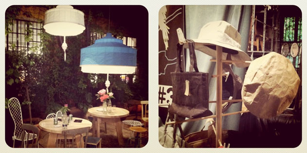
So in order to kick this week a good start, we’ve decided to begin from one of the unmissable events – the fascinating collective exhibition at Spazio Rossana Orlandi.

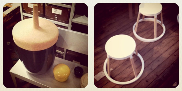
Besides the charming garden where we spotted one of the Bouroullec brothers sipping wine (you can imagine how excited we felt seeing one of our heroes), the space has presented more than forty new projects from both acclaimed designers as well as new talents. Although Spazio Rossana Orlandi, as usual, offered a huge amount of experimental projects that both raised questions about form and material as well as production and distribution methods, we still had to pick a few favorites.


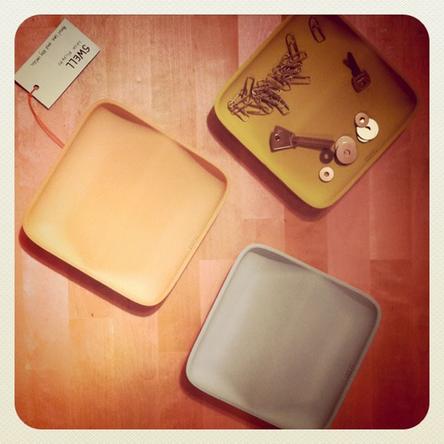
The first one is Luca Nichetto with his Swell series. Designed for the french design editor Petite Friture, the Swell series consists of a pencil case and a key holder made in colored concrete. The other objects produced by Petite Friture are Cairn boxes and Vertigo pendant lamp by Constance Guisset, Ikebana vases by Edward Robinson and Hollo stool and tables by Amandine Chhor and Aissa Logerot, to name but a few.

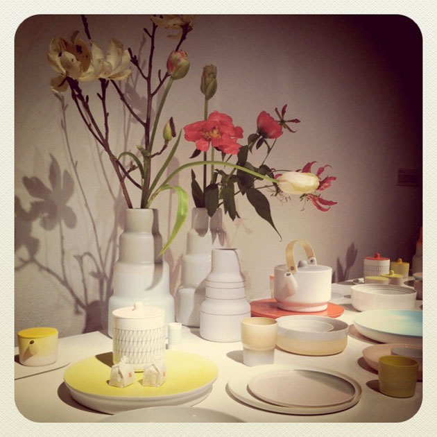
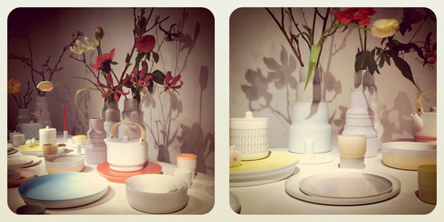
Another collection that has made an impression is the ceramics collection by Taruhiro Yanagihara for 1616 / Arita Japan. Together with Dutch designers Scholten & Baijings, Yanagihara as the creative director of the company coming from the birthplace of ceramic art in Japan, has decided to design a collection that reflects the European perspective on the Japanese tradition.

The last but not least, Ercol Furniture presenting beautifully crafted oak, ash, elm and beech chairs, that combine modern machinery with hand craftsmanship and intelligent design.

Without pretending to be exhausted from the first Salone visit, we have actually managed to give the week a real kick-start!

Our official Salone reporter: Rujana Rebernjak

Share: Facebook,  Twitter  
17/04/2012

Southern Hemisphere

Southern Hemisphere


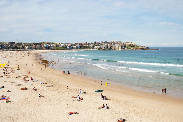
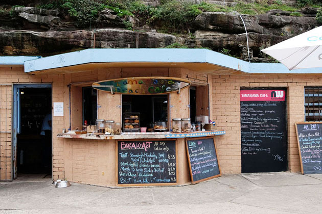
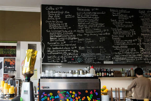
I got the chance to leave for work to Australia. Now that good weather had settled in in Rome, I didn’t think there would be much of a weather change, but it’s the scenery change that really works for me. I am spending most of my time with no ocean view, in meetings, indoors. But when I have a moment on the weekend, I will find my own way to Sydney to have a quick bite in its fabulous cafes, and sit and enjoy the sun.

I used to be surprised when Australians were nonplussed about Italian food. Then when I visited, I could see why! Bakeries like Bourke Street Bakery, restaurants like Longrain or Phamish, or cafes like Bill’s or Cafe Giulia just don’t seem to abound here. The vibrant Italo-Australian community makes sure that Italian food is great and not underrepresented, and the Asian is the best outside of Asia.

Kristina Gill

Share: Facebook,  Twitter  
17/04/2012

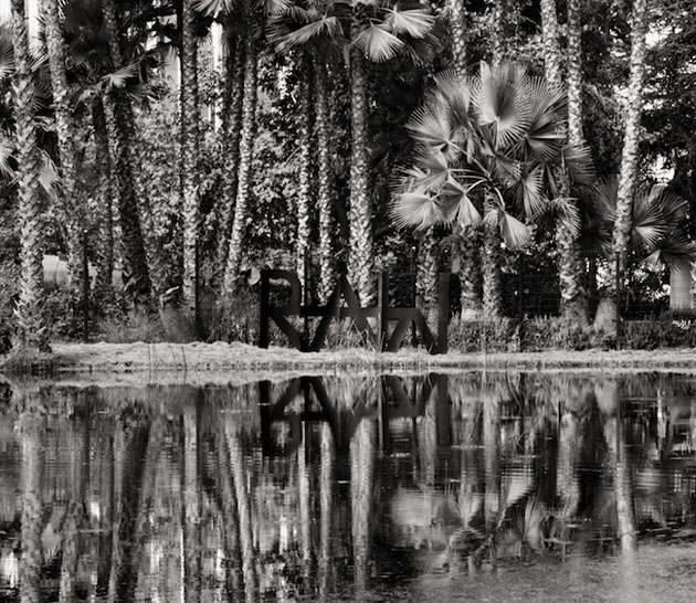
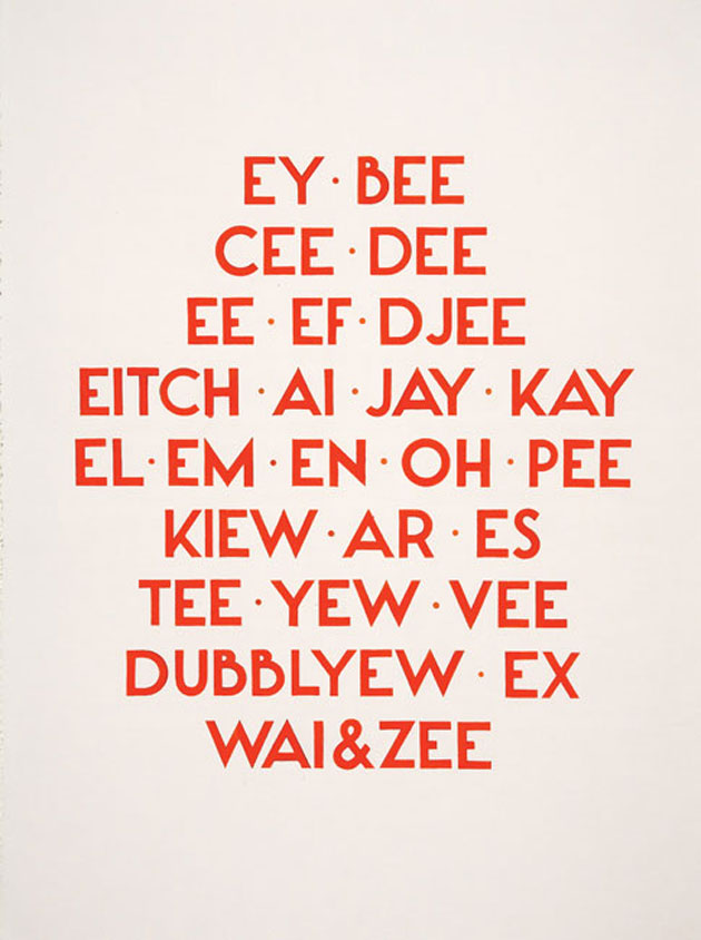
Ecstatic Alphabets / Heaps of Language at MoMA

Ecstatic Alphabets/Heaps of Language at MoMA

In our everyday life we never actually ‘think’ about the language. While for most the language is often invisible, some are more attracted to its visible form – the letters.

Significantly, graphic designers sometimes get lost in this tangible form of basic human expression, often considering the visible part as an abstract form, thus ignoring its meaning. But they are not the only ones who work with material qualities of language. Since Apollinaire and concrete poetry movement, artist and poets have been handling language as a physical structure.

It is exactly this kind of approach that MoMA is trying to investigate in its latest exhibition entitled “Ecstatic Alphabets/Heaps of Language”. The curator Laura Hoptman has decided to take an insight into material qualities of language explored by artist working with a wide range of media.

The exhibition provides both a historical look (even though some of the artist could still be considered contemporary) through the works of Carl Andre, Marcel Broodthaers, Henri Chopin, Marcel Duchamp, Ian Hamilton Finlay, John Giorno, Kitasono Katue, Ferdinand Kriwet, Liliane Lijn, Filippo Tommaso Marinetti, Bruce Nauman, Lawrence Weiner and others.

While these modernist experiments are being presented through a timeline, in order to get a broader historical view of the phenomenon and tell the story of concrete language in visual art, the contemporary part of the exhibition focuses on the new ways of investigating the concrete language phenomenon. Hence, the ratios has become not only a poet but also writer, graphic designer, performer and publisher working with a contemporary mix of the available media.

Thus, the fact that among the impressive list of contemporary artist we can find designers like Experimental Jetset, isn’t a pure coincidence. Since graphic design has become an evolving collaborative approach, more than a defined discipline, this exhibition sheds some light on these kind of practices, that both open the discipline to contaminations from other fields as well as free it from the duties of (commercial) communication.

The exhibition, opening the 6th of May and running until 27th of August, will be accompanied by a catalogue curated by Stuart Bailey and David Reinfurt from Dexter Sinister. If you actually manage to miss the exhibition, you must stay tuned for their Bulletins of the Serving Library where concrete language goes digital.

Rujana Rebernjak

Share: Facebook,  Twitter  
16/04/2012

Kaleidoscopic cosmetics – Carolina Melis

Kaleidoscopic cosmetics – Carolina Melis

2012 Beauty Club Awards, the annual competition for cosmetics brands launched by Debenhams to involve cosmetics addicts to vote for their favourite beauty products, has its winners. To celebrate the closure of the 2012 edition, the British retailer commissioned 2DM’t talent Carolina Melis to design and direct an animated film, which shows the most-loved products chosen among six different categories – make-up, skincare, fragrance, new kids on the block, body and tan – and selected by a panel of experts.

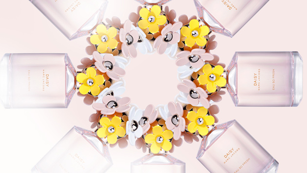
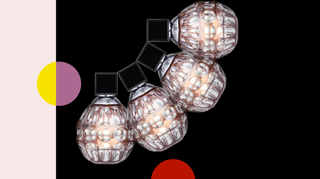
Floating among colourful dots, lines, and geometric figures, Carolina Melis displays the winning cosmetics on the screen creating wonderful kaleidoscope effects and charming images. From the lipstick by MAC and the women’s fragrance by Marc Jacobs and Jimmy Choo, to the best night cream by Clarins (just to mention a few) the video presents in a magical and imaginative way an array of must-have beauty products women can do without.


From the Bureau

Share: Facebook,  Twitter  
16/04/2012

Mundi – A Surreal Fashion Story from the North

Mundi – A Surreal Fashion Story from the North

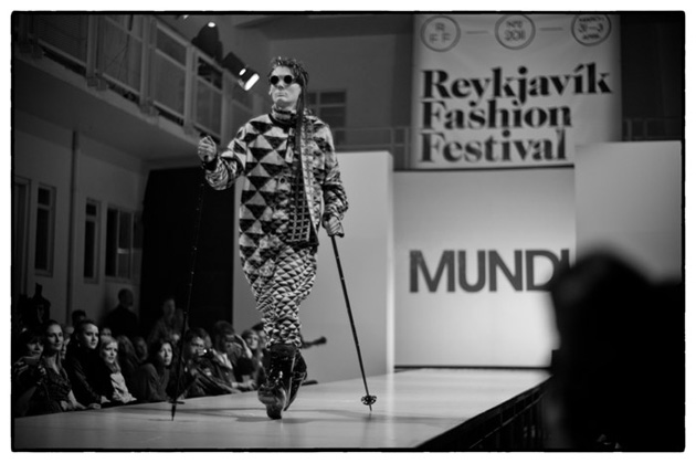
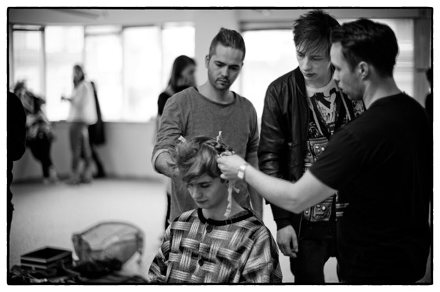
Despite his young age, Guðmundur Hallgrímsson, better known as Mundi, is no rookie in the fashion industry. After having started his career in fashion as a pure accident involving the Icelandic phone book, he has been crossing boundaries, creating amazement and managing to stay an artist while pursuing a career in fashion. Barely 25 years old, he is one of Iceland’s most well-known designers and artists.

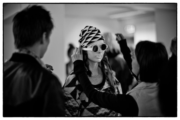
The young and somewhat avant-garde designers often get under the loupe with the discussion “Artist or designer, fashion or art?” In the case of Mundi there is no real need for discussion. He is not just a designer with an artistic angle to it, or an artist turned designer, more than he is an artist who also designs – and makes the whole discussion damn interesting. Ever since that first knit, which was made to be printed as the cover of the Icelandic phone book, also turned to be a sweater, he has managed to produce seasonal collections as a fashion designer while taking part in major art projects. His art collective MoMs has travelled the world, exhibiting and performing, and among the more famous projects you find collaborations with the Austrian, worldwide known group of artists, Gelitin. As a designer his skills in graphics as well as the Icelandic knits have become parts of the brand’s foundation and his understanding for art has become the way he presents it.


For not only does Mundi know how to put on a runway show or excite the audience of an art exhibition, he has also proved to master the art of fashion film. His first short, The Rabbit Hole, was launched during Paris Fashion Week 2010 and received tons of attention. Mundi himself was though strict on pointing out that the film wasn’t one in the category of fashion. In an interview with Dazed Digital he said: “If you focus too much on the fashion, the main subject falls apart. I only look at fashion in terms of extreme costumes that help to create the characters. If you are making a film it has to be more focused on a story, a character, a plot… I think in some cases ‘fashion films’ are nothing more than a long dramatic commercial. They come to life when a lost photographer realises his new Canon 5D Mark II has a video option, so instead of taking photos he makes a terrible video of skinny models jumping around in slow-motion!”

Despite this, the film amazed its audience, being like a seventeen minutes long surreal fashion editorial showcasing Mundi’s eccentric designs in the surroundings of the Icelandic highlands.

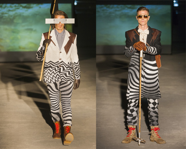
For the AW 12/13 collection, Mundi presented The Journey, another short film, but this time with the goal to create a pre-story for the runway where the characters would finally come to life. The Journey turned out to be far away from a long, dramatic commercial featuring skinny models, and even though we dare to say it’s a fashion film, it still has that Mundi ‘surrealness’ about it. The collection is shown in its full, from the distorted graphics to the careful details in the shirts, knits and accessories and was the perfect parallel to the later put on runway show.
Mundi seem to have a penchant for the futuristic side of things but the charm of his predilection is that it takes shape in something that could as easily be taken for an inspiration from the past. With a strong base in his Icelandic heritage, this is an artist slash designer who has already impressed the international fashion crowd and might be one of the stronger reasons for the industry audience to travel all the way to Reykjavík, even though the two last collections have been premiered during Paris Fashion Week. For SS13 Mundi will be showing his 13th official collection and by looking at the evolvement of his designs in the retrospective we can just guess that his graphic knits will take another turn, yet again.

Lisa Olsson Hjerpe – Images courtesy of Fridrik Orn & Ruediger Glatz – Video from Now Fashion

Share: Facebook,  Twitter  
15/04/2012

Sunday Breakfast by Love For Breakfast

Sunday Breakfast by Love For Breakfast

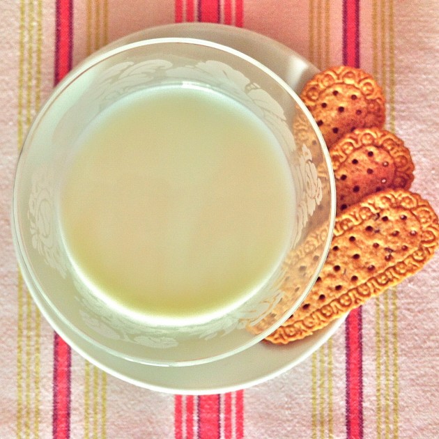
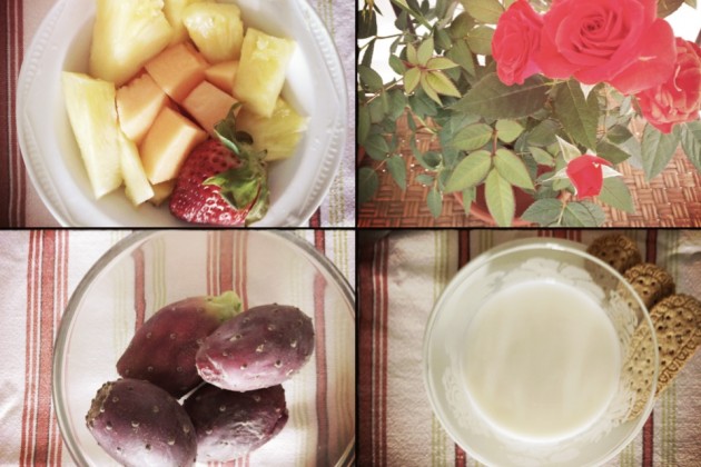
The simplest side of breakfast. Fresh fruits, milk and 3 biscuits. It sounds like perfection. It’s the best way to say hello to Springtime.

Alessia Bossi from Love For Breakfast

Share: Facebook,  Twitter  
13/04/2012

Delfina Delettrez – Metalphysic

Delfina Delettrez – Metalphysic

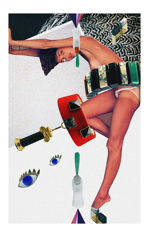
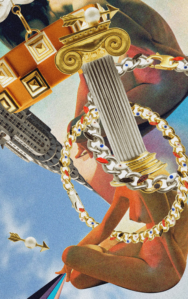
We’ve seen and fallen for the jewelry work of Delfina Delettrez, the globetrotting fourth-generation Fendi, on The Blogazine before. But as the seasons tick by, her uncommonly intelligent and sophisticated brand of design always manage, however impossibly, to turn up the wow factor. Each collection is boldly, drastically different from its successor, as well as both subversive and beautiful.

This newest collection, called Metalphysic is Rome in jewel form. “Metalphysic celebrates the miraculous architecture in Rome’s churches and palaces from antiquity and the modern day, blending these two radically different eras. The neoclassicism of Canova and Piranesi combined with the intriguing metaphysics of Giorgio De Chirico.” And in spite of the usual grandiose marketing speak, we really do see it – the pieces not only look say “Rome” through their shapes and compositions, they also make fantastic use of materials not generally used in jewelry to solidify the image. By going back to her Roman roots, Delettrez has mined some powerful inspiration to imagine a collection that we daresay might be her best yet.

For the occasion of the new collection, 2DM’s illustrator Diego Soprana went way Dada for a collaboration with Delfina. Soprana’s trademark style proves a perfect match for Metalphysic, bringing out its Romanesque character while injecting it into a canvas charged with absurdity and decadence: a perfect foil to the collection’s rigorous neoclassical/metaphysical bent.

Excellent job, Delfina and Diego!

Tag Christof – Images Diego Soprana

Share: Facebook,  Twitter