06/03/2012

Kristina Gill: Sandwiches

Kristina Gill: Sandwiches

I know this will seem like some sort of heresy, but one of the things I look most forward to when I go to Paris and London is finding a sandwich from some fancy bakery with great cheese and other great flavors that all fit perfectly together. Two sandwiches I can’t get out of my mind are the grilled cheese sandwiches with leeks at Borough Market and a sandwich using cherry preserves from a bakery in the Marais.

Here, I buttered and grilled the slices before adding the shaved Comte cheese to melt under the grill. I dressed it with the sauteed leeks and a bit of whole grain mustard. Upon the recommendation of the cheese shop, I tried a St Marcellin Fermier that I brought to room temperature with the cherry preserves, and a whole wheat bread with walnuts.


Kristina Gill

Share: Facebook,  Twitter  
06/03/2012

Zak Kyes working with…

Zak Kyes working with…

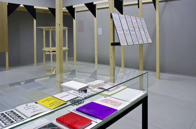
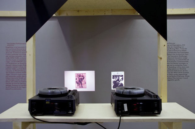
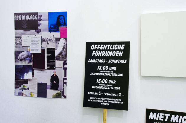
Since becoming art director of Architectural Association at the age of twenty-four, Zak Kyes has done so many incredible works and won so many prizes that counting them might give you a headache. And if you think that having a major retrospective means being at least forty, you are wrong. As the doors of “Zak Kyes working with…” exhibition open, he is still in his twenties. The head spinning show is being hosted by Galerie Für Zeitgenössische Kunst in Leipzig as part of the annual “Inform Award” given to prominent designers that develop work within the context of applied and contemporary art. Zak, who was rewarded with the prize in 2010, has developed the exhibition together with curator Barbara Steiner and a long list of artists and designers. 

More interested in editorial, curatorial and publishing activities, Zak uses graphic design as a medium, a conveyor of content. The type of content Zak is interested in is arising from collaborations between disciplines and practitioners – artist, designers, architects, theoreticians. Citing Zak’s declaration: “The studio’s approach is defined by its active collaborations in ever-changing constellations. The studio is engaged in complex projects that integrate graphic design, publishing, research, strategy and architecture.”


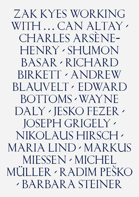
This approach should emerge clearly in the exhibition in course in Leipzig. Conceived as a participatory event, the exhibitions sees involved Can Altay, Charles Arsène-Henry, Shumon Basar, Richard Birkett, Andrew Blauvelt, Edward Bottoms, Wayne Daly, Jesko Fezer, Joseph Grigely, Nikolaus Hirsch, Maria Lind, Markus Miessen, Michel Müller, Radim Peško and Barbara Steiner in production of site specific work, as well as in a series of talks and lectures. The exhibition and the following catalogue (published by Sternberg Press) didn’t only show examples of incredible graphic design work from one of its most interesting practitioners, but also shed light on new kinds of collaborative and highly critical working methods that have become central for contemporary design practice.


Rujana Rebernjak

Share: Facebook,  Twitter  
05/03/2012

Werner Herzog at NYPL

Werner Herzog at NYPL

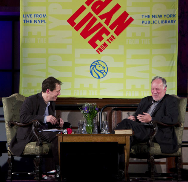
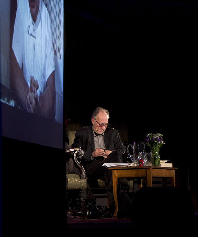
The last time Werner Herzog and Paul Holdengräber had a public discussion, the question was whether or not the 20th century was a mistake; this time around the jumping point was Herzog’s new film Into the Abyss, a documentary that examines America’s fascination with capital punishment from the perspective of a man who, in his words, “as a German, has no right” to condemn it. (Spoiler alert: he condemns it anyway.)

These two do not prefer to dance lightly.

Holdengräber and Werner have been friends for decades, and they treated one-another like two old comrades sitting next to the fire sipping brandy and trading war stories. The endlessly witty Live from NYPL director didn’t so much ask questions as poke at Herzog with a stick, which was good, because the filmmaker has a tendency to ignore questions anyway, preferring instead to go off on whatever happens to be on the top of his mind. There’s quite a bit up there—capital punishment laws, his childhood in Sachrang (“Snow is my element, mountains my landscape”), dragging a boat over a mountain in Fitzcarraldo (“I have a strong sense of feasibility”), his take on always playing the villain (“According to my wife, I’m a fluffy husband”), why he doesn’t go to museums (“They frighten me”)—and it’s highly entertaining to listen to him wander off on (seemingly) random tangents only to piece them together long after you’ve lost his trail. A man of contradiction (“I don’t like art. I am a soldier. That’s it. I am a soldier of cinema.”), he is a stoic realist but also heavily poetic. When asked whether or not someone can be forgiven for irrefutably heinous crimes, he casually replied, “Humans are capable of the most monstrous things, but they are not monstrous themselves.” I couldn’t help but think him pulling a gun on Klaus Kinski.

For all of his tenacity, it can also be a bit disconcerting to watch him work. (The audience did tense up when Herzog spun off-topic to talk about his admiration of Vladimir Putin, who recently repealed capital punishment in Russia.) Many things he talked about flew right over our heads (Mycenaean linear B script in five minutes, anyone?), but he’s less interested in making his audience understand what he’s talking about than he is with talking in front of an audience. At 69 he remains more curious than a giddy teenager about the inner-workings of the universe, and he sometimes appears dizzy with desire to share his knowledge with those lucky enough to get within earshot. “Give me Cormac McCarthy,” he demanded from Holdengräber at one point. “Beautiful stuff. He is the best living American writer.” He proceeded to read the final passage from McCarthy’s All the Pretty Horses before concluding the night with a scene of a Texas highway from Into the Abyss. How it all ties together is something I’m still trying to figure out, but it’s a fascinating thought nonetheless.

Lane Koivu – Images courtesy of Adam Kopysc

Share: Facebook,  Twitter  
02/03/2012

Tung Walsh / POP

Tung Walsh / POP

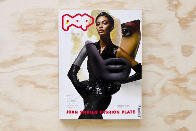
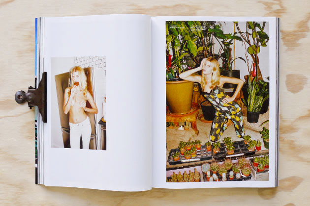
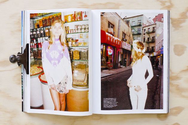
We were more than happy to see the newest spring/summer issue of POP magazine on the shelf of the bookstore, and indeed one copy of the fresh number landed in our office on a sunny spring morning.

The bi-annual POP’s number 26 is strongly present with its fashion editorials. Not a single editorial leaves you empty-handed, and the issue responds to various kinds of eyes for aesthetics with shoots from Emma Summerton, Tyrone Lebon, Hugo Tillman, Colin Dodgson, Danielle Levitt, Jamie Morgan, Viviane Sassen, Daniel Sannwald, Mel Bles, Mark Borthwick, Robi Rodriguez, Anthony Mayle, Max Farago and 2DM’s own Tung Walsh.

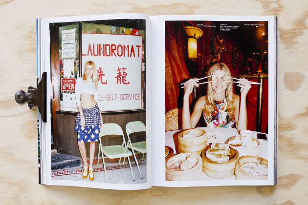
“POP Chinatown: New York” features Tung Walsh’s adventure with the model Maryna Linchuk from home to the Tom Sachs show “WORK” at Sperone Westwater gallery. The journey took them also around Chinatown’s streets and shops, mixing the Asian scenery with the gossamer clothing from Diesel Black Gold, Alexander Wang, Donna Karan, Marc Jacobs, The Row, Rag&Bone, Calvin Klein, G-star, Proenza Schouler, Michael Kors, Ralph Lauren and Altuzarra. The shoot is styled by Sara Moonves, hairstyling is by Tamara McNaughton, and the make-up by Ozzy Salvatierra.

Nora Stenman

Share: Facebook,  Twitter  
01/03/2012

The Change Of Luxury

The Change Of Luxury

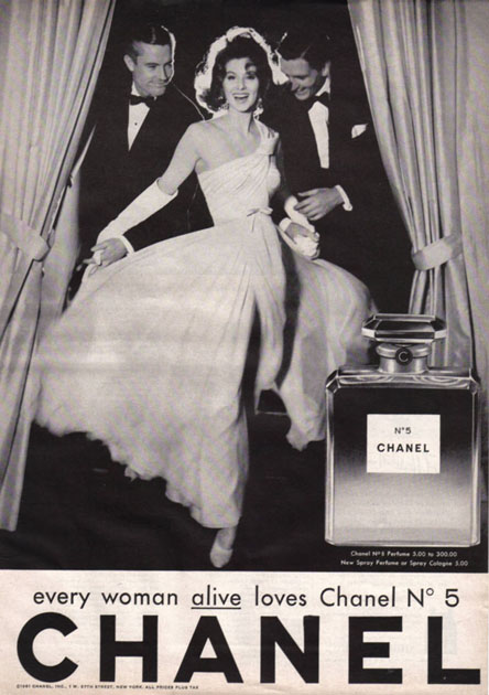
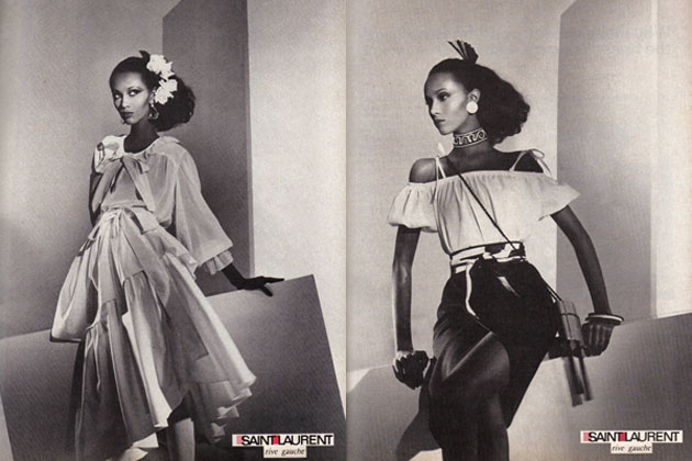
Gold, champagne and a recognized logotype on the inside of a handbag or craftsmanship, primary materials and history – luxury means different things to different people, and the view on luxury brands have changed over time as well. While big logotypes in shining metal on your bag, sunglasses or loafers mediated timeless style, success and the power of spending during the 90’s, the view on luxury have become subtler today. It is no longer only a high price that conveys status; time and knowledge are becoming as valuable, in particular among consumers, and brands can no longer depend on people’s wish to extend their self-image through an expensive logotype. “Gucci Gucci, Louis Louis, Fendi Fendi, Prada, the basic bitches wear that shit so I don’t even bother” might just be a line in a rap song, or it might give a hint of where the luxury market been heading. People are looking for something that makes them unique and stand out of the crowd and even though words such as inaccessible, limited and second to none are continuous leading stars, the necessity for it to be expensive isn’t as important anymore and customers might just turn to other markets to find what they’re looking for.

So how are traditional luxury brands supposed to react to the changes in the view of their segment? Some of them operate in their natural environments, presenting skillful craftsmen in their stores, creating something genuine and push for heritage, history and quality. Some of them have turned to social media to help tell their story and some of them make the two worlds blend perfectly. The digital world that a few years back was discussed as something that would kill luxury through making it accessible for everyone, is what today might save them. Brands are discussing strategies for how they can become within reach for more people while retaining a high quality, discussing how they can be accessible but exclusive. Some of them trust customers to choose them because they deliver what they always done; prestigeless quality that is available for a slightly higher price while others focus on overtop the expectations of the luxury consumer, at every level. What they have in common is that the majority of them mention their genuine history as the foundation of their branding strategies for the future.

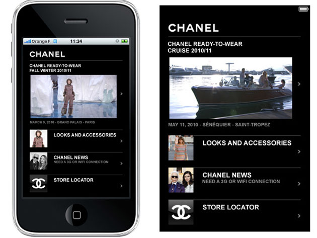
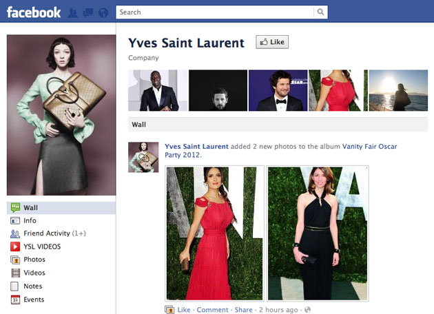
Most of the brands embraced the power of Facebook, Twitter and every other social media channel matching their target. Market researches show that high income earners, as well as the “regular” shopper, go online to see new products or learn more about a brand whether they in the end shop online or in a store, another reason to why it has been crucial for the luxury market to go digital. This pressure to be present online has though in many cases instead led to low quality content and a chase of likes and followers, resulting in a watered down message where the digital image of the brand doesn’t match the high end image conveyed through printed ads. Experts says that the solution is to make brands live their luxe life virtually as well as in reality, something that today is fully possible with technology that helps create real, customized digital content. Quick-made and poorly presented backstage videos or presentations just for the sake of it are no longer going to do it if you’re aiming at the self-centered and selective quality consumer. So which is the right way to go, the smartest line of attack?

Undoubtedly there is more than one answer to that question and luxury marketing have probably never been more complex than it is at present, but in many ways it has also never been as challenging and interesting as it is today.

Lisa Olsson Hjerpe

Share: Facebook,  Twitter  
01/03/2012

Sometimes She Disappears: Cindy Sherman @ MoMA

Sometimes She Disappears: Cindy Sherman
Cindy Sherman has played many parts over the years, Hitchcock lady, horror victim, Madonna, Monroe, low-brow actress, ageing socialite, and sun-burnt Beverly Hills do-nothings among them. A lot of what she deals with identity and gender, but a lot of it is also deliberately abstract and multi-faceted, which is why it’s always been somewhat difficult to keep Sherman pigeonholed in one camp or another for too long. She simply refuses to be pinned to one thing or another. It’s also why she’s so popular.

What has never been revealed is the real Cindy Sherman, and you’re certainly not going to find her here. Her expansive, brilliant retrospective at MoMA should instead be viewed in part as an exercise in mass identity contortion. Though you can see that iconic face in nearly every shot, at 58 she remains an elusive figure as ever.
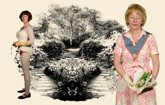
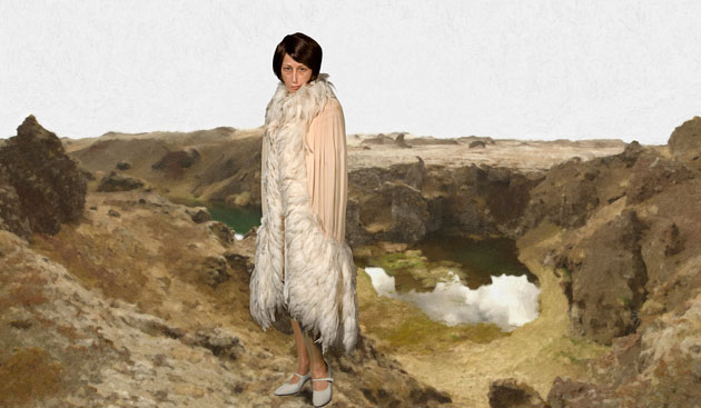
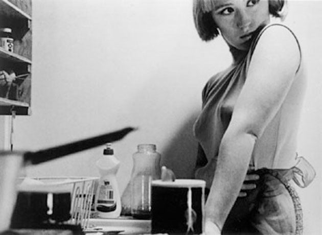
Sherman has long been in the business of deception and illusion, ever since she blew up with her Untitled Film Still, a brilliant 69-picture series from the late 70s that showcased many of the themes she would spend the next four decades exploring: gender roles, identity, voyeurism, exploitation, and consumerism. She executes in one frame what most filmmakers couldn’t dream up with three hours worth of tape. It’s impossible to tell exactly what you’re looking at. If born 100 years ago she probably would’ve been a rabbit-wielding magician in competition with Houdini, but in an era where media images are cropped and manipulated beyond recognition she is instead a modern trickster who utilizes photography as a way to showcase the unreliability of identity. Contrary to popular belief, the camera does lie―hers does, anyway―and often does so with an eye winking in the audience’s direction. The first thing you see off the escalator at MoMA are four 18 foot pictures of women dressed in what look like homemade Viking costumes, their facial features photoshopped just enough to make you cock your head. It’s funny, but not in a laugh-out-loud kind of way.
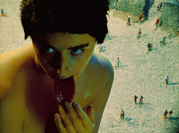
Artifice and irony have always bled through even her most serious portraits, though a large chunk of the opening afternoon crowd seemed to miss the inherent humor in her work. “That is disgusting!” remarked one young woman, notebook in hand, when she saw one of Sherman’s “LA women” staring at her, her tanned and sagging breasts all but dripping out onto the floor. Others could hardly stomach her late 80s work, one of the rare times Sherman stepped out of the frame and instead filled it with raw meat, cookies, vomit, and sunglasses to make some sort of comment on the AIDS epidemic (Untitled #175). A few people laughed when they saw Sherman playing Caravaggio playing Bacchus, wryly eyeing the camera with fresh grapes between her fingers.

How could you not?

Lane Koivu – Images courtesy of MoMA 

Share: Facebook,  Twitter