.
The Editorial: This Is A Work Of Art. Why?
“QUESTO È UN’OPERA D’ARTE.” “THIS IS A WORK OF ART.”
So says a blaring voiceover repeatedly as a small crowd gathers around two armchairs on wooden platforms designed by Gaetano Pesce. They appear to be straight out of Dr. Seuss, are highly derivative of his iconic 2010 “Senza Fine” line, and are occupied by two lounging nude models – a very busty blonde woman, and a muscular, long-haired man. Gaetano himself is there, mingling with the people who have gathered around mostly to catch a glimpse of the nudes, and perhaps to shake the hand of the celebrity designer who produced the pieces. But wait. “THIS IS A WORK OF ART,” the voice reassures us again. We’re not so sure…
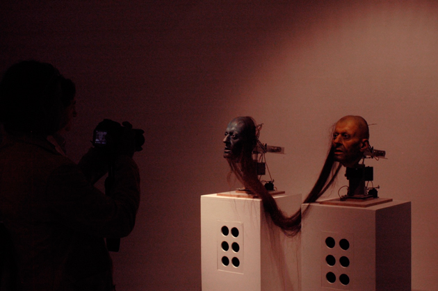
As part of Italy’s pavilion at this year’s Biennale d’Arte di Venezia, Pesce’s contribution was among the included works of several hundred others in the canon of contemporary Italian art. The pavilion is supposed to be a celebration of Italian art at the country’s 150th anniversary of unity, but it is mostly just a confusing mess. Now, nobody should fault the noble attempt to include the entire scope of art of a massive and diverse country like Italy. But many works of dubious quality were included, and each being in the context of so many others ensures that the importance of all of them is lost.
Some are claiming that what I’m calling a mess is instead an appropriate representation of the difficulty of Italy itself. The Franco-Italian critic Philippe Daverio had this to say:
“They are all together, gorgeous and ugly, in a populist and transversal exhibition. A community where everyone is a happy, participating member of the family… It is an exhibition which helps us understand how one makes inroads in Italy, and for this, the pavilion is the most anthropologically appropriate that I’ve ever seen in my life.”
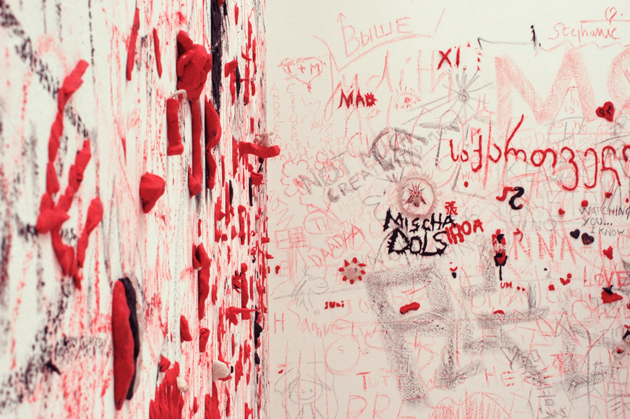
Perhaps. But Curation 101 dictates that a common thread – more elegantly a filo conduttore in Italian – is essential to any good exhibition. And when seen in the context of the American, Danish, Russian and several other strong pavilions this year, Italy’s misses the point entirely and is more likely representative of the lack of a clear idea for what Italian art should be. If this exhibition’s common thread is none other than “a bunch Italian of artists,” it says nothing.
Art itself has gone through quite a tumultuous period over the past several years. With infinitely easier access to images, art texts and art culture, it seems like everyone is calling everything art. The proliferation of e-art and the word “art” and vague ideas of flamboyancy as art appearing even in the most mainstream of pop culture, everyone is now “into art.” The problem is, pop culture is by definition superficial and transitory. Art cannot be – yes, pop art is art, but art is not pop.
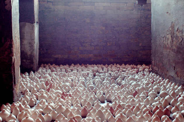
The Italian pavilion – and the inclusion of a piece of design by Pesce, an easily recognisable name the curators believed might lend credibility to their show – is surefire proof that we are rapidly losing sight of the pivotal and important roles art plays. We frequently allow quantity to win out over quality and for art to be confused with several other things. In the case of Pesce and his work, we elevate a random piece of design to the exalted status of art. Why?
Design may sometimes do the same things as art, but its primary goal is practical. Design is none other than the improvement or changing or re-shaping if the environment with which we interact – aesthetics play a role, but only insofar as they affect experience. Design must change behaviour and enhance lives.
Art must change minds. Art must beg questions. Provoke. Challenge. It can be wholly impractical. It must provoke thought and discourse. Impractical, whimsical design is not art. It’s probably just bad design.
With that in mind, we have nothing against Pesce as a designer. His design work has been influential and imaginative. And his recent and very powerful installation for the Triennale “L’Italia in Croce” (“Italy Crucified”) was strong sociopolitical critique and a symbolic lament for a country he clearly loves – that was much closer to art. But with some odd-looking armchairs that are heavily related to pieces he’s already commercialised, he most certainly can’t accomplish both. Like the designer he is, while he mingled with the crowd, Pesce talked up the materials the chairs are made of – not the statement they make nor the significance of the piece itself. Despite what the voiceover said, they are not works of art.
Tag Christof
