30/06/2011

Wheel Of Nutrition

.

Wheel Of Nutrition

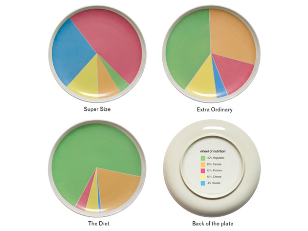
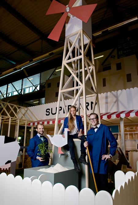
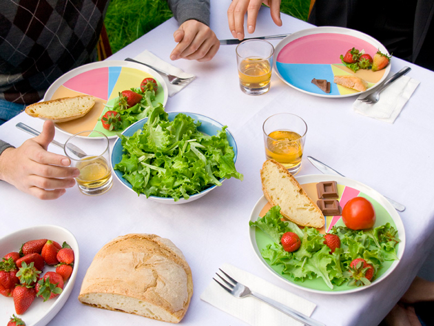
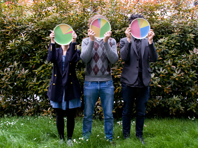
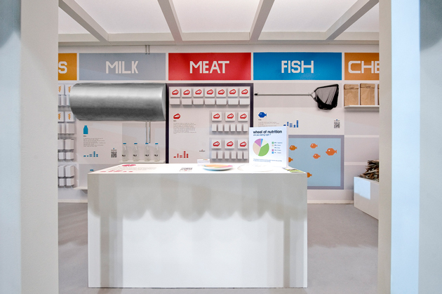
We first came across Wheel of Nutrition at this year’s Fuorisalone as part of the excellent Superfarm project. A novel and deceptively simple idea, Wheel of Nutrition is a plate whose pie-chart decoration makes for a clever dietary guideline and game. While it might seem counterintuitive that a straightforward graphical solution can compel change, designers have recently found, for instance, a huge behaviour-bending potential with engaging graphical interfaces to encourage drivers to use their cars more economically (driving becomes a race to ‘green’). So, it stands to reason that when a meal feels like a game, there is increased incentive to eat according to the rules. And because the plate’s guidelines are more a playful suggestion than a forced imposition, the fun of eating remains fully intact.

As diabetes and obesity ravage both developing and rich nations, the imperative to create creative, engaging solutions for the world’s dismal eating habits is intensifying. Designers Rui Pereira and Hafsteinn Juliusson (whose intriguing growing jewellery we saw at Instant Design in February) in collaboration with Joana Pais, who are behind the plate (and Superfarm) are leading a charge for their generation. With Wheel of Nutrition, they’ve had very positive feedback from around the web, and the plate has even been given the thumbs-up by nutritionists and doctors. (Well done!)

And in a rare feat for a design introduced at Fuorisalone, Wheel of Nutrition is going into production in Diet, Extra-Ordinary and Supersize. The designers will get their hands on the first factory prototype by weeks’ end, and beginning in September it will be produced in Portugal and distributed by Iceland-based HAF.


From now on, it’s definitely okay to play with your food.

Tag Christof – Images courtesy Rui Pereira and Superfarm

Share: Facebook,  Twitter  
29/06/2011

U Barba

.

U Barba

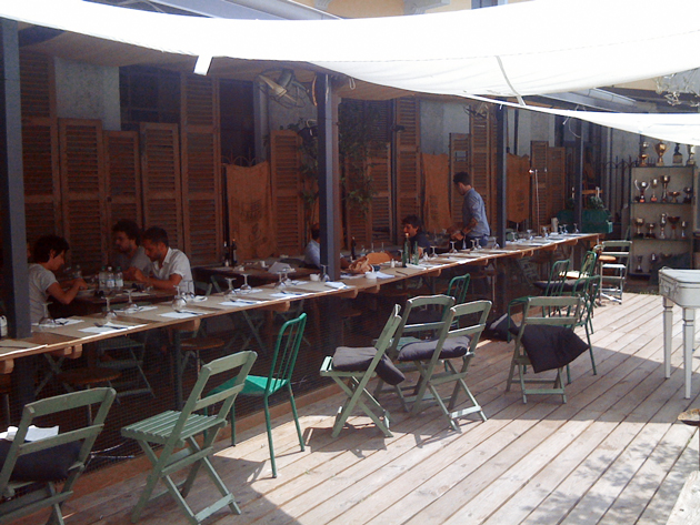
Just past its first birthday, Osteria U Barba has become an unqualified smash hit in the Milanese food scene. Booked solidly every night since its inception, its influence has surely but steadily grown. It has even managed to wow a certain correspondent of a very influential, rather selective lifestyle and affairs publication with a glossy black cover (you all know the one), and landed itself a feature inside. The rest is history. And ever since, the restaurant tucked into an unassuming neighbourhood between Corso Lodi and Viale Liguria whose name means “uncle” in Ligure has quietly become a destination unto itself. The place is that good.


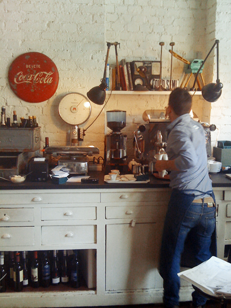
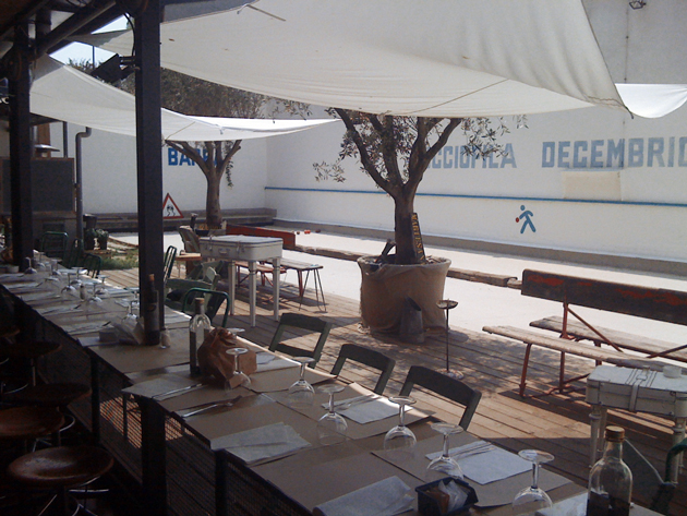
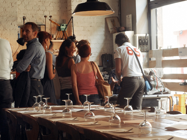
U Barba’s atmosphere is fantastic. It’s warm and unpretentious, yet young and unselfconsciously chic – it feels like a cross between a trendy Copenhagen café and one of LA’s many haute-natural hotspots. It’s spacious and airy, with a sprawling table flanked by lovely curvy chairs (whose designer we weren’t quite sure of) as its main room’s centrepiece. Lots of well-worn wood. Whitewashed brick. Thonet replica chairs painted battleship grey. And a cozy courtyard complete with a campo di bocce (pétanque court) that is, at least during the lunch hour, flooded with sunlight. This is exactly the kind of place Milan’s stuffy gastronoscene could use more of: social, fresh, inviting.


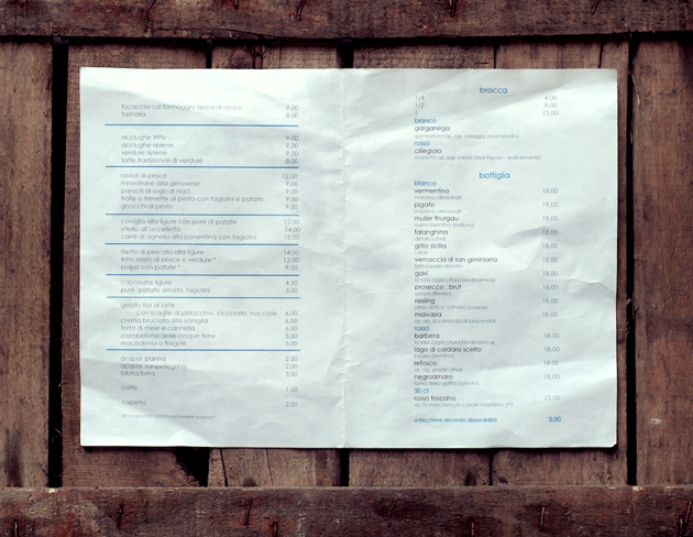
The fare is deceptively simple. Classic Ligurian dishes with high-quality ingredients and clean, straightforward presentation. The Blogazine lunched there yesterday (inside, to avoid the heat), where we enjoyed our lunch over a couple of nice imported beers, and finished off with gelato with neat garnish cups of nuts, pistachio and chocolate shavings. All come highly recommended. And dinner, apparently, is stratospheric – just make sure you make reservations in advance!

We had a lovely chat with one-half of the partnership behind the restaurant, where we talked food, architecture and Milan’s future. And we learned that there could just be a second (or third!) U Barba in the works for another lucky city around the world. London? Barcelona? Yes, please!

Tag Christof – Special thanks to Quanshang Pua Ra Do

Share: Facebook,  Twitter  
28/06/2011

Guest Interview n°29: Jack Skuller

Guest Interview n°29: Jack Skuller

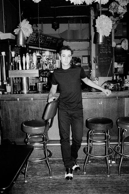
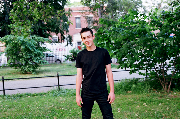
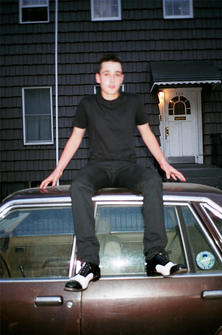
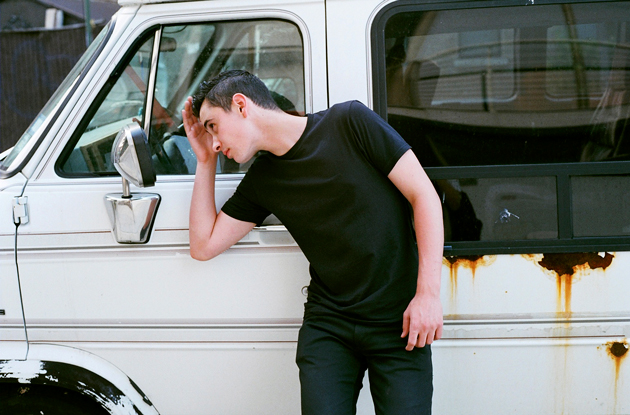
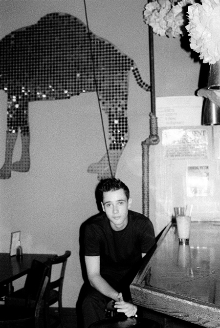
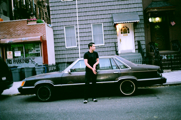
Jack Skuller is on fire. He made waves last year with his toe-tapping, singalong single “Love Is a Drum” and has just followed it up with the every-bit-as-catchy “Secondhand Smoke.” His music is pop in original sense: engaging, approachable and instantly classic. The Ruckus hailed him as the “Anti Bieber,” and he certainly provides refreshing relief from the leagues of overproduced marketing machines that have ruled the international pop airwaves recently. He’s lightyears away, and is a stellar musician first and foremost.

Combined with his addictive rhythms, uncanny knack for songwriting and good looks, we’re convinced Jack’s going big places. 2DM photographer Roberta Ridolfi spent an afternoon with Jack – and they got on famously. With The Blogazine, Jack talked musical style, his favourite album of all time, and life in Jersey.

I hear a modern-day Ritchie Valens in your music… but you’ve been called a mini Jack White! So how would you define your style?
I am simply a rock and roll artist with a 50’s twist. There is a lot of blues incorporated into my writing and melodies and it mixes with modern rock and roll, which is what you are hearing.

And how do you feel about being called the “anti-Bieber”? (We’d feel pretty good about it!)
Well, I never know if it’s good or bad! (Haha) To be honest, I never really focused any of my aspirations on becoming the “anti-Bieber” nor the “next Bieber.” Our music is completely different from one another’s – we’re musically in separate galaxies!


And who do you consider your greatest musical influences?
There are so many that I can’t even name all of them! But some of my biggest influences are definitely Elvis Presley, Eddie Cochran, Little Walter, Black Rebel Motorcycle Club, and The Kills. A wide range of music I just covered, I know… Some may call me a hybrid!

Dream collaboration?.
A blues covers album with The Black Keys or Jack White.

How do you listen to music? Vinyls? iPod?
Great question! My family owns a lot of vinyl, but I usually use my iPod or my laptop.


What’s your favourite album of all time?
The Beatles’ Revolver

Let us in on your songwriting technique. Does inspiration flow when you sit down with your guitar, or do ideas strike more randomly?
It’s both. Sometimes I’ll think of a melody or a chord progression based on how I’m feeling and then the lyrics just write themselves. Other times, I’ll have an idea and just sit at my desk and go nuts on the paper. Most of my songs come from real experiences.

If you could choose to live in any era, when would it be?
Without a doubt, the 50’s – first generation of rock and roll!

Tell us a little about life in Jersey!
It’s splendid. I’m 10 minutes away from New York City, where most of my gigs are. I love school and my friends are so awesome and supportive.

How do you spend your time when you’re not rocking out?
I’m usually writing, rehearsing, running, playing basketball or baseball, or completing an assignment for school. But I don’t have to do that again for a while since I’m on summer break!!

Tag Christof – Very special thanks to Roberta Ridolfi / 2DM


Share: Facebook,  Twitter  
28/06/2011

Sportswear International / Jolijn Snijders

.

Sportswear International / Jolijn Snijders

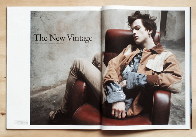
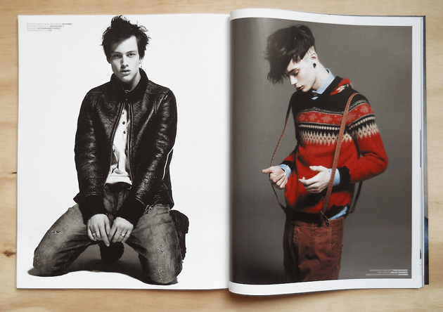
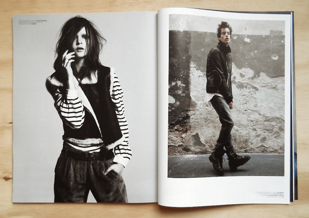
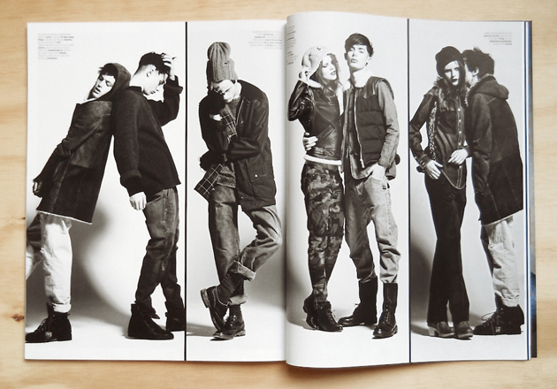
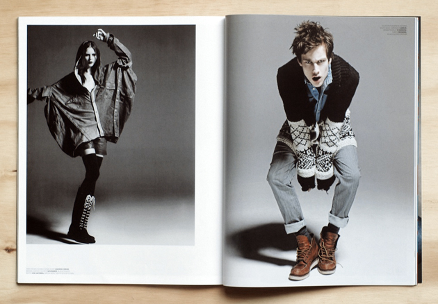
2DM’s Jolijn Snijders did an editorial for the latest issue of Sportswear International, the compass of the ever evolving world of sportswear. Aptly named “The New Vintage” the twelve page spread codifies the new-old influences in active wear. In this ever changing world of fashion where things need to be new to be hip, the need to look back in time for inspiration is inevitable. With fresh faces Sylvester at FM, Simon at Major and Irma at Why Not bring the edgy editorial to life the nuovo/retro influences in sportswear could not be more emphasized. If looking back is a step forward then sportswear seems to be making 360’s to keep us charmed.


Labels, quick to cash in on the sportswear phenomenon have been churning out active wear like newspapers at a printing press. The industry has grown in colossal measure over the last two decades. Though, who’s to say this is such a bad thing… In today’s style market, its safe to assume there is a market for all good things, and if common sight on the streets are anything to go by, sportswear is one ginormous market. Sportswear hitting the street has grown beyond chavs and pimps, as a quick browse on The Sartorialist or a stroll in Milan during fashion week will confirm. A trainer under a flowing dress is actually quite hip. Yet at the same time youngsters in their baggy tracksuits and jumbo sneakers are also a by product of this fad, but then again isn’t fashion all about the hits and misses?


Fashion includes Burberry, Fred Perry, Meatpacking D, Levi’s, Diesel, Paul Van Hagen, FILA, Jucca and others.

Killer job, Jolijn!

Daniel Franklin

Share: Facebook,  Twitter  
27/06/2011

The Editorial: Fashion Kids

.

The Editorial: Fashion Kids

Fashion is a canvas for wild experimentation. It is the single most tangible cultural lever by which we move forward in our relationship to the world. And in relation to ourselves and one another. Fashion is a harbinger of change, a powerful barometer of society’s mood, and a temporal definition of taste. Despite its seasonal direction changes, fashion opens the world progressively, and in a remarkably structured way. Compare the brilliant men’s collections we saw in Paris and Milan this season to the uniforms of the Mad Men era, or even Wall Street’s extroverted reign over the 1980s, and it becomes clear how drastically men’s role in society has evolved. Everyone’s role in society has evolved drastically. But, kids?

It goes without saying that fashion exists to break rules. We need fashion to fill that function. But as product design, architecture and other related worlds have progressed from styling-for-profit-driving to bastions of good ethics, fashion has stayed behind in several places it should be well ahead of the curve. Sweatshop labour abounds even today, fast fashion is raising serious issues of waste, and even the most prestigious labels can be less than forthcoming about their production practices. These are all, of course functions of the fierce competition brought on by globalisation.

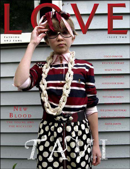
But in terms of fashion as a cultural force, the role of children has become a tenuous one. Not kids in sweatshops (although they are certainly a far more serious problem), but the junior fashionistas and talented young personalities who are capitalised upon by fashion for their recognizability and youth. The awkward and bespectacled mini-savant Tavi is, of course, the epitome. A few years after her she gained notoriety through her very well-written blog (she’s now 15 years old), she has become a full-fledged force unto herself (her “press” person once brusquely blew me off). And much to the chagrin of several of her (much) older colleagues, she has been snapped up by the industry as a sage and muse. But, did she ever have a childhood? She certainly didn’t have a long one. But her age creates buzz. She sells magazines. She’s good business.

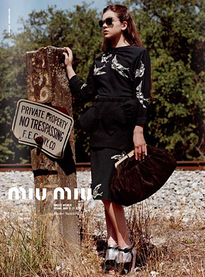
Prada has just made Hailee Steinfeld the new face of Miu Miu, and instantly at 14, she’s to become a full-fledged icon of her time. Now, exploited is certainly too harsh a word: these kids are anything but mistreated. They’re swathed in lavish outfits and marched around like the mini superstars they are. But the whole song and dance seems suspiciously like a highly calculated ploy in which marketers (and not designers) are grasping at anything out-of-the-ordinary for leverage in their brand-building wars. It’s like, “Flat, curvy, ethnic, strange, plain, ugly and extreme have all been done. So… um… how about kids?”

The problem is, using a kid as a marketing tool is slippery slope. Parents react strongly. And marketing tools, by nature, are designed to compel certain behaviours. Namely, consumption, adoration, reverence. What happens to the kids’ peers and their distorted worldview? Entirely separate from the wrongheaded Puritan diatribes about skinny models driving eating disorders and body image problems (that’s like saying advertising delicious food causes obesity, shitheads), throwing a kid into a mix changes the playing field. Tavi’s smart. Hailee’s a brilliant actress. Both are prodigies. But a prodigy in music or mathematics and a prodigy as marketing tool are drastically different. And precisely because fashion is a manifestation of our deep social and cultural conscious, maybe we should think a bit harder about what our new obsession means.

Maybe it’s just an uncomfortable inversion of the system. Maybe the beauty of youth is just too beautiful to ignore. Maybe we’re opening doors for new forms of expressions in fashion. But even in fashion, where most things should never be off-limits, there should be some room for the sacred. Maybe we should just let the kids be kids.

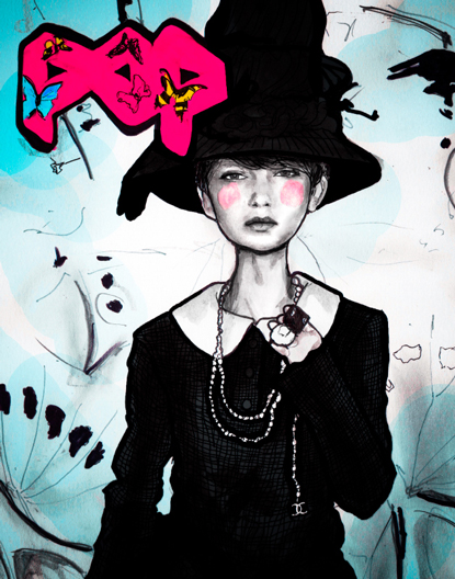
Tag Christof – Images courtesy Pop, Love and Miu Miu

Share: Facebook,  Twitter  
24/06/2011

Hello, Paul Barbera!
Hello, Paul Barbera!

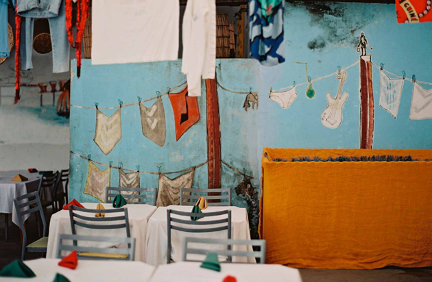
With all the warmth and feeling of his photographs, we welcome photographer Paul Barbera into the 2DM family. The Australian (and recent New Yorker) with Italian roots has crisscrossed the planet on a career that, beginning behind the viewfinder of a bulletproof old Minolta, has gone on to take him to exhibitions around the world and work with an impressive client list. He’s also quite the accomplished portraitist.

Paul has also forged several impressive collaborations. He uses the web extensively to collect and curate, and is behind the sweeping and evocative internet projects “Love Lost” and “Where They Create” (and we learned in this interview that he’s also behind “Where We Collaborate” and “Stuff People Send Me”). It the effervescence of Paul’s work’s and warm energy, though, that best communicates his strength as an artist. And we’ve known few photographers who can better inject positive emotion into a place. We’re thrilled he’s joined us.
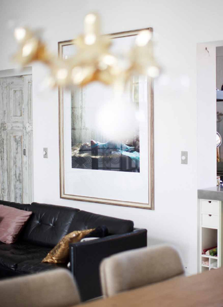
Describe your relationship with photography. What was your first camera?
My first memory is of a Polaroid camera at 8 or 9 years old. But it wasn’t until I was 15 or 16 that I tried to control what I was trying to put into the frame. I used a Minolta SRT 101. It was the first time I found something that made sense to me, because I struggled with school. The Minolta was actually my father’s camera and I am certain that I wouldn’t have a relationship with photography if it wasn’t for him. He was born in Sulmona and came to Australia at 24. He worked as a motorbike mechanic but in his little spare time he not only practiced photography but also painted, did woodwork and made metal sculptures. These were technical, creative and practical skills which my brother, who is a furniture designer, and I inherited. We were given the opportunity and chance my father never had, so the foundation of my craft is somewhat of a legacy that was seeded by my father and my relationship with photography is bigger than me.
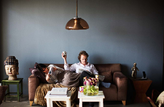
And what are your weapons of choice these days?
When I was younger, I worked in a camera shop and spent all of my wages on new cameras and equipment. I don’t do that anymore. In fact, the camera is not the centre of my work – my kit is very minimal – but rather, it is part of a process that I have been refining over the years so that everything I deliver is consistent in quality.

You are primarily an interiors photographer, but you also do fantastic portraits. How did you arrive there instead of becoming, say, a fashion or landscape photographer?
I think interiors found me. I spent many years exploring different genres and I have a website of this work. However, interiors always seemed to follow me around and it always felt effortless and easy so I never took it seriously at first. My good friend Edson Williams (who was also my agent for ten years) always told me to focus on interiors but it wasn’t until three years ago that I felt I was comfortable doing this and everything has fallen into place ever since. Before, I was doing some great projects and traveling a lot but now there is a new calmness and focus in my life and work.
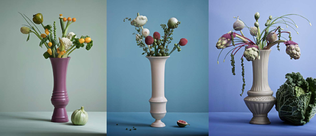
How are you able to infuse such energy into your interiors and still-lives? We’ve remarked that you have a rather warm sensitivity towards objects and spaces…
I have learnt to trust my instincts after 20 years of shooting and that allows me to work naturally and openly because I’m actually a very energetic person and I’m constantly seeking new experiences, people and spaces. I get bored easily!

Tell us a little bit about your side projects “Love Lost” and “Where They Create.” There’s a monograph in the future for at least one of them, right?
Both are personal projects that are very close to my heart which I have self-published online. I tend not to talk about Love Lost in terms of what it is about. But I do envisage it evolving in a new direction in which I use actors and singers to create intimate portraits which can be published as a book one day. Where They Create comes from a very natural place because it comes from my travels and my interactions with a city and the creatives that I meet. About a year ago, I went to Frame magazine to shoot them as part of the blog and they ended up offering to publish it. It’s now coming out to bookstores in July.
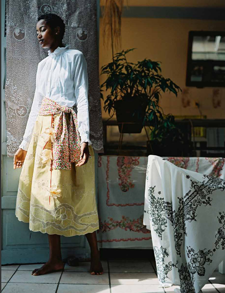
What’s it like to be a cosmopolitan Australian? Is there a certain mark your home culture has etched onto your creative spirit?
Nice question! I think Australia as a ‘new world’ country sometimes lacks a sense of heritage but there is also freedom in that. For me it was important to live abroad to understand what this heritage meant to me, so one of the first places I moved to was Italy. I’ve also lived in Berlin and Singapore and for the last 10 years I’ve been working between Amsterdam and Melbourne. I think most of my Australian friends have lived and worked abroad because you feel a bit disconnected from the cultural capitals of the world because of our geographic location and when you return home, you seek to bring the best of what you experienced back home. I think Melbourne is the cosmopolitan capital of Australia. It’s got some amazing restaurants and there is room for innovation.

You’ve done a lot of work around Milan’s design scene – you’ve photographed Rossana Orlandi, Rosselini Missoni, Tom Dixon, Ross Lovegrove and others here. How do you feel about the city?
I love Milan, I really enjoy it when I visit. Compared to Rome, Milan is less chaotic. However it is also weighted down by its past – you see it in the advertising, film and culture. There is good side and negative side to this. I feel in the years to come, Italy will have a big shake up, as the next generation fight for more opportunities and possibilities. Italians are capable of greatness because there is a such a strong history of innovation and exploration. That’s why the great designers you mention descend towards Milan.
Sources of inspiration? Favourite photographers (besides yourself)?
As far as inspirations go, it changes I tend to look outside of photography. But I love the work of Martin Parr and Richard Kern an Australian called TIM RICHARDSON, there is too many to mention, i keep everything i want to share and remember on a site called Stuff People Send Me.

And why the big move to New York? Where in the city will you be living?I just arrived yesterday but it’s taken 6 months of planning to make it happen. I wanted to move here for many years for professional and lifestyle reasons and we’ve found a cute place to live in the East Village.
What do you do when not behind the lens?
I am behind my computer! I’m always planning and editing, there’s so much to do behind the scenes. But outside of work, socializing, family, watching documentaries, listening to podcasts on science and culture, cooking, enjoying coffee and spending time with my partner fill what gaps are left. I have to say in many ways my life is my work and vice versa.

Tag Christof – Very special thanks to Paul Barbera
 

Share: Facebook,  Twitter  
24/06/2011

Art Basel / Francis Alÿs’ Fabiola

.

Art Basel / Francis Alÿs’ Fabiola

The 42nd edition of Art Basel, the art world’s most prestigious fair, has just closed its doors with a great final act. The number of visitors and sales has improved over last year and it’s been said that the art market has once again hit a stride reminiscent of 2007-2008. Maybe it is an illusion, but the huge amount of people (and especially buyers), who invaded Basel last week are a clear indication of an art market recovery.

In any case, Art Basel is not only about the market, and during the fair, visitors can have a relaxing break from ‘fair stress’ profiting from the outstanding summer exhibitions proposed by the numerous art spaces in the city. This year, in addition to the wonderful exhibition by Brancusi and Serra at Beyeler Foundation, Shaulager presents, at Kirschgarten Haus, an unusual project by Francis Alÿs enitled Fabiola.

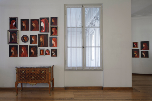
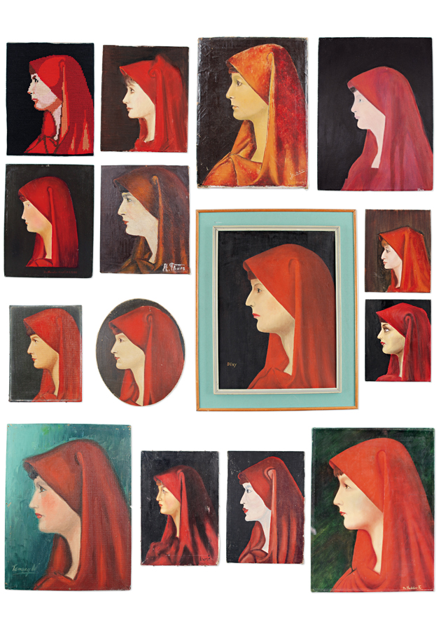
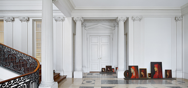
The contemporary Belgian artist, who lives and works in Mexico City, instead of displaying his videos, drawings, paintings or photographs decided to exhibit his own unique collection of around 370 Sunday painter, amateur and professional reproductions of Jean-Jacques Henner’s 1885 portrait of Saint Fabiola. (He is truly a versatile artist!) The collection is the result of about 20 years of flea market and antique shop searching that the artist carried out to find portraits of the Christian saint known as Fabiola (d. 399 AD).

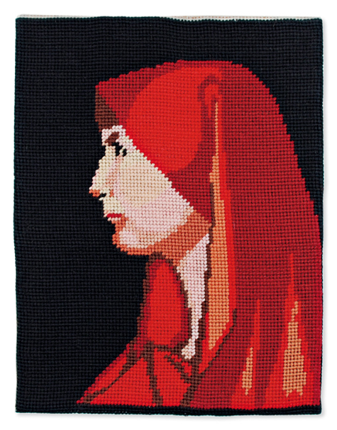
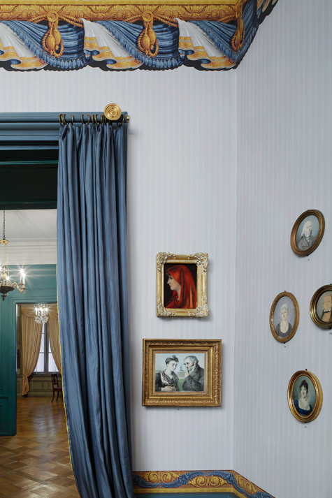
Even if, at first glance, all the portraits seem similar – in each one the Saint is depicted in profile, turned to the right, wearing her red-purple veil – on closer examination, you can see many variations. Unique versions made on canvas, glass, wood and even realised with painted sesame seeds have different colour intensity, frames and textures, but also features and expressions that draw the attention to the details, sometimes subtle, which renders the portraits hypnotic. Drifting around the house, visitors can see the pieces arranged among the objects – porcelain, furniture and toys – of 18th and 19th century domestic life. Aligned in galleries or disposed as ornaments, the works sparks off a sort of game to find all the clearly visible or hidden pieces. Iconic representations of saintliness with all their religious references overwhelm the house in a way that recalls pop culture reiteration of images, giving them new meanings and creating an atmosphere of dialogue between sacred and popular.


Alÿs’ project represents a change in the act of collecting, which is more comparable to a sort of fetishism that comes close to obsession of the icon itself. Using this curious monographic collection that looks like a collective work, Francis Alÿs underlines the distinction between kitsch and valuable, original and copy, anonymous people and famous artists’ production and, of course, the role and structure of market and the issues of authorship.

Even If you missed Art Basel, it’s still worth a visit to the city to discover its cultural offerings, and the exhibition will run until August 28.

Monica Lombardi – Images courtesy Shaulager

Share: Facebook,  Twitter  
23/06/2011

The Adam & Eve Projects

.

The Adam & Eve Projects

The Adam & Eve Projects takes the hazy idea of the “creative collective” to fantastic new heights. At once a sort of borderless community for our generation’s most influential creatives and a display case for their work and ideas, the initiative includes “the most exciting and important shapers and definers of our cultural landscape” In the collaborative spirit of Wonder-Room, the project draws on particularly relevant talents to produce a body of projects, and in the process becomes a fantastic cross-section of the creative landscape as a whole. It’s like a 21st century salon, with big ideas and lots of rule-breaking. Except cooler.

No medium is off limits, and contributors span the entire creative spectrum, from musicians to architects, to filmmakers, artists, fashion and industrial designers, and illustrators. Both individuals and organisations take part. New talents join regularly as the project’s influence grows, and the discourse and scope only makes it more interesting. In some cases the work created is even for sale (especially from the fashion designers), and the site is also a great place to score some seriously distinctive bespoke fashion.


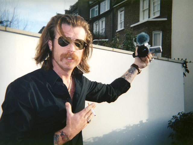
Three of 2DM’s photographers are actively participating in the project. Skye Parrott, well known for her emotional snapshot photography, has contributed quite a bit (see her stream here), and her magazine Dossier Journal also contributes regularly. Roger Deckker, in his project billed West End Artisans, shot badass Jesse Hughes from The Eagles of Death Metal in grainy, tactile film. Roberta Ridolfi is also slated to contribute, and after her recent and fruitful stay over in New York she certainly has something good in the works. Other photographer participants in the project include our recent acquaintance, the very talented Kuba Dabrowski, as well as Ari Marcopolous, Nick Night, Cass Bird, and others.


Beyond photography, other contributors include lovely British design duo Jamesplumb, who we met at Spazio Rossana Orlandi for their solo exhibition there late last year, architect extraordinaire Bjarke Ingels, designer Sarah Applebaum, A.P.C. creator Jean Toitou, and way too many others to mention.

We’ll be watching closely!

Tag Christof – Images Skye Parrott & Roger Deckker courtesy Adam & Even – Special thanks to Scott Woods

Share: Facebook,  Twitter  
22/06/2011

Guest Interview n°28: Rosaria Rattin / Kose

.

Guest Interview n°28: Rosaria Rattin / Kose

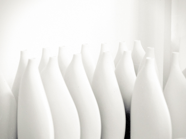
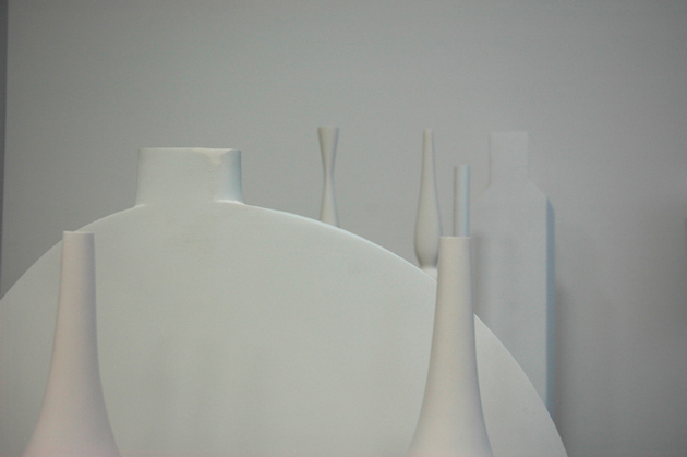
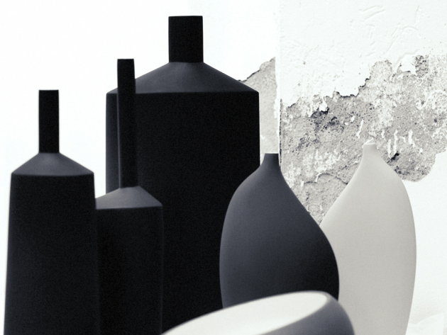
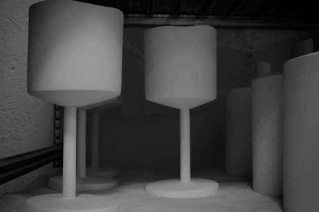
Rosaria Rattin is an intensely sentient being. Truly straddling the line between designer and artist, she charges her objects for Kose with deeply social, political and human questions. Their provocation, however, is brilliantly hidden behind their minimal forms and delicious tactility. Along with her partner Graziano Azzolini, she has built the entirely artisanal brand from the ground up based on a belief that the value of handcraft is an indispensable tool for humanity going forward. She began her design career at Max Mara in an era where fashion was an entirely different animal, and her work for Kose continues to be informed heavily by her roots in style.
Rosaria is proudly Italian and hopeful for her country’s future. She is a visionary, and like every great designer, is possessed of an intense curiosity and humanity: strong, single-minded, critical, intelligent, and a voracious connoisseur of knowledge.
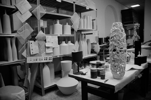
The Blogazine had the pleasure of spending two afternoons in Kose’s Milan studio, where we talked everything from form-giving and the importance of materials in design to Italy’s future, humanity’s past and the power of childhood…

Kose pieces are entirely handmade, unique objects made using “ancient handicraft techniques.” Share with us a bit the story and idea behind the company.
I’ve always considered the “human animal” a marvellous wonder of Nature. A mammal that evolved being able to transmit a thought, a feeling, emotions through words and through doing. And throughout their history, humans invented and passed down through memory their discoveries, their personal thoughts, their personal experiences… the very essence of the experience of life. This all in a constant labour to continually evolve, for posterity’s sake… small beings for a big Being.

I wanted for this reason to recapture ancient memories of “artisanal technique.” Those that came about in the 3rd millennium and were such an integral part of human life .. The artisanal is considered old-fashioned in a society that tends to simplify an few groups and homogenise everything in the name of industrialisation and mass consumerism. A rebirth of the artisanal is, in my opinion, a recuperation of memory and history. The recovery of uniqueness of the individual, of thought, of emotion and of sentiments.

Every Kose object transmits a part of the person who designed it, worked-over and even loved it… because clay (earth), you must handle it with care. You must touch it with sensitive hands and care. Otherwise, it breaks.

Since handcraft is inherently “anti-design” because of its opposition to mass-production, what is Kose’s design process like?
I wanted to demonstrate that the “antique,” if brought up to date is modernity itself. Design. Because man’s evolution has been to constantly “modernise,” humans through their constant pushing forward make projects in the present that… well, they become the future!

Their pared down simplicity recalls Japanese and Scandinaian aesthetic – but also perhaps Lino Sabbatini’s metal work. What are the inspirations for their forms?
The simplicity of the objects in the Kose canon represent for me a love for the elemental. The nature of objects. The flow of thought without , and beauty that is always extremely natural.

The process that goes into creating objects for Kose is a storytelling of emotions. And Kose objects are principally cities. The Note line is New York, and the Geometrie line is Berlin… Their “peripheries” (in both a physical and contextual sense) represent an end to the industrial age…

And the materials used? Glass, wood… even gauze. Why these in particular?
We use earthen clay, wood, glass, gauze for texture… quite simply because they’re natural. Natural compliments people. Natural for the people.

What do you think the future holds for handmade?
I think that handmade is the future. For decorative products it is a gift of uniqueness to another uniqueness.
I also believe that for a more “correct” trajectory of our species – and I consider global to include both the world and the entire universe – we must re-appropriate, take back for ourselves “doing,” “making” in order to reacquaint ourselves with… ourselves! To recognise ourselves. And to truly create.

Tag Christof – Very special thanks to Rosaria Rattin & Graziano Azzolini

Share: Facebook,  Twitter  
21/06/2011

Under Current 5 / Biblical

.

Under Current 5 / Biblical

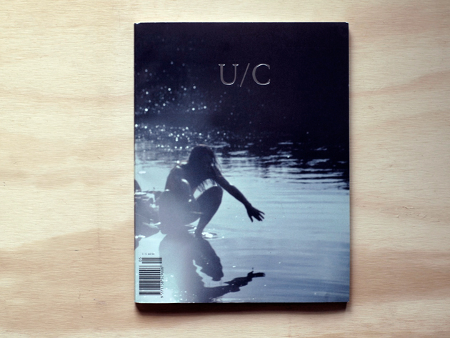
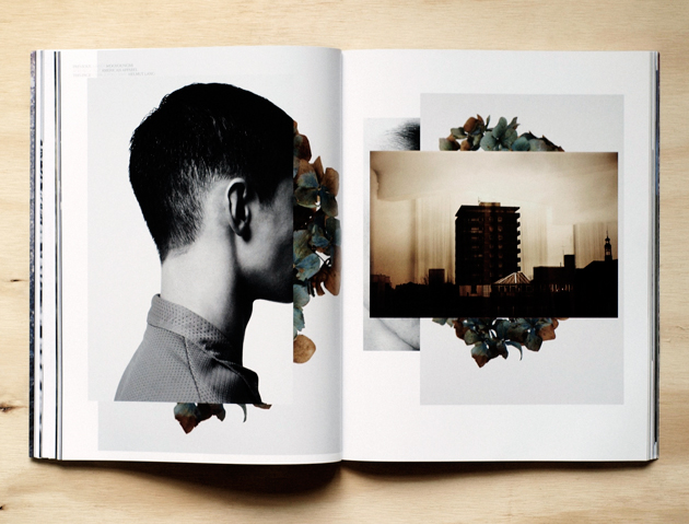
From an undercurrent of Biblical proportions comes the latest issue of Under Current.

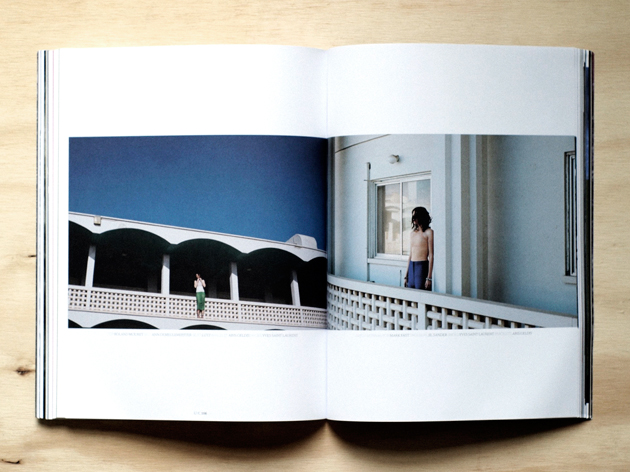
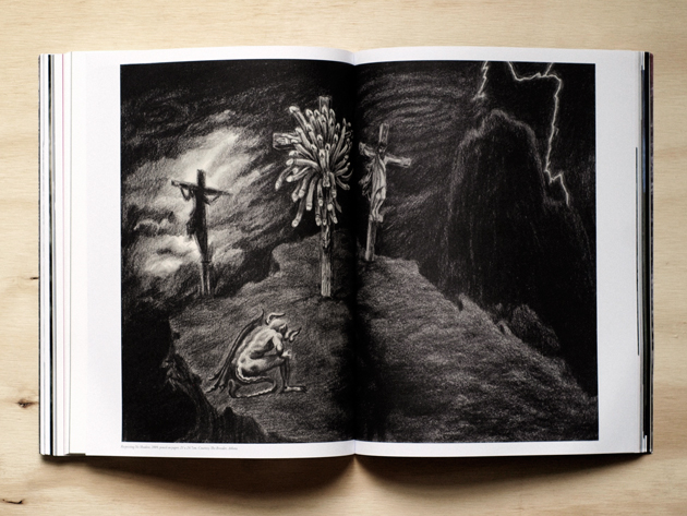
This fifth issue pays tribute in its own, unorthodox way to the victims of the recent disasters in Japan. Billed “Biblical,” it muses on themes ranging from Genesis to biblical mysticism. It is perhaps the most beautiful, and certainly the most impacting work from Under Current so far – it comes as close as possible to being an emotional experience. Haunting, evocative and complete, we cited it in our editorial yesterday as being among the current magazines that, like good albums, manage better than any to distill a mood and a moment into a bound, timeless volume.


In addition to its excellent, somewhat minimal art direction (with a particularly gorgeous selection of fonts) from Daren Ellis & Josh Hights, photo editor Daniel Sannwald chose a sweeping selection of images from the likes of Mel Bles, Mark Borthwick, Ronald Stoops and others. Taken together, they paint a picture Biblical picture of solitude, conflict, and emotion. Artist contributions include the fantastical collage work of Hans Weigand and the very of-the-times sculpture work of Nick Kosmos and Daniel Keller. Other contributors include Vivienne Westwood), filmmaker Bruce LaBruce, sculptor Josh Baum, gallerist Maureen Paley, and filmmaker Ruth Hogben (of Gareth Pugh fame).

Despite its seemingly tired theme, the issue manages to come across subtly and powerfully. We’re eager to see whats next from them.

Daniel Franklin & Tag Christof

Share: Facebook,  Twitter