31/05/2011

Mayami Son Machín / Gallery Diet Miami

.

Mayami Son Machín / Gallery Diet Miami

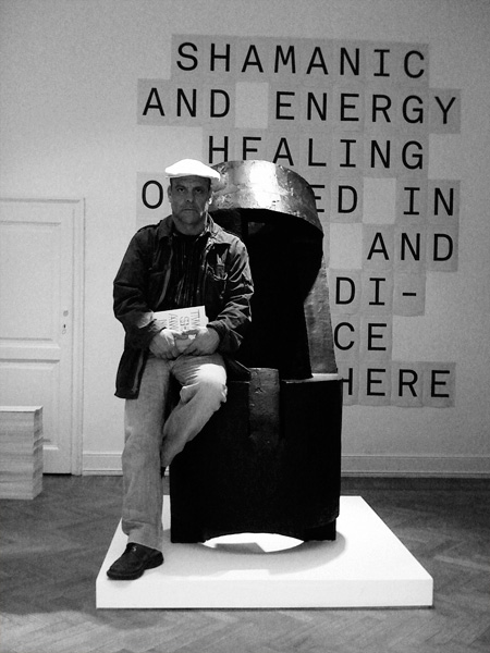
Our guest bloggers Proyectos Ultravioleta talk about their exhibition “Mayami Son Machín” which runs until July 23rd at Gallery Diet in Miami.

When Gallery Diet invited Proyectos Ultravioleta to do a show in Miami, a city we knew very little about (besides all that we Latin-Americans pretend to know about Miami, that is), our most reasonable option was to do a show about what we thought Miami was, regardless of whether it was true or not.
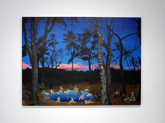
Neon colors were definitely involved, as were sex, music and a large dose of glamour, decadence, and humor. Partly because that is what a subcontinent believes Miami stands for, partly because that is what it wants the city to be. We broke the exhibition down into three parts: Mayami Son Machín. It is a a simple wordplay on “Miami Sound Machine,” the band that epitomized Miami in the 80s and 90s and was led by the mythical Gloria Estefan, herself an emblem of the complex relationship between Miami and Latin America.
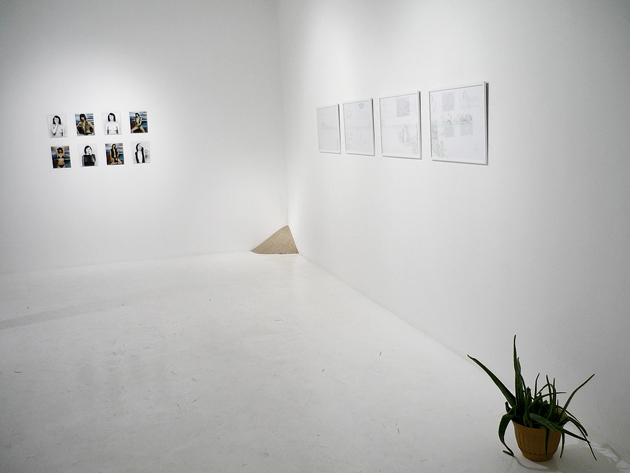
I spoke to someone recently who unconcernedly claimed that Miami was the capital of Latin America, and in many aspects, it is. On one hand, it is the most tropical and thus familiar version of the American dream for forced migrants. On the other hand, it’s a mecca of shopping, glamour and parties for nearly every member of the continent’s aspiring middle and upper classes. But regardless of the circumstances, the Floridian city is a place not to be ignored.

After considering Miami itself – Mayami – and its relationship to Guatemala in particular alongside the whole of Latin America, the show intended to analyze some elements that characterize either one of the geographic areas on which it focused.

Then, the music, vaguely summarized by El Son, of which its Cuban variation became one of the most widely spread Latin rhythms in the world, going as far back as the 1930’s. Using the word as an excuse, the exhibition gathers a series of works that analyze and use music as an idiosyncratic element, which summarizes a whole other series of elements normally associated to all things tropical (rhythm, skin, and sociability in the first place).
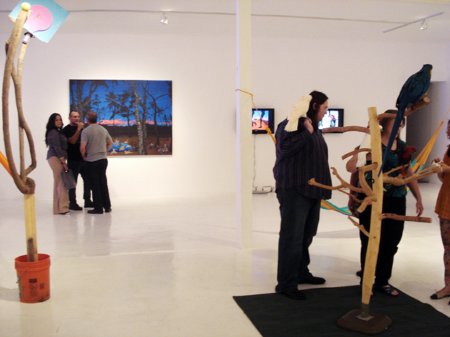
Lastly came Machín, a derivative of macho, usually used to describe a man with an attitude of being overtly masculine, though previously softened. This was an excuse to analyze the role of men in Middle and South American societies as well as gender construction in general, challenging the cliché of the Latin lover and its myth. This of course, leads you only too quickly to sex and that, in turn, takes you back to the ideas of tropicality, Latin-ness and its associated patterns of behavior and cultural preconceptions. MSM is an attempt to understand Miami from a Latin point of view but also a reminder that art can and should be fun and that (to the dismay of many) Miami is exactly what people think it is.

Emiliano Valdes – Images Courtesy Proyectos Ultravioleta
Share: Facebook,  Twitter  
31/05/2011

Automatic Books / The Book Affair

.

Automatic Books / The Book Affair

Automatic Books’ much anticipated event, The Book Affair, kicks off June 2. Set up as a modern day salon on independent publishing, the event will include book launches, signings, conferences and talks – and should be a very interesting bellwether for the state of independent publishing.

Over the past several years, independently published books have become increasingly fertile territory for experimentation in graphic design, avant-garde literature and poetry, and a means of pushing publishing itself into uncharted territory. And in the context of La Biennale, The Book Affair is certain to be an influential event.

The event will include a host of the best independent art publishers from around Europe, as well as a couple wild cards from Korea. The roster includes Studio Temp, The Milan Review, Studio Blanco, Mousse Publishing, 0_100, Kaleidescope Press, San Rocco and others from Milan, as well as Incertain Sens, Making Do, Occulto, Salon für Kunstbuch, and a host of others from elsewhere in the world.

The Book Affair will take place at Metricubi – “one of the only independent exhibition spaces in Venice” – and opens officially at 14:00 on June 2. Follow the event’s Tumblr for more information at t-b-a.tumblr.com. See you in Venice!

Tag Christof 

Share: Facebook,  Twitter  
30/05/2011

Biennale Di Venezia D’Arte / Preview

.

Biennale Di Venezia / Preview

This week marks the beginning of La Biennale Di Venezia D’Arte. With things already heating up and the art world descending on the city in droves, there is an enormous lineup of new works from the art world’s best. The Blogazine will be arriving Wednesday morning just in time for the first round of openings – we’ll be tweeting live, with tons reportage from around the events.


Wonder-Room: Salvatore Cuschera x Tankboys. 2010

We’ve already mentioned the Mexican Pavilion with works by Melanie Smith, and tomorrow we’ll give you the full details of the exhibition of our friends’Automatic Books. Be on the look out for the imposing, ethereal sculptures of featured artist and Wonder-Room alumnus, Salvatore Cuschera. Much more to come.

Download the full programme of openings along with a map of exhibitors here.

Tag Christof

Share: Facebook,  Twitter  
30/05/2011

The Editorial: Type Is Personality / Matthew Carter

.

The Editorial: Type Is Personality / Matthew Carter

Humans have a strange relationship with type. We stare at it literally all day, yet it generally goes completely unnoticed – letters are letters are letters. Except that they aren’t. Subtle differences in their form means big differences in how we feel about what we read. About whether a text shouts or whispers. Some type is so functional it becomes invisible (Helvetica). Others luxurious. Some vulgar, maybe old-fashioned. We associate places, things, eras with type. Type is sacred. It would be nothing less than cruel to carve out a tombstone in Comic Sans.

Big Caslon and Georgia, designed by Matthew Carter.

And while we may not notice type much in day-to-day life, the subtle, calculated changes designers make to centuries-old letter archetypes speak to our deepest sensibilities. In the most human of senses, type is personality. Think of the highly stylised “R” in Prada, the formal rigour of Mercedes Benz‘s Kurt Wiedermann-designed “Corporate A,” the iconic script of Alfa Romeo, the cryptic typewriter-look of “Maison Martin Margiela.” The forms of these letters tell you exactly the attitude of the products behind them.

And since computers have infiltrated every facet of life over the past two decades, we’ve all become at least peripherally aware of type’s power. We are able to give style to our written content far beyond that of our own handwriting. Our letters are no longer written in the oppressive uniformity of the typewriter (even though, like using Hipstamatic to fake old film photography, we often insist on Courier to fake retro). We now have a huge degree of control over our written environment through the power of desktop publishing. And as publishing itself is revolutionised by the wireless mobile technology of instant gratification, our personal relationship to type will continue to become richer and more complex.

Type is inseparable from place.

Appropriately, type designer Matthew Carter was awarded the lifetime design achievement award by Cooper Hewitt national design museum this month. (And this comes on the heels of a 2010 MacArthur Genius Grant.) Among designers in all fields, his work’s importance was singled out for its huge impact. Like the good, invisible design of “Super Normal,” the book and 2006 Triennale exhibition by Naoto Fukasawa and Jasper Morisson, the power of Carter’s work lies in its unassuming functionality. It is ubiquitous and looked over, even though when measured by use, the infinite reproduction of the internet means he is probably the most prolific type designer of all time.

Chances are you didn’t notice that you’re reading a text set in Georgia. It’s a serif that looks nice both big and small, and without getting into technical mumbo jumbo like “x-height” and “stroke,” it is an absolute masterpiece. Matthew Carter designed it. He also designed Tahoma, Bell Centennial, Big Caslon, and the most widely-used typeface on the internet, Verdana, as well as several others. The names may or may not mean anything to you, but their effectiveness is extraordinary and you’ve most definitely interacted with all of them. As typography nerds who work extensively on the web, we’re very happy to see a type designer honoured with such an enormous award.


Big Caslon (Top) and Verdana (Above).

Earlier this year, we revealed a new logo as the beginning of a top-secret revolution that’s happening at The Blogazine. We spent weeks in the studio considering typefaces for the logo alongside expert calligrapher Luca Barcellona – we leafed through stacks of 20th century style books and drawers of Luca’s beautiful 19th century wooden type. We wanted a logo that was at once smart, worldly, fashionable, bold and clearly bespoke – essentially, our brand in logo form. Barcellona’s end product combines our signature hexagon with a hybrid B that brilliantly combines elements Gothic and modern type into a powerful whole.

Our identity has been thoroughly enriched.

The Blogazine’s Luca Barcellona-designed logo.

Earlier this year, I was stricken by a banner I saw in a newscast that was being brandished by several Egyptian protesters just before Mubarak’s fall. It was scrawled in bubbly characters and looked like it had come straight from a 1940s Warner Brothers cartoon. In its careless presentation, the protesters’ gravely serious message had lost all effectiveness.

Type is personality. Force. It speaks loud, just like fashion. And like fashion, its signs and significance must be taken seriously. Let’s all take a lesson from master Carter and listen to it – and use it – with care.

Tag Christof 

Share: Facebook,  Twitter  
27/05/2011

L’Aquila Paper Concert Hall / Shigeru Ban

.

L’Aquila Paper Concert Hall / Shigeru Ban

It’s been just over two years since the disastrous earthquake that destroyed major parts of L’Aquila. The city continues to rebuild, but a tenuous political situation combined with the sheer scope of the damage have so far made it difficult for a complete renaissance. But with continued attention from around the world and a fresh slate to start from, things are looking bright for the city’s future. And on the cultural front, L’Aquila has one more impressive new structure to add to its renewal.

The concert hall is a project of Japanese starchitect Shigeru Ban, whose ingenious paper projects have filled orders for the likes of Hermès and proven a brilliant solution to problems of temporary architecture. All are easily recyclable and cost-effective thanks to their relatively pedestrian and simple materials. Ban’s recent partition structures for the crowded shelters where thousands of earthquake victims in Japan continue to live have proven a success, and his work is a model for the transitional architecture often required in the aftermath of natural disasters.

Like Ban’s other projects of this type, the concert hall is structured around reinforced paper columns – cardboard, essentially. This one in particular is a sort of 21st century homage to the Romans, with its rectangular outer elevation and pitched roof looking vaguely like a marble columned monument. Within the outer structure there is a central, elliptical space with pretty spectacular acoustics (especially considering the walls are paper), with more than 200 seats. The structure can even be torn down and reconstructed elsewhere.


As a gesture from one earthquake-battered nation to another, the structure is a powerful symbol of solidarity and a new ray of hope for L’Aquila.

Tag Christof – Images courtesy Shigeru Ban

Share: Facebook,  Twitter  
25/05/2011

Essen: Ethiopian Teff / Injera & Sega Wot

.

Essen: Ethiopian Teff / Injera & Sega Wot

This is the second The Blogazine & Essen collaborations with photographer Vittore Buzzi, whose travels have taken him to the very farthest corners of the globe in search of adventure, exotic food and beautiful imagery.

Teff is an a grain native to the Horn of Africa. Adaptable and resistant even to the most difficult territorial and climactic conditions, it is as important as it is mistreated. “Orphan” is the adjective with which it often comes accompanied, as it hasn’t received much investment interest as agricultural systems are modernised.

But despite a lack of drive towards possible intensive cultivation, teff has for centuries on end been the bedrock of the bread of Ethiopia: injera. This thanks to the crop’s incredible robustness – all its takes is a handful of seeds to plant an entire field! And this very bread is key to the celebrated dish zighini, a meat dish with rich sauces whose only rule is that it must be eaten without silverware.


Only in the past few years has the phenomenon of land grabbing taken hold in China and India – “I pay you for the land, I reap its fruits” – and teff has consequently experienced a huge surge. Nonetheless, this comes at the expense of Ethiopian agriculture, as foreign pockets are lined while the situation of those within the country only worsen.

Beyond its inimitable flavour (spongy and acidic), teff has one very important characteristic: it is entirely gluten-free. (Check out Essen’s very cool infographic on coeliac disease.)

In an unprecedented historic period, where one in every 100 people has a gluten allergy and half of all sufferers go undiagnosed, intensive teff production could have a positive effect on the diets of those who are forced to take gluten-free “vacations.”

A second, but certainly no less important consideration, is that teff production could help to reduce the plight of Ethiopia, a country burdened with an economic system that can only politely be described as inauspicious (read: a disaster).

So, while we consider these particular dynamics together – which remain thoroughly outside the conscience of most occidental consumers – we present to you a tasty Ethiopian recipe for dedicated to all the gluten-free of the world (and pretty delicious even for gluten eaters)!

Recipe: Sega Wot

This is a variation that can be prepared at home. Unfortunately, following the original recipe without local Ethiopian utensils is very difficult and doesn’t guarantee success. The modifications here will get you very close to the real thing, however, and it remains gluten-free! Feeds four.

Ingredients:
1 packet beer yeast
120cl hot water
1/2cl honey
600 g finely ground teff flour
Baking soda
1 onion
2 cloves garlic
20 grammes butter
40 grammes berbere sauce
40 grammes of cubed pork
500 grammes peeled tomatoes
salt

Injera Preparation

Dissolve the yeast in a mug of hot water. Wait 10 minutes until it starts to foam, and then add the remaining water and flour. Mix well and cover. Let it rest at room temperature for 24 hours. Mix the batter well and add a bit of baking soda.

Heat up a large nonstick pan at medium heat. Pour the batter into the pan forming a spiral in such a way that the bottom of the pan becomes completely covered by the batter. Cover and cook for a minute. The bread must not be toasted; it should only slightly increase in thickness Injera is normally only cooked on one side – its top must be moist and covered completely with tiny perforations (eyes). Let cool on a serving plate, and place the others on top as they are cooked.

Sega Wot Preparation

Sauté the chopped onion with the crushed garlic. After five minutes add 1 tablespoon of butter and 3 tablespoons of berbere sauce, 1 glass of water and a generous dash of salt. Reduce the mixture gently, then add the peeled tomatoes and as it cooks, add another glass of water. Continue to simmer for 15 minutes, then add the cubed pork. Let cook for an hour, or until the meat is cooked an the sauce is thick. Serve over the injera.

Reportage Vittore Buzzi – Text and Recipe Christina Zaga – Translation Tag Christof

Share: Facebook,  Twitter  
23/05/2011

The Editorial: Fix It Up

.

The Editorial: Fix It Up

DIY has swept the world. Etsy has become a sprawling platform for thousands of micro creative endeavours. This weekend’s premier Maker Faire event in California’s Bay Area united thousands of do-it-yourself enthusiasts and set the blogosphere and Twitter on fire. And although the thrift shoppe/junk store has fallen out of favour as the prime shopping destination of the voracious hipster (as “hipster” is now merely another easily marketed-to ethnographic group), it is certainly fair to assume that we’ve made significant cultural inroads with this mass-revival of handicraft. But no matter how trendy DIY becomes, we remain a society of wasteful, wasteful children.

Let’s be honest: even the most staunch advocate of DIY lives in a world that is filled primarily with mass-produced objects. Furniture. Appliances. Electronics. Knicknacks. And certainly, we must! Most objects owe their existence in the first place, to the economies of scale and technical precision that is only possible through mass production. But, despite our best efforts, the “planned obsolescence” pioneered by the likes of designers Raymond Loewy and Brooks Stevens’ (and perfected in our generation by Steve Jobs and Jonathan Ives) will remain a major motor of the built economy for the foreseeable future. Simply, mass production isn’t the enemy – rather, it’s our reckless consumption of mass-produced things that is dangerous and unsustainable.

And, indeed, we throw some very nice things away. Our reflex to buy almost always seems to override any logical desire to repair. When something breaks – or starts to look less than perfect – we simply throw it away and replace it. That old espresso maker with a broken handle? Trash. The nice wooden table that would look stylish with a sand down and a new coat of varnish? Rubbish. The lamp that could use a new shade? Garbage. Instead of spending any time getting our hands a bit greasy (and brushing up our dexterity), we toss and re-buy.

While our society’s general propensity for buying cheap junk is part of the problem (throwing out objects designed to have short lives is inevitable), we tend to throw out nice things anytime they become démodé, too. Think of the countless classic rangefinders and Polaroids to be found for a few euros in any suburban junk shoppe that require only a thorough cleaning, a new battery and a roll of film. The beautifully-patterned old clothes waiting to be sewn into something new. The old books with lovely, lost typefaces.

Buying from “curated” vintage shops is concomitant recycling. But a real relationship with your objects – and a real, active contribution to sustainability – requires more than buying and consuming. And the deeper relationship you earn by maintaing older objects is therapeutic. You impose yourself upon them. They become personalised. And a mass object is transformed into a one-of-a-kind.


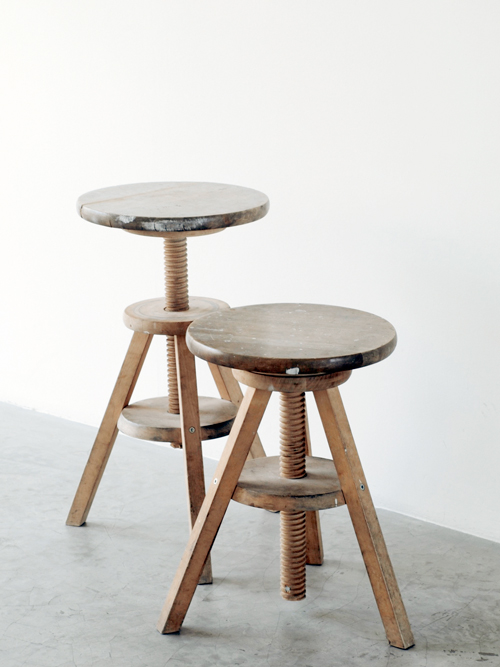
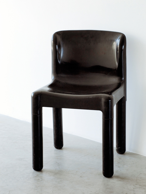
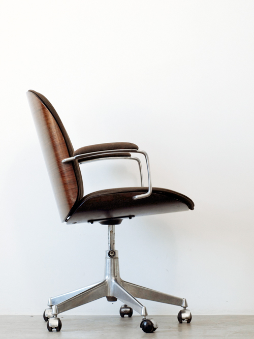
Our studio – a thoroughly modern, minimal place – is filled primarily with old, found and worked-over treasures: A recovered couch for guests, now painted pristine white. Several early 20th century Thonet chairs. Versatile height-adjustable found wooden stools and a sturdy old multipurpose table. A gorgeous MiM office chair from the line’s original 1960s Made in Italy range (MiM was back then a close relative of Fazioli grand pianos). An entire set of first-run 1974 Kartell 4875 chairs designed by Carlo Bartoli. Our most recent “acquisition,” is a circa 1995 drum scanner (complete with the requisite slightly yellow computer plastic of the era) whose superfluous quality kills that of expensive, much-newer flatbed scanners. Everything but the scanner was found – not searched for – after being thrown away by someone else.

Some of these objects could very well be museum pieces. But we use them, day in and day out because their inherent value is far from used up. And their inherent beauty, we feel, increases with age. Now, this isn’t an appeal for dumpster diving, nor is it a self-righteous lecture about recycling. But disposability is simply out of hand. This is broader than DIY: it’s foolish to think we can escape our manufactured world, so we must instead take steps towards truly engaging with it.

Tag Christof

Share: Facebook,  Twitter  
23/05/2011

Kilimanjaro 12 / Thinking Of Collective

.

Kilimanjaro 12 / Thinking Of Collective

The twelfth issue of one of our very favourite cult magazines Kilimanjaro has hit newsstands. We’ve previously called it the “indefinable, iconoclastic and always original art/culture/fashion/film publication,” and this newest issue carries on its lovely tradition of true editorial experimentation. We loved the odd tabloid format of their last issue – and just about a year later, as magazines themselves increasingly become an endangered and ever more transitory species, the same observation about Kilimanjaro’s inventiveness rings true even now: “Filtered through the sensationalism, disposability… and the bigotry of this most hyperbolic and transitory of mediums, the serious discourse and creativity of this issue’s contents are amplified…”

This time out called “Thinking Of Collective,” the magazine comes in clever “ten of clubs” boxed set and takes on an a multilayered, onion-like form, with various supplements and features together making up the issue’s structure. And in terms of fashion, it’s stepped up quite a bit, featuring exclusive content from Yves Saint Laurent and, fittingly, gold foil throughout. And, there’s a new supplement called Kiliman, which contains twenty-five gorgeous pages of high-end mens fashion including pieces from YSL and Yamamoto. All this on tasty peach newsprint.


We’ve talked with the project’s mastermind Olu Michael Odukoya several times about past issues, including a 2010 interview, and remain impressed by his projects. And since we’re name dropping, this issue includes appearances from musician Damo Suzuki, Roman Signer, Martin Creed, Hauser & Wirth, Elad Lassry, and a full-colour supplement from Heinz Peter Knes.

Tag Christof – Images courtesy Kilimanjaro

Share: Facebook,  Twitter  
20/05/2011

Pabellón de México / Biennale di Venezia

.

Pabellón de México / Biennale di Venezia

The 54th edition of the Biennale di Venezia d’Arte is just around the corner. As we slowly and not-so-surely lurch out of global recession, the Biennale’s importance for gauging the art world’s temperature has never been more important. A prime selection of world-class artists will be featured, including our good friend and Wonder-Room alumnus, sculptor Salvatore Cuschera. In addition, look for treats in the worlds of graphic design and publishing, especially from Automatic Books – the brainchild of our pals Tankboys and 2DM’s Elena Xausa – who is hosting an event at the Biennale as well (more on that as the event gets closer).

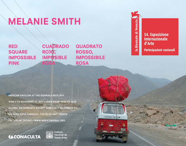
We’ve gotten word that the Mexico Pavilion is shaping up to be something exceptional. Featuring the artist Melanie Smith, who is British but has lived and worked in Ciudad de México for over two decades, and curated by José Luis Barrios, the exhibition is billed Cuadrado Rojo, Imposible Rosa (Red Square, Impossible Pink).

“Red Square Impossible Pink is an exploration on the frame as the aesthetic and political limit of representation in art. In Melanie Smith’s work the pictorial question on the frame as a limit has driven large part of her artistic research. By questioning the aesthetic and artistic practices of modernity — particularly the relationship between abstraction and utopia in Suprematism — this project works on the displacements and variations this utopia has produced in Latin American geo-esthetical emplacements. Thus, Smith tackles the issue of the transformation of utopias as artistic projections into heterotopias as productions of social and political experience in Latin America.”

Despite its nebulous description, it will include a major portion of Melanie Smith’s paintings, installation and video works. Her “expanded vision of modernity,” which is undoubtedly informed by her position as both British and adopted Mexican. Her works have generally concentrated on Mexico City itself – its vast size, its massive and diverse population, its decay.

Mexico itself has become an absolute cultural hotbed in the past few decades, with a skyrocketing artistic and geopolitical importance. Its central position between the rest of Latin America, the United States and Spanish Europe will make it even more economically and cultural pivotal in the coming decades. The exhibition should also prove an interesting corollary to our recent editorial about American hipster culture in Mexico.

Much more to come from us about the Biennale in the days ahead. Find the Pabellón de México at Palazzo Rota Ivancich – opening vernissage June 2 at 18:00, and running from June 4 until November 27th.

Tag Christof – Image courtesy Pabellón de Mexico

Share: Facebook,  Twitter  
18/05/2011

Terence Malick / The Tree of Life

.

Terence Malick / The Tree of Life

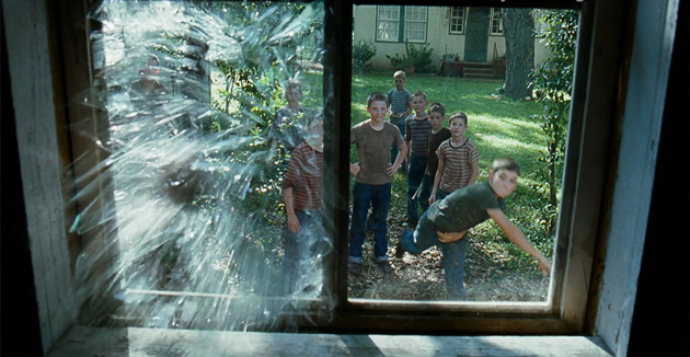
Terence Malick’s new film, The Tree of Life has caused plenty of media buzz over the past several weeks. In a career spanning four decades, this is only the fifth film he has directed, so the anticipation has understandably been massive.

With hardly any buzz around his directorial work since 1998’s “The Thin Red Line”, this film – which is the only film he’s both written and directed besides 1973’s “Badlands” – was almost sure to be a revelation. But beyond its star-studded cast, epic story and the hype, the cinematography is sublime. Full stop. Cinematographer Emmanuel Lubezki – who was also behind the gorgeous photography in Burn After Reading, Y Tu Mamá Tambien, Like Water for Chocolate and several others – certainly had his work cut out for him, and despite differences in opinion among critics, the film is sure to be a feast for the eyes.


So since photography is at the heart of what we do, we just couldn’t help but share and spread our affection and anticipation for the film. Now that it’s been dissected and pored over by the critics at Cannes, all there is left to do is wait for Italian release on May 27th. We’re already queuing…

From the Bureau – Images courtesy Fox Searchlight Pictures & twowaysthroughlife.com

Share: Facebook,  Twitter