.
The MegaPhone
After our editorial rant last week about the decline of tactile, purposeful objects, we hit Salone del Mobile to see designers’ take on the future. What we found was mildly depressing: hundreds of plasticky, computer-generated chairs, mediocre devices from upstart Chinese electronics companies, and show stopping grandiose installations with little bearing on producible objects. The word “artisanal” was thrown about everywhere, but most objects described as such were either high-priced luxury trinkets (as usual) or ignored the influence of modern technology altogether. Not that there wasn’t a lot of excellent work, but this year didn’t give the impression that many boundaries were being pushed.

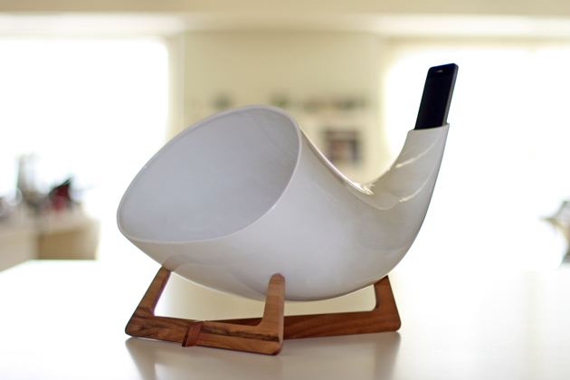
But sometimes a design is so elegant, so straightforward that it stops you in your tracks. Or sings to you. The MegaPhone from Italian design duo en&is for iPhones and iPods is brilliant.
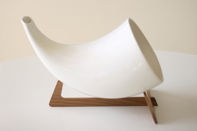
It is exactly the kind of concrete, semi-analogue solution that we crave to see as product design merges with interface design. It is a simple ceramic amplifier on a wooden stand, utilising natural acoustic principles to play music (or inversely, to make speakerphone calls). Its sound is full and earthy, and its form recalls the bells of tribal instruments, antique hearing horns and conch shells. It uses the iPhone’s existing hardware to its advantage (and that’s good design). And while it won’t charge your device, it looks a hell of a lot better than anything that will.

I couldn’t help but looking at Yves Behar’s much-hyped Jambox (also revealed in Milan last week) and thinking that, despite its technical prowess, the MegaPhone is a far superior design. Efficient. Timeless (insofar as the iPhone keeps the same general configuration). Desirable.
It cleverly unites low-tech with high tech, and it transforms the iPhone (while using it to listen to music, at least) into a 21st century take on the parlour phonograph. Now that’s progress.
Tag Christof – Images courtesy en&is
