.
Salone del Mobile: The Fair
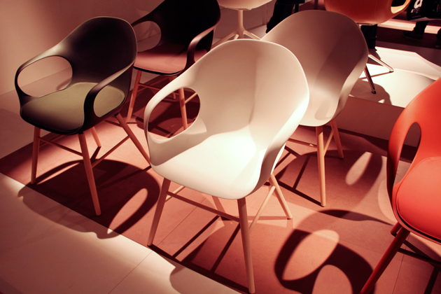
With light at the end of our economic tunnel for the first time in years, the design world should be alive with audacity and imagination. But when it comes to the world’s biggest furniture fair, we didn’t see much to capture the imagination this time out.
We saw a decisive shift towards plastic chairs with metal frames: they were everywhere, from Swedese to wood pioneer Thonet. And speaking of wood, the was a conspicuous lack of it, as well as leathers and other natural materials despite the fact that quite a bit of brand literature was dedicated to proclaiming “sustainability.” Colour palates this year are generally sober and solid, with muted 1970s-esque shades of green, blue and pinks, while patterns are few and far between.
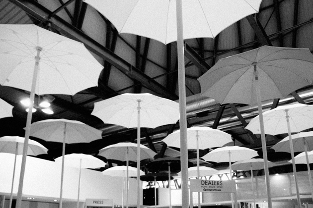
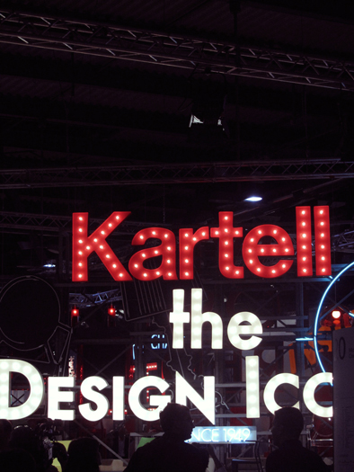
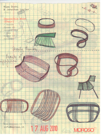
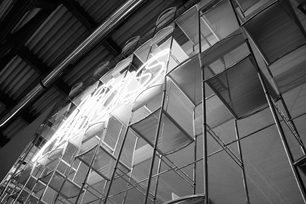
Plastic king Kartell was the star of the stands, with massive Broadway neon signs and colourful, well-organised sections – it was probably the best integration of product and display, too. Vitra’s stand, complete with crackling raw parquet and neatly-decorated cubbies was also pretty nifty, although it looked a bit too much like a child’s playroom. Other standouts included the umbrella ceiling and gravel floored mini-world of Elena Xausa and the walls made of metal chairs at Alias. We also loved the “tear-off” pads of sketches from Doshi Levien, Patricia Urquiola and others on the walls at Moroso.
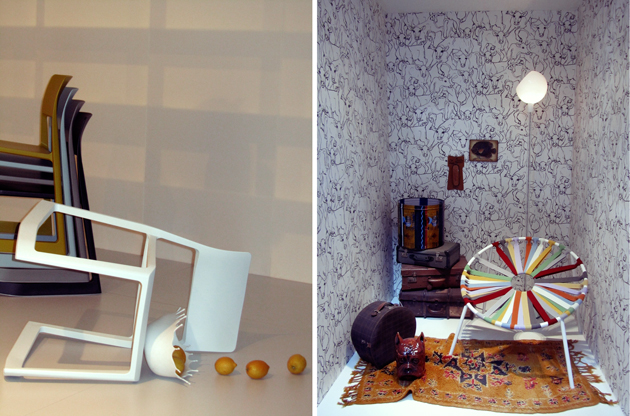
Still, any good design nerd knows that chairs are the heart of Salone. But sadly, on the chair front it seems that very little forward progress was made this year. Edward Barber and Jay Osgerby’s “Tip-Ton” is typical Vitra – it’s well made and should age gracefully – but nothing from the usually innovative company truly stood out. Piero Lissoni’s Audrey chair for Kartell, which does a fantastic plastic impression of the typical rattan dining chair has finally made it to production (very cool!). But our favourite chair so far was the “Gaulino”, by Oscar Tusquets Blanca for Barcelona Design. Called “a cross between Gaudí and Mollino,” it’s wooden, sensual and suggestive. Hot stuff.
Far and away the most fun part of the show was Satellite – the student’s realm – where genuine creativity is transformed into handmade prototype projects and the designers of tomorrow get their first chance to show their stuff. (But more on that from us towards the end of the week).
Now for the rest of the week: Fuorisalone! Fun!
Tag Christof – Photos Emelly Blomqvist & Tag Christof
