21/02/2011

2° Atto / Opus Creative

.

2° Atto / Opus Creative

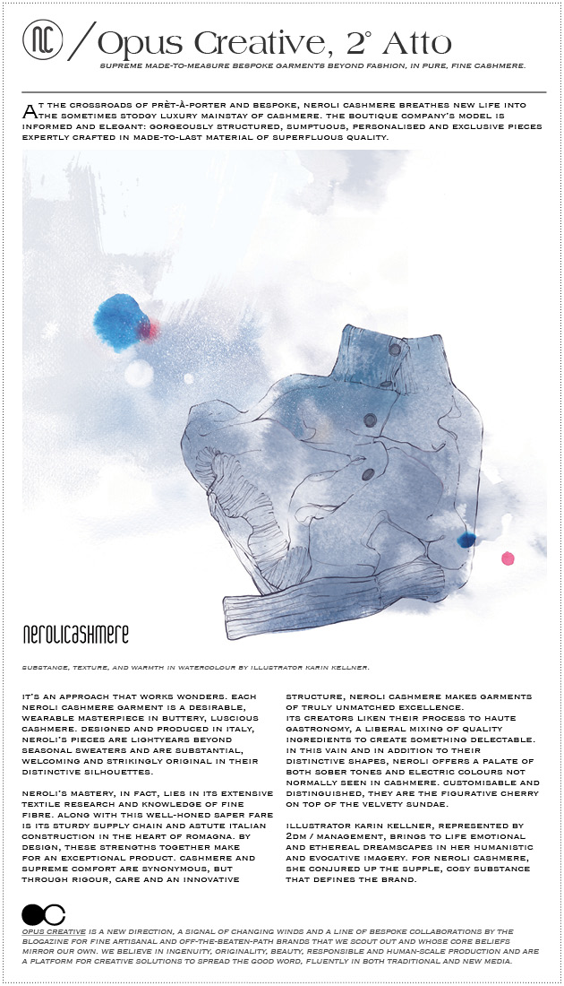
And the curtain rises on Opus Creative’s second act, launching today with boutique purveyors of fine and customisable cashmere, Neroli Cashmere.

Together with exceptional, young, artisanal brands, The Blogazine crafts high-quality, bespoke collaborations to creatively amplify and tailor their distinctive messages and brand qualities. For this edition, we called on the ethereal, atmospheric intuition of 2DM‘s Karin Kellner to bring the aura of Neroli Cashmere to life.

Share: Facebook,  Twitter  
18/02/2011

Nencioni’s Tokyo

.

Nencioni’s Tokyo

2DM’s swashbuckling architecture and design photographer Lorenzo Nencioni is just back on our boot-shaped peninsula after quite the wintertime adventure in Japan. A capable speaker of Japanese (impressive!), he and his camera hopped from prefecture to prefecture of Tokyo while green tea kept him cozy. We saw his interior shots of the recently-reconstructed Kabuya coffee shop complex there last month.


Japan’s intense connection to its architecture and storied, perpetually white hot design scene is the ideal subject for Nencioni’s ultra-precise and expansive photography. And as you can imagine, these images are only the tip of the iceberg…

Tag Christof – Images courtesy 2DM / Management

Share: Facebook,  Twitter  
17/02/2011

Passport to Trespass

.

Passport to Trespass


A dozen years and counting in the making, Mikael Kennedy’s series “Passport to Trespass” is a chef-d’oeuvre in Polaroid if there ever was one. The epic work is set to launch its seventh chapter, billed “Hunt Them Out,” later this month.

Working with some of the last precious cartridges of Polaroid 779 – the authentic and dreamy genuine stuff – Kennedy has crisscrossed North America several times with his SX-70. Over time, an emotional narrative with his surroundings and the acquaintances he’s made along the way has emerged.

A spiritual successor to the likes of Kerouac, he looks upon life as a visceral, riveting adventure and his work comes accordingly saturated with this perceptible enthusiasm. His fine art images are made with such simple honesty, no doubt accented by his studied choice of such an anachronistic and mercurial medium, that it’s clear he positively lives through and within them.

In a short conversation with us, he recounted, “I got caught by the police, one summer, climbing over a fence onto an abandoned and crumbling pier. They let me go when I showed them my camera and told them I just wanted to take a picture. That wasn’t the first time I had gotten out of trouble by showing my camera and explaining that I was just exploring…”

“To me the most important thing is a life that is lived at the end of it, not wasting my life is the goal, every single day that I am alive is important and should be spent accordingly. I recently told a friend I don’t care why the world is the way it is, I just want to see it before I go.”

His blog, Passport To Trespass, is definitely worth exploring at length and is frequently updated. Catch “Hunt Them Out” from its launch on February 21st, in tandem with an online exhibition and sale of limited-run prints through his gallery, Peter Hay Halpert Fine Art in New York.

Tag Christof – Special thanks to and images courtesy Mikael Kennedy

Share: Facebook,  Twitter  
17/02/2011

Terre Vulnerabili

.

Terre Vulnerabili

Terre Vulnerabili is an ongoing project of four exhibitions – mirroring the lunar cycle – based on collaboration among 30 international artists asked to create site-specific works, thought or readapted for the amazing space of Hangar Bicocca in Milan.


Vulnerability can be seen as an absolute capacity, which gives human beings the sensibility and responsibility to understand others’ needs.

The second step of this “growing exhibition” (whose main issue is based on an assumption by Georges Perec to “Question that which has forever ceased to amaze us”), curated by Chiara Bertola and Andrea Lissoni, will last until March 3, enriching the first show with new works that constantly interact with one another. Starting from the precarious stability of our Mother Earth and the fragility of human beings, the artists reflect their personal vision of vulnerability: from the labyrinth made of cardboard by the Hungarian French architect Yona Friedman, to the transparencies representing the strange holes on the sand close to the nuclear centre of Yeong Gwang (South Korea) by Kimsooja, or the fireworks by Nico Vascellari, which recall the blast of a bombing.

Both the impalpable delicacy of the tube realised with horsehair by Christiane Löhr and the wall carpet made of grass that keep growing and turning yellow by Ackroyd & Haervey express precariousness and mutability. While wandering around the huge space of Hangar Bicocca, you’ll be hypnotised by the amateurish video Staging Silence, in which the Belgian artist Hans Op de Beeck rebuilds locations, urban and domestic contexts, real or fictional, where the absence of people allows the visitor to jump into the stage and stay there alone in silence, in contemplation. Moreover, casting a glance to the ceiling you’ll be trapped by the “Web” (2006-2010), an installation that the artist Mona Hatoum realised with crystal balls and metal wire, so to encompass all the earth and human being pains that we have to face and fight.


After visiting the exhibition don’t forget to have a drink at the HB Bistrot, which combines an international atmosphere with original design and good food.

Monica Lombardi – Images courtesy Hangar Bicocca, special thanks to Lucia Crespi

Share: Facebook,  Twitter  
16/02/2011

Happy Pills

.

Happy Pills

Popping pills can be a brilliant escape from the frustrations of the day to day. Until you’ve woken up on a park bench with no recollection of the previous day and an unfortunate new tattoo. And when your life becomes a bad reenactment of Valley of the Dolls, you know you’ve gone much too far.

Enter a most elegant solution, Happy Pills: side-effect-free and positively gorgeous candies to cure what ails you. Made with top-shelf ingredients and merchandised in the cleverest way perhaps possible, the Happy flasks look a lot cooler than a rumpled bag of Haribo. And they’re are also wry commentary on our turbulent relationship with mind and body-altering substances. In any case, humour and high design are far more attractive than headaches and hypochondria…


“Porque no contienen ni pizca de mala leche, amargura, palabras necias, ni oídos sordos…”

The Happy Pills lineup consists primarily of a cornucopia of exotic jellies (gummies), but also runs the gamut of chocolates and chewing gums. Each fix comes packed in gem like little flasks and pill jars, emergency kits, and even a cheeky take on the quotidian pill dispenser, which ensures a healthy daily dose.

The family owned company, with its epicentre on Calle dels Arcs in the Barcelona, is a smash sensation in Spain and is constantly evolving. They’ll eventually even offer personalisation – happy prescriptions, if you will. Their flagship apothecary in Barcelona, furthermore, is a gorgeous take on the sometimes depressing pharmacy, with a gratuitous selection of treats.

And since Happy Pills is looking to spread its goodwill around the world (and since grey Milanese days definitely require heavy-duty pick-me-ups), we hope we’ll see them on our side of the Mediterranean soon. Until then, overdose!

Tag Christof – Special thanks to Imma Dueñas and Txus Sánchez

Share: Facebook,  Twitter  
15/02/2011

Larry Clark / What Do You Do For Fun?

.

Larry Clark / What Do You Do For Fun?

The raw intensity of Larry Clark’s iconic work still carries its gloriously hormonal energy and frustration surprisingly well. And four decades on it remains as impacting and relevant as ever. Causing a stir since his publication of “Tulsa” in the early 1970s, Clark has worked extensively in photography and film, and links the two mediums together through the narrative of collage. In his first UK show since 2008, billed “What Do You Do For Fun?” and at the Simon Lee Gallery and following his contentious “Kiss The Past Hello” exhibition at Paris’ Musée d’Art Moderne last year, this outing highlights collage works, the debut of a silent film and also includes several vintage works.

On exhibition are “1992,” a collage of more than two-hundred staged photographs, and the more recent “I wanna baby before you die.” His subjects themselves are ever anguished, themselves also subject to a social fabric that places them in almost desperate situations. Manhood expectations. Drugs. But quite unlike the often pitiable, freakish subjects of, say, Diane Arbus, Clark’s always comes across as caught in the turbulence of coming of age. However jarring they might be, as can attest any of us who have seen his 1995 masterpiece, “Kids.” And though the world has changed drastically in the forty years since Tulsa showed its face to the world, Clark’s images continue to affect their viewers and to speak volumes about our relationships with our young, rebellious selves.

Running through the 2nd of April at Simon Lee Gallery, at 12 Berkeley Street in London.

Tag Christof – Images courtesy Simon Lee Gallery, London with special thanks to Edlyn Cunhill

Share: Facebook,  Twitter  
14/02/2011

Marco Klefisch / Ala Champfest

.

Marco Klefisch / Ala Champfest

2DM illustrator kingpin Marco Klefisch’s was just featured in experimental Aussie/Brit mag Ala Champfest. Klefisch’s work was featured alongside an extensive interview on an eight-page spread where he mused on about the nature of his work and also talked at length about Wonder-Room, where he showed with Studio Fantastico in May.

Of the event, Klefisch recalled, ‘The show, titled “Mirrored,” was conceived in a small temporary space called Wonder-Room, an empty space which hosts these serial events promoted by 2DM / Management. They connect a young studio with an artist for a small exhibition based on a short selection of works. I based this show on my background production in relation to illustration. There was a good amount of interaction and I was happy about the final results on my photographic background work.’

Ala Champfest bills itself an “ever-relevant graphic and image-based journal magazine,” and fittingly features an awesome roster of graphic designers, illustrators and otherwise provocative image makers. Klefisch’s multilayered and thought-provoking work has otherwise been published in Vice, The End and tons of others.

WONDER ROOM n° 4 OPENING from WONDER ROOM on Vimeo.

Wonder-Room’s story is set to continue with its next chapter during Salone Del Mobile, with a new exhibition in a new space…

Tag Christof

Share: Facebook,  Twitter  
11/02/2011

Mick Jagger. The Photobook.

.

Mick Jagger. The Photobook.

Sunday marks the close of “Mick Jagger. The Photobook.” at Fondazione Forma per la Fotografia. Curated by François Hébel and featuring the most iconic shots of Jagger from the gamut of the last half-century’s portraiture greats from Cecil Beaton to Anne Lebovitz and seemingly everyone in between. The exhibition takes a look at his position as the definitive and undying icon of rock stardom. And in the context of today’s musical landscape, Jagger’s seeming permanence in rock iconography is jarring. He is nothing less than a cultural monument.

Movements in culture and art no longer gel and dominate for a decade or so at a time, but ebb and flow by the season, each one borrowing gratuitously from something that came before it. For music, save today’s disastrously bad radio pop (which survives as the last bastion of old distribution models and thanks to the easy manipulation of pre-teen girls), this means no more definitive sound. No more definitive rockstar. Jagger is the last.

And as we listen to ever more sophisticated music in ever more isolated space, lost in noise-cancelling devices and privy to exponentially larger and more eclectic music libraries than were imaginable even a decade ago, one can only wonder what fragmented legacy today’s music will leave. The sound of a decade is no longer galvanised in a style, no longer called to mind by a distinctive song or particular instrument, and also no longer subject to its level of technology. But decades from now we’ll all still listen to Jagger and the Stones. Probably with our grandkids. And our parents. And probably out loud.

Catch the exhibition while it’s still open, together with a parallel show of emotional Marco Anelli works, at Fondazione Forma per la Fotografia in Piazza Tito Lucrezio Caro 1 in Milano.


Tag Christof – Images courtesy of Daniele Testi

Share: Facebook,  Twitter  
10/02/2011

Holga D

.

Holga D

With the current ubiquity of so hi-fi-it-hurts in the age of the Blu-Ray and 3DTV, our human sensibilities seem to be crying out for human softness. Maybe even human error. From blaring Neon Indian vinyls to pixellated everything, lo-fi is here to stay. Nowhere is this more evident than in photography, however, from Nicky S. Lee’s insistence on disposable 35mm for her fine art work to the improbable rises of both Lomography and The Impossible Project. And do you know anyone with an iPhone who doesn’t snap Hiptsamatics?

In any case, this relationship goes far deeper than the (mis)use of analog cameras as a medium considered appropriate only for making distant, retro images. The warmth of a botched image, with its erratic light, untrue colours and tentative textures, is extraordinary and human. The plastic iconic Holga, as much a trendy icon in our generation as was macramé for the truly groovy in the 1970s, is of course the paragon. The junky, creaky little monster has been rigged up by enthusiasts for ages and loved for its unpredictable results. Enter now, the Holga D.

Yes, a digital Holga. Finland-based Indian designer Saikat Biswas has tapped brilliantly into the lo-fi zeitgeist, to create a “why didn’t I think of that?” minor masterpiece, that despite its inherent chintz is elegant and desirable. It uses a fixed plastic lens and low quality sensors to make up for its lack of real light-leaks (which wouldn’t play as nicely with a sensor as it does with analog film), and without an LCD actually requires its user to wait for its lush lo-fis to be “developed.” Of course, the wait is only as long as it takes to download the images to your computer, but it’s a welcome design element that controls our instant-gratification reflex and perhaps forces a more well-considered approach to taking images. And those unflattering photos you just took of your friends – they can’t flick through and delete them while they’re ‘just having a look.’ Ha!

Alas, like the DIY tinker toy BigShot that we’ve mentioned before, the electro Holga is as yet just a prototype awaiting development. But its synthesis of lo-fi and digital – probably the most seamless to date – is an interesting take not only on dreamy, fuzzy imaging, but could prove to be a nice friendly camera to re-teach patience and re-instil everyday photography with a bit of its lost magic.

Tag Christof – Images courtesy Saikat Biswas

Share: Facebook,  Twitter  
09/02/2011

Guest Interview N°22: Karlie Gartner

.

Guest Interview n°22: Karlie Gartner

Desired, evocative, esteemed, and no two are alike. Organic creations merging past and present to tell an individualistic tale and yet simultaneously continuing anew for the one who wears a jeweled piece made by Karlie Gartner. The beauty of these one of a kind jewels, is that they originate from another time and place and find their way to Karlie, are deconstructed, and made to order as her eye and creative hands see fit. Extravagant and bespoke melodies to be adorned, each with its own special story to tell, and upon first sight, it’s love. We crave what no one else has, and Karlie gives this special gift. These are transformation pieces, and they all carry the whimsical, the royal, and a never-ending dream… which is in fact the key in fashion that is so intensely sought out. We caught up with Karlie to get into the details of what makes these hand-made historical jeweled pieces so delightfully inviting to the eyes.

What inspired you to begin jewelry design?
I love fashion accessories and have always dreamt of converting my vision into an accessories empire. Growing up I taught myself how to make my own jewellery, so I could improvise and replicate the amazing pieces I longed to own without the funds to finance my caviar tastes. I figured jewellery was the perfect place to start as it’s something that I innately understand and appreciate.

Your pieces are extraordinary…each with its own special identity. What is the ‘behind the scenes’ process that each undergoes?
The process of designing varies greatly from piece to piece, but once I’ve come up with a specific design, I set to work on deconstructing the original components by removing pins and backings etc. and reworking them together into a new design. This too can be completely different for each piece, weather it requires re-stringing, drilling, sewing, hand wiring, beading or cold connecting.. I sort of consider each piece on an individual basis and work it out as I go along.

How long does each piece take to create? What is your feeling once you have completed a piece?
Each piece depends completely on the design.. and of course the time it takes to source all of the components. Generally the more intricate the design, the more time it takes to create, owing to the fact that it’s all assembled and wired by hand. Of course it is for this reason that the feeling of completing a piece is tremendous. Seeing your vision come to life is so satisfying in itself, and that feeling is compounded by people who appreciate your work.

Not one piece is identical. Is this something that was intentional from the beginning? Which do you prefer – the mass production of pieces? Or keeping them as individuals, one of a kind?
It’s actually not something that was intentional from the beginning, but as I became more and more interested and inspired by vintage jewellery and designs, it very quickly became apparent that I wanted to maintain the integrity of the components I was collecting, and that has become very important to the theme of my collection -that they should remain one-of-a-kind pieces.

I believe that the fashion world is heading more and more in this direction. With high street stores competing so fiercely to churn out the latest trends and catwalk looks on mass, I think people are beginning to explore other avenues to express themselves through fashion, and are willing to pay that little bit extra in an effort to break the cookie cutter mould and wear something that celebrates individuality and an appreciation for traditional craftsmanship.

How long have you been collecting pieces? Where do you go to add to the massive collection – will you share your special vintage spots?
I have been collecting really since I was a young girl. I would trawl through my grandmother’s jewellery box and play with her vanity set and powder compact on weekly visits. I think my hardcore addiction kicked in, however, when I started travelling. Moving to the UK, I discovered London to be a vintage playground which is what ultimately inspired my current collection. I visit markets on a weekly basis.. Some of my favorites include Spitalfields, Camden Passage, and Portobello Road (when I can face the crowds!)

Who do you create these pieces for?
I create for women who appreciate fashion but like to set themselves apart from the crowd. For women who celebrate individuality, sentiment and nostalgia.

Your primary focus is accessories – do you plan to extend the Karlie Gartner label? In which direction do you feel would be additionally beneficial to the existing collection?
I would love to expand the label into a full range of accessories! I think 2nd to jewellery is my love of handbags.. I would like to design a handbag range next. I’m currently working on hair pieces under the existing theme of restyled vintage, and I plan on developing that into a full bridal and fascinator collection. Watch this space!

These statement pieces are representations of you. Can you describe what they mean?
I believe that accessorizing is the easiest way to transform a person from the mundane to the spectacular. For me, my pieces project an image of whimsy and fantasy.. Something to transport you into a fairytale world. They represent my vision of a fairytale world and my way of linking the past with the present.

In what city is your heart? Where do you find yourself most creative in flow and inspiration?
My heart will always belong to my hometown -Melbourne. My favorite city though is definitely New York! Its got such a cool vibe and has so much to offer in terms of inspiration. I would love to live there one day!

Do little moments and experiences in your life influence the designs of the pieces?
Definitely! I pick up inspiration from all over the place. I think I’m having a ‘Black Swan’ moment right now.. Im getting very into dark and moody pieces and black Victorian lace.

Who are your favorite accessories designers? Dream collaborations?
My favorite Vintage jewellery designer is Miriam Haskell because her pieces are like works of art – so incredibly intricate and beautiful! Contemporary designers I love are Tom Binns and Michelle Jank because they create statement accessories that are bold and unique.

I would love to one day collaborate with Sass and Bide…

Which direction do you think the future of jewelry design is moving in?
Jewellery design is becoming increasingly experimental and conceptual which is very exciting. Contemporary designers are pushing the boundaries in terms of materials that constitute foundations for jewellery and accessories. I once read an article about a designer who used human bone tissue to create a ring, coining it ‘bio-bling’. I love that!

What do you want your clients to know when they wear your pieces? What should they take away with them?
That when they wear a piece from the Karlie Gartner collection, they are not only wearing a hand worked, one-of-a-kind accessory, but also a piece of history, reviving and re-loving treasures from years gone by.

Interview and introduction by Coco Brown. Photos courtesy Karlie Gartner.
Share: Facebook,  Twitter